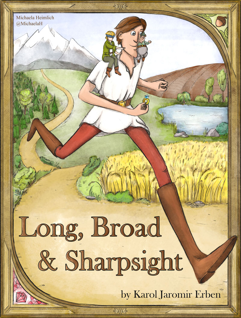
WIP Book Cover "Long, Broad and Sharpsight"
-
I am working on the cover for czech tale "Dlouhý, široký a bystrozraký" by Karel Jaromír Erben, it has also other names:
"Long, Broad and Sharpsight"
"Longshanks, Girth, and Keen: The Story of Three Wonderful Serving Men"
or it is similar to "The Six Servants" by Grimm
I have made two tumbnails for it, still don't know which one I will be making/using.
My thoughts:
The first left one, the characters are coming at me as reader, but going away from the witch castle. The other two characters are very small. But is more open and free design. I don't know how I fit the cover title in the forest.
The seond right one, the characters are going to the castle. The long guy is looking to the two other characters, they are communicating, and the other two are big enough to get some space. I made the long character bowing under the rectangle, because I wanted it to look like he doesn't fit in the cover picture, like the ceiling would press him down.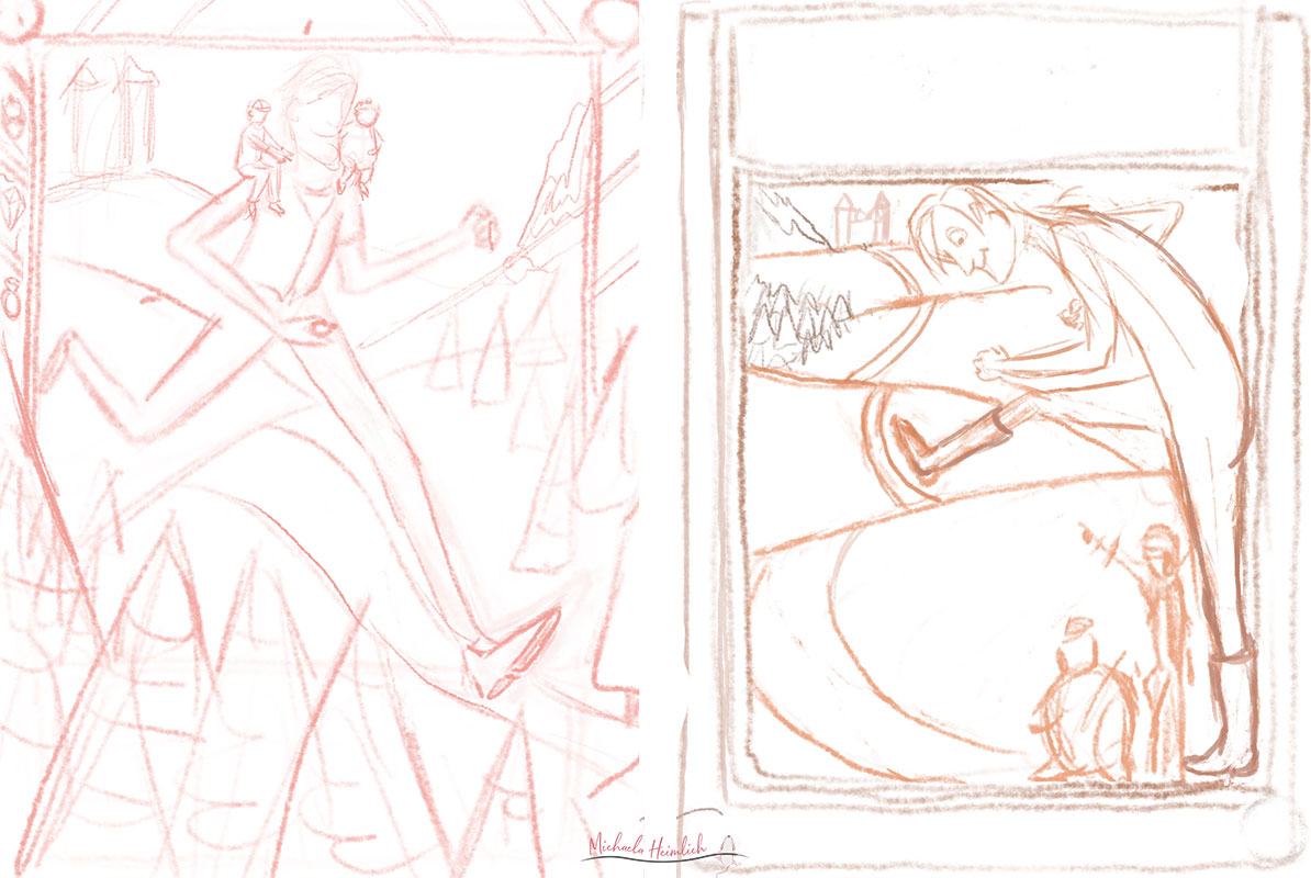
-
@MichaelaH Oh this looks like such an interesting and fun story! I like number one the most because number two is so cramped up in the bottom right corner. The first one has nice movement in it making it stick out more and feels more free.
Can't wait to see where you are going with this!
-
Thank You Saskia for Your feedback, You are right, I think I need to make the right bottom corner of the second thumbnail more open, the figures not so close to each other.
-
@MichaelaH I like the first one too, it feels more like an active adventure/sense of urgency. If you are worried about the castle being behind maybe you could do the shadow of the castle on the mountain in front of them all impending sense of doomy
-
I like number one too, it seems to tell more of the story (even though i dont know what the story is haha) and it looks more fun
") With the second one you could always try and move the two smaller character to the left hand side and lower the castle a bit so there aren't as many rolling hills? Four hills seems like too many hehe!
With the second one you could always try and move the two smaller character to the left hand side and lower the castle a bit so there aren't as many rolling hills? Four hills seems like too many hehe!
Really looking forward to where you take this, is sounds like such an interesting story! -
@Heather Bouteneff Thank You for the feedback, I think I will go with the first one, althought I still feel pulled to the second one (maybe I will try a different aproach.
-
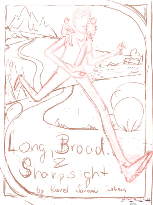
So I changed the first cover, castle is out of picture, the three heroes are coming back there, but I put the three quests places there, mountain, forest and lake, where they are coming from.
-
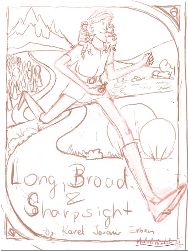
And almost finished raw sketch, changed some little things.
-
@MichaelaH looks like a fun story! One thing I’d mention is that when we walk or run, our arms swing forward/backward opposite of our legs. So, right foot forward, right arm back (or left arm forward is another way to say it.) at the moment, it looks like the tall character has both his left arm and leg coming forward at the same time. Might want to consider tweaking that, so he has a more natural movement.
The landscape looks good, I think, and I love the little acorn in the corner of the frame! -
@Kat Hi Kat, thank You for Your feedback, I really did forget about the movement of the hands
But I worked on it today, also I changed the right side of the landscape a little bit, I put some field behind and cornfield infront.
The acorn, the gemstone and the ring are the enchanted princess, it was their quest to find her.
Now I will try to do some color thumnails...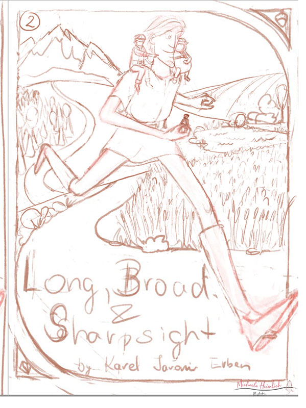
-
This is looking great Michaela, the characters on his shoulders look brilliant! One thing i'd look at is lowering the first hill a bit so it's not so close to his body?
-
@hannahmccaffery Hi Hannah, thank You for teh feedback. :smiling_face_with_open_mouth_cold_sweat: :smiling_face_with_open_mouth_cold_sweat: , I already lowered the first hill, but only little, I will try to lower it more
 .
. -
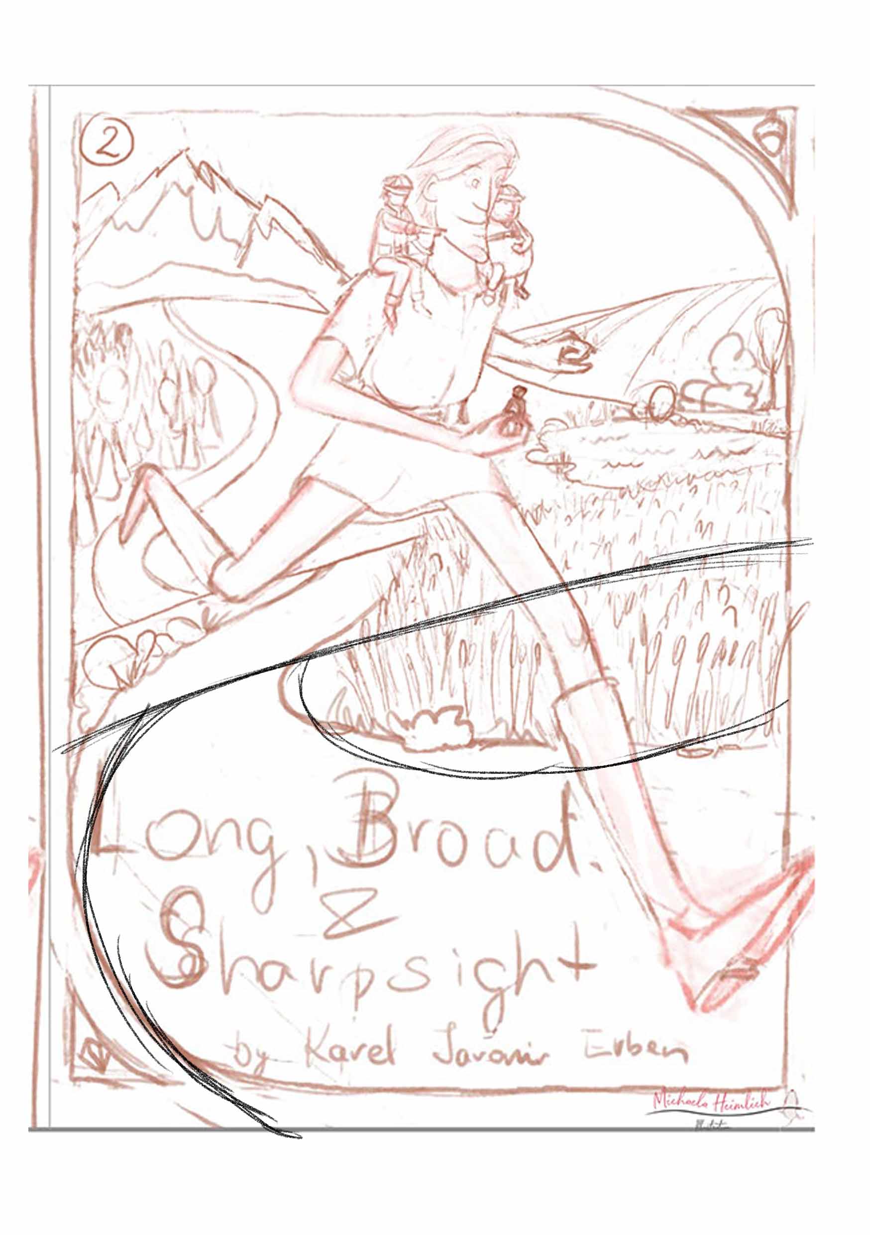
Last Version, not it is clean sketch...what to do, afraid to start with color
-
@MichaelaH Love the composition! I can't wait to see color!
-
@MichaelaH I like how the foot is breaking the border. I also like how you placed the type. As far as color I would just start to throw local color on and play around with it. I see a lot of cool colors for the background and warm colors on your character. It will help pop them off the screen.
-
@Chip-Valecek Thank You for the feedback with the colors, it helps me a lot.
-
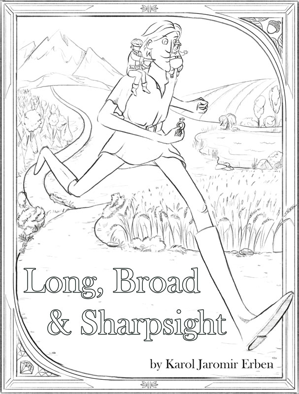
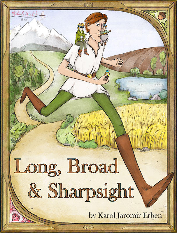
I am still not finished, have to work on some project , but my colored illustration progress here:
-
Cooool
I would make his trousers a different colour though, like dark red or purple or something so you break up all the green great stuff! -
@hannahmccaffery Thank You Hannah, I will look at it.
-
So finished.