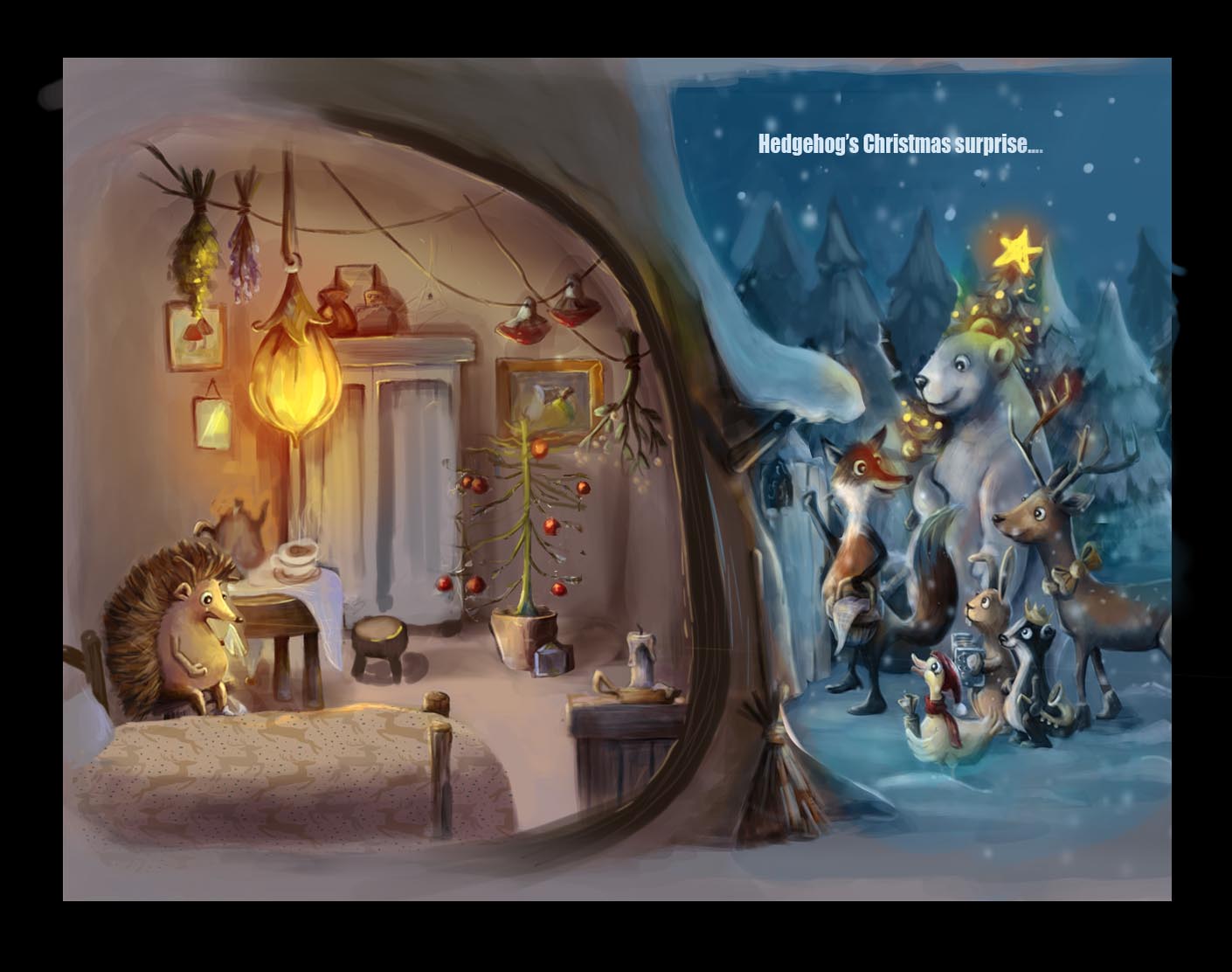
Entry for Tuesdays critique
-
This is a lovely concept @Leontine, and so beautifully painted too. It's going to be a good critique session tonight!
-
@Dulcie Thank You! It was FUN and there's so much to learn from these wonderful people-teachers @Will-Terry and @Lee-White! You guys rock! Ill take it to the next level and try to join in next session.
-
Nice work and seeing this piece critiqued last night was a great.
-
@Jonathon-B Yes it was you...Your illustration is really cool as wel! hopefully it helps you to enhance it!
-
I loved this so much, its adorable. You nailed the hedgehog expression... you can feel his sadness, and you feel the warm inside to see that the friends are going to do him a surprise visit.
-
@Camila-Picheco Thank you Camila!
-
Great work Leontine! Here's the image from the crit last night if you want to see it...

-
Looks amazing... Would be lovely to do a follow-up piece with hedgehog all happy at his party

-
@Lee-White Thanks Lee!
-
I was looking at the paint over that Lee did and I think it loses some of the emotion. In your original placement of the little hedgehog he is sitting in a corner looking at the tree all alone. It is sad and you can feel his loneliness on Christmas.
With Lee moving the hedge hog across the room, he may still appear sad but it no longer has that more specific feeling of being alone on Christmas as the cause of his sadness. I really miss that connection in the paint over.
If part of the reason for flipping the hedge hog to the other side of the room was to make him face inwards and draw the viewers eye into the rest of the scene, I think that is fine. But I would then consider rearranging the room a bit to put the tree near him again so we can feel that connection more.
-
I really like this piece and I think your character design is fantastic.
-
Ooh interesting points @Rich-Green, yes I see what you mean. In the first one hedgehog looks like he's staring forlornly at his only present...that connection gave you a clue about his thoughts. I agree maybe rearranging the furniture, eg swapping the bed with the tree/present, might help.
-
@Rich-Green I agree with you and try and place the tree on the other side. maybe place the bed somewhere else as well. During the weekend, Ill work on it!
-
@Dulcie Thank you, I agree and play around with it.
-
I agree with Rich about moving some of the elements around. Moving the hedgehog over there was a composition fix. When you move a main character other things will definitely need to be adjusted around them.
Really cool piece. Can't wait to see where you go with it! : )
-
@Lee-White @Rich-Green Thank you again for your help. Now with all nice comments I can take it further!
-

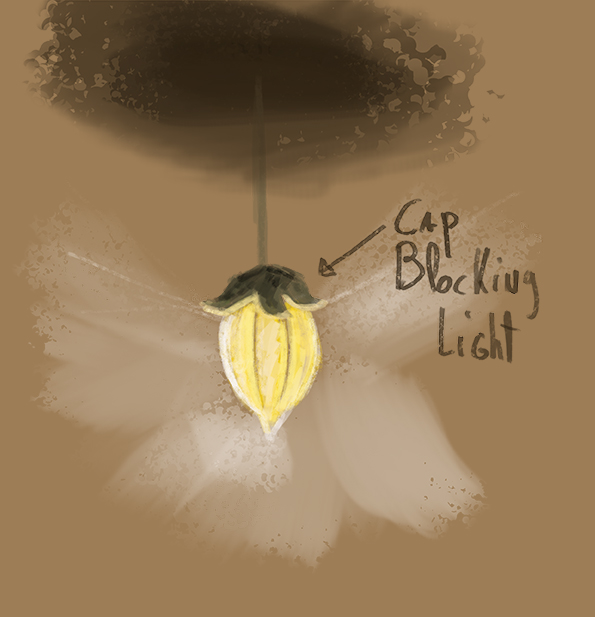
sorry for my crappy sketch but it should make my point clear !this is what i see, because the cap is over the lightbal, its sort of blocking the light so the cap and the ceiling on top of the lamp should be darker, i know you have bouncing light , but thats less stronger, and you should change the moon or redo it because that looks to digital and not rendered enough!
overall, i realy like your piece,love the details composition, the carcters looking adorable , your a great artist! but understanding light is hard, i also struggle with it, but where learning everyday!!
-
@Nancy-Gormezano thank youuuu!
-
@johntatulliart Thank you John!
-
@smoke Thank you! Yes, there's still a lot of work on this one!