Harry Potter and the Prisoner of Azkaban
-
am a representational painter trying to learn illustration ( ouch my brain lol). Trying to not lean directly on reference and create from imagination is something I haven't really done since I was a kid so the learning curve is steep!
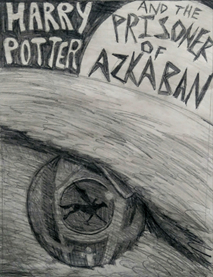
I have been playing around with the Prisoner of Azkaban book cover idea. I used to draw a lot of horses from my head when I was a kid and the hippogriff is part horse so that's where I started to come up with this idea. I have also painted a lot of horse eyes but always from reference, this is an eagle eye partly from reference and partly made up.
I watched Lee White's video on visual storytelling techniques recently and when I boiled the story down to one sentence as he suggested, it was about a race against time to save two lives, that of Buckbeak the hippogriff and Sirius Black. So I came up with the idea of seeing things through Buckbeak's eye, as he's flying over the clock tower, moon light casting his shadow and the clock is basically where his eye pupil would be. The clock doesn't yet have numerals on it but that's the plan. Right now you can see suggestion of a dark mysterious figure held in tower ( Sirius who escapes on Buckbeak). Suggestion of a figure on Buckbeak.... That's Harry

Anyhow, wondering people's thoughts. Open to feedback! not sure if i'm finishing this in traditional oils or photoshop. My digital skills have a loong way to go....tho I
 may give a try for practice.!!
 -
@Coley Looks great, at first I saw only the rider and big moon and after that i saw werwolf eye...will be great piece
-
Here are my thoughts
- The lettering is a little cramped. I would grid the lettering out to compose it a little better in that top third. I love the white on black and black on white, that is gold! Just play with the lettering itself so that it doesn't feel squeezed in.
- The Hippogriff silhouette. It is immediately recognizable. However, I would adjust it to be in perspective with the clocktower. right now it feels like it is an image literally on the eye not reflected in the eye ON the clock face.
- The Clock tower is really good, It feels odd that it lines up perfectly with the pupil, this goes back to my previous note that it makes it feel like the clock face is the eye, not reflected on the eye. And I get that that is intentional, but it flattens the space and hurts your stellar storytelling.
- Add more feather texture to the head to really sell that this is the hippogriffs head and eye. it took me a second to figure out who's eye it was.
- Overall I would play with a little more breathing room, its a little cramped and you will run into problems when this goes to print with where the trim and the live area is. try to give yourself a quarter inch around the whole composition.
- Good job, I love how you really thought about the storytelling and honing down the whole thing to one sentence, it really shows and I can't wait to see how this turns out.
-
@andersoncarman thanks, very helpful advice! Nice to know what is working and not for viewers. I really appreciate the advice
 The eye certainly does need more work to read properly. So I will be going back in trying to figure out the clock face, eye pupil and reflections etc...... without a reference it's tricky for this addicted to reference gal....... There does need to be a bit more back and forth between the eye and the reflections. The feathers etc I haven't really worked yet anyhow, was just trying to scrub in some values and feather suggestions. So they will be worked up more. Thanks!
 -
Trying to reply to MichaelaH but not sure it's working lol, thanks for the comment
 It's a hippogriff eye and not a werewolf, but good to know I need to make it more hippogriffish.......hopefully more work on the feathers etc it should make sense! Thank you
-
Love this book, I think it's probably my favourite Harry Potter!
I like how much thought you've put into incorporating all the different characters etc, but for me it's just a little bit too much? I love the silhouette of Harry and Buckbeak and the moon is going to look awesome with the title on it like that. Maybe you could put the silhouette of the clock tower somewhere in the background against the moon and then just have the silhouette on the eye on its own?
Or have a play with more compositions with Buckbeak's eye, if you zoomed out a bit and showed more of his face and then showed a hint of Harry riding on the back of him? I think if you could see Harry more on the cover then it would make it a stronger design
-
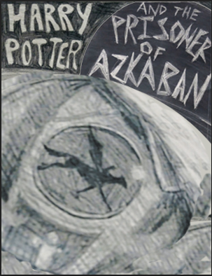
I like the idea of incorporating the different story elements. For me, Buckbeak's eye is not translating very well. I had to reread your comment, before I saw what it was. I wonder if containing the story elements inside a large moon instead would help.
I hope you don't mind, I did a quick example of what I mean.

-
thanks everyone! I really appreciate that you took time to comment. Not sure it's working as I hoped, I need to work on things a bit (a lot lol) more. I will try some new thumbnails. Thanks again! Will post once I have some more done.
-
@burvantill thanks, that's kind of cool
 Something else to think about!