Monster Truck WIP (Critiques welcome)
-
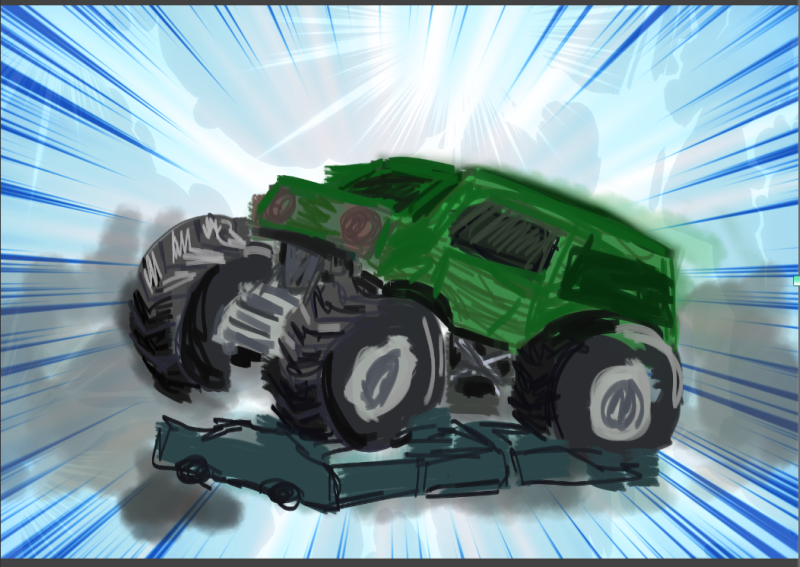
I really didn't like the cat and this contest has anthropomorphized animals covered . This is a new idea I'm playing with. Any thoughts? Can it work with this camera angle? Maybe not the "Biggest" but I want it to read so I can send a print to a two year old who had me drawing monster trucks for him this Christmas. It's loud, but that seems to go over well with two year olds. Not the most refined taste. lol
-
@ThisKateCreates i'm really loving the idea behind this! for some reason monster trucks never even crossed my mind for this contest, even though they're MONSTER trucks

I think having the monster truck right in the middle of the shot kind of takes away from the whole action of the shot. I'd suggest changing the angle, maybe so we're looking up at the truck to accentuate the monster size; that change could also make it seem like truck is coming down onto the viewer.
Hope my feedback is helpful! thanks for sharing

-
@marissaarts Thanks. I bought some hot wheels and may stage a scene and see a few angles before going forward. Coming down onto the viewer will probably appeal to the two year old as well.
-
@thiskatecreates yess
-
-
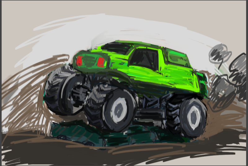
I hope you still give the truck some cat features
-
Definitely! Go for it!. I personally think the blue background worked better with the car.
-
@thiskatecreates oh my goodness that sounds like a great way to find angles and have fun playing with hot wheels, haha
-
@Aleksey I'm trying to adapt to kiddo's fave monster truck. So cat truck may have to be next. The classical landscape artist I got the "Don't draw a tree, draw a portrait of a tree" would probably question my choice of subject though. XD
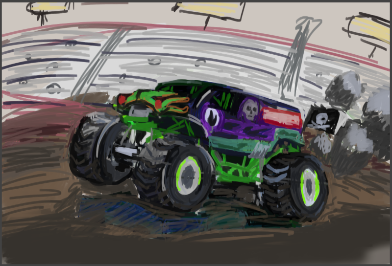
@nyrrylcadiz I did like the blue but trying to do a crowd now. I often do the neutrals as I'm adjusting the shapes. I don't like to use the eraser because it changes my edge shapes too much. I "erase" with neutral paint then repaint the edge. Now I'll paint over that with a better BG. Maybe I'll use blue or red to give it liveliness though. Hmm.
@marissaarts This piece is totally inspired by drawing crayon pictures of toy trucks (and dinos) for the child I'm giving it to. I thing 30 minutes of attentive quietness from a 2 year old is a high compliment. Apparently he asks all adults to draw trucks for him and was quite happy with mine.
-
@thiskatecreates Brought some blue back. lol
-
@thiskatecreates I'm a bit stalled:
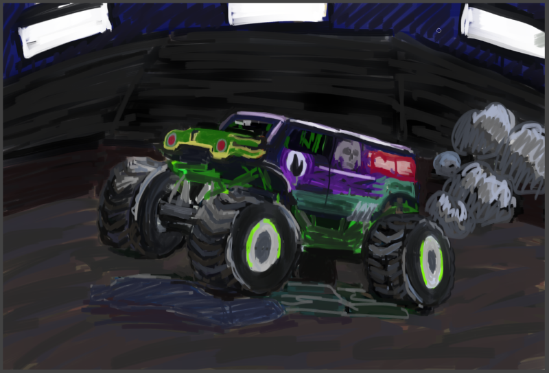
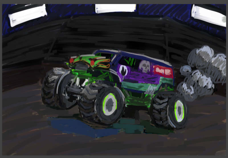
I think the lighting and contrast could use work. But it expresses most of the thing I set out for. It's recognizable as the "gravedigger" monster truck two year old loves. It shows some dynamism, though I wish I had pushed the gesture harder.
Time to decide. Do I print this and send it out so I can move on to something I'm more excited about? Is there room at my current skill level to make this picture work better? I could add more texture to the ground and stadium and clean up the value structure? Any thoughts from the crowd? -
@thiskatecreates this may be too dark. Perhaps you can lighten the bacground a bit.
-
Thanks @nyrrylcadiz . I'll have to have a think on it and how to approach that without reducing truck to bg contrast. Also whether I want to keep it dark for drama. I could definitely improve the overall comp with some midtone or light shapes. Hmmm. Will think over
-
@nyrrylcadiz In the end I submitted as it was. The child it's for seems to like dark colors and if I'd stayed working on it I would have redrawn the whole truck to get back to the gesture, which I didn't have time for. If I had time and energy left for it I would use the spots to highlight the truck and ground better; add more texture, especially to the ground but also to the stands; either exaggerate the truck so the drawing and perspective issues are clearly part of the execution or correct the drawing and perspective issues. If I made those changes then your point would be addressed and I do appreciate the feedback and learn from it even where I haven't necessarily used it in the same piece.
 I also found the camera angle advice beyond my skill yet. In time though.
To the forum at large, sorry for the bump. -
@ThisKateCreates You guys. Let me just share. Do get your work printed and "shipped" to learn from mistakes. This actually looked much less dark on my apparently uncalibrated screen. At the printer when I made my postcard.... the whole bg is basically black. Lesson learned.
-
After a little time mulling and seeing this printed and considering feedback I made a few more edits.
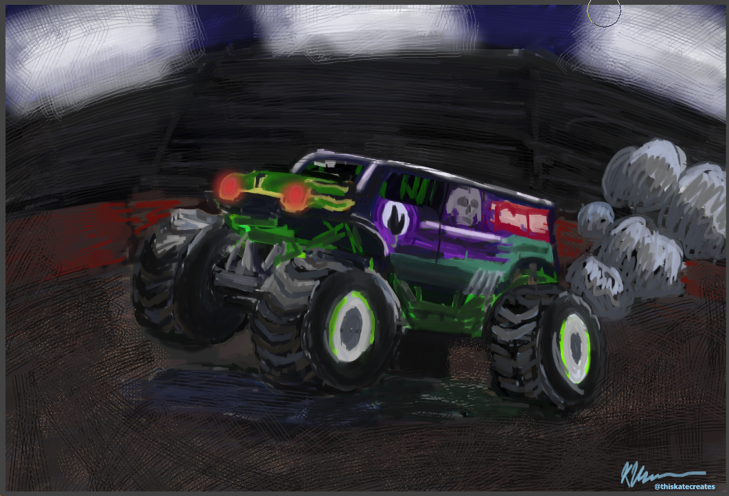
I'll probably tighten up the car now that I've loosened up the BG. I've discovered there is a hatching brush in clip studio for me. I feel like that texture works for the effect I intended better. And the contrast in refinement can help keep the focus on the fun parts.It's too bad I didn't see and fix everything before the due date, but no reason to leave errors in a piece that I can readily improve. :face_with_stuck-out_tongue_closed_eyes: