Illustration Feedback?
-
Hello! I haven't been on SVS while I was finishing school. I'll be looking for work soon, so I'm trying to get back into the forums and would really appreciate any feedback anyone can offer!

-
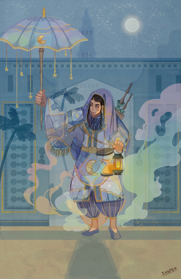
@ixspen Hi! I like the color in the image a lot. Considering the composition, I think there is too much space at the bottom and not enough time space at the top. The umbrella also tangents against the left edge of the image.
-
Hello! I am also digging the color scheme! It will help us give you feedback if you ask specific questions (is the composition readable, is the lighting all right does the pose work, etc). But my feedback is to check that the character is grounded - they don't have a shadow on the ground. This is really lovely overall though! Congrats on finishing school, that must be a weight lifted from your shoulders!
-
Thank you, Teju! I've added some space to the left, trimmed down the excess space near the bottom and lengthed the sky. Is this better?
@carriecopa
Thank you, carriecopa! Okay. I've made changes and now I know what I want to ask! And thank you! I'm very happy it's all over. It's certainly weight gone.

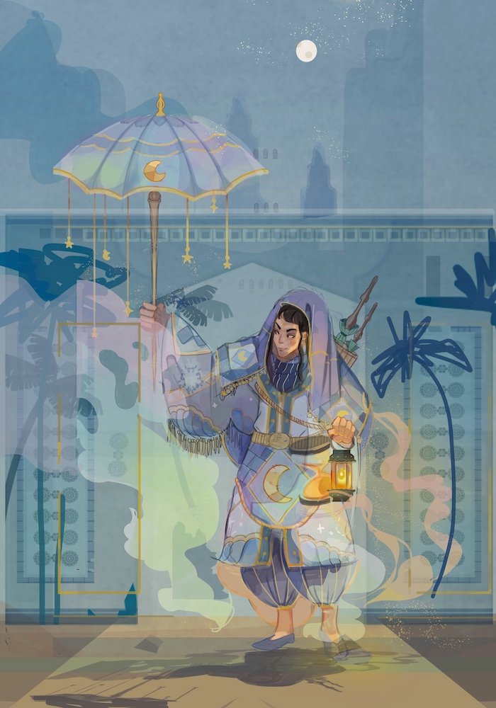
I don't have my tablet at the moment, so I did the doodling with my mouse and lasso tool. Please forgive my messiness!
-
The character was intended to be a giant. I wasn't sure how well it read though. Does the additional palm trees help establish a stronger sense of scale?
-
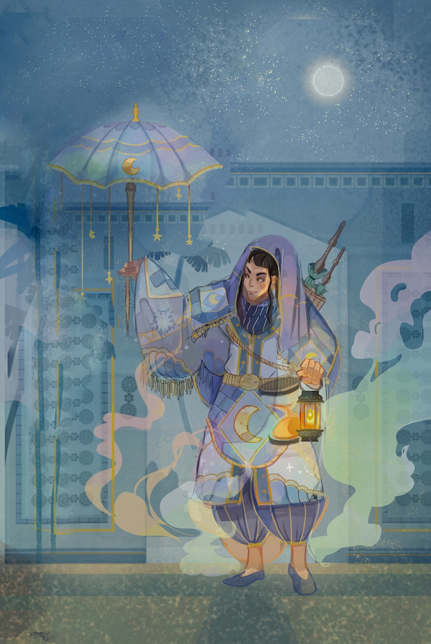
I've moved the smoke so it's facing the direction of the eyes. Do you think this builds a stronger composition? This started as a character sketch and I later thought of adding a background, so I realize my planning was poor.
-
In addition to the character's shadow, there's rim lighting on the umbrella and the top of the building, and shadow along the wall and a cast of orange on the ground. Is this correct? Should anything be altered?

-
-
I am speaking to your original work, I wish almost everything wasn't lined up in the middle. Even having the architecture and floor line off to the side would help. But I really love the light transparency in the smoke and the colours that are created. It is a very playful and has an ease atmosphere to it.
=)And welcome!
-
@ixspen Now I think it's too open at the top, unfortunately, and especially since you want this character to be a giant, makes them look even smaller. It also introduces empty space for eyes to wander on the upper right. There seems to be a problem of scale, because the trees could just be small trees, not necessarily regular trees next to a giant. You need something really small for comparison, since the architecture and every thing seems to be made for the character's size. There is no reference for the viewer.
I did a really fast, really crude PS job for a composition that might work where I moved things around a bit, cropped a bit, and darkened the corners to prevent eyes from wandering out.

How important is the sky to the story? If the character is a giant, making them take up more space in the frame could help in addition to a small regular human sized something for reference as well.
-
@ixspen I really like the new flow of the smoke, and shadow on the ground helps the character stand out more! I'm curious what's just off canvas, so there's some storytelling coming through too. Great work.
-
This is great @ixspen I enjoy the overlay of colors & the warm & cool, Very tasty.
Would you be able to have anything that's human size for scale? Like birds maybe?
Currently everything looks proportionate in size to the giant character.
Great piece. What are your required size dimensions? For I'd suggest cropping the top of the last edited image to make the giant bigger. If the dimensions are set, another possibility is to scale the giant & reduce the distance between the umbrella & the giant's face.
-
Hi @ixspen. I really do like this image. The colors are great and as well as the drawing.
-
But for me the values are not working. Different elements kind off blends together and so I am confused because of that. I recomend you do value sketch first - I know it might be painfull (because for me it was :D) but follow through it will get easier over time.
-
In terms of scale the point that he is giant didnt come through for me and i think that if you add something to foreground that will show how much giant the character is might help (as of now it looks like the character is just close to the camera and everything else is far away)
-
Also decide what is the main focus point (the character, the lamp, the umbrella? - you decide, but make it clear - this part comes back to the values as well.
Other than that I am really enjoying this picture. The colored smoke is neat and different patterns on cloths are beautiful.
I hope I helped a bit
-
-
I'd agree with Jonas's comments above on the value not reading real well, the other issues I had was on first glance the hand holding the umbrella appears to have extra fingers, so I would get some reference if needed and redraw that. You've got a lot of good stuff going here though.
-
I noticed that shortly after I posted. I had two different hand drawings and accidentally clicked the older layer on when I was trying to close a folder. Whoops.
Sharp eye! No one else had mentioned it.
@Jonas-Zavacky
You’ve helped a whole lot! Thank you, Jonas! I’ll do that. I see where things get muddled.And thank you! I had a lot of fun with the clothes.
@Darian
Thank you, Darian! Also, I have no required dimensions or restrictions. This is a character of mine and something I did for fun.I'll try cropping + adding more small scale objects to better emphasis it. I had taken some inspiration from the high arch walls in Middle Eastern architecture and hoped the palm trees might have helped. I'm going to try dividing it into stories with balconies, stairwell, windows, etc. Thank you for suggesting birds! Gardens likely would have some nesting somewhere.
@carriecopa
Okay! Thank you! I think I have an idea of what to put so that storytelling aspect is filled. Thank you again for your help!@Teju-Abiola
I see!When I started this, I had been looking at Middle Eastern architecture and its high arch walls. I'll test out dividing it into floors, add shutters/windows, and balconies, etc. I see where I can push it to look more like a courtyard to help with scale.
Thank you so much, Teju! I really, really appreciate all of your help!! Thank you so much for the PS edit as well! It helped me a lot.
And the sky isn't terribly important. I can cut some of it away.
I see what you mean. I’ll move some things around so things aren’t so symmetrical. Thank you, heather!
—
I want to thank all of you again so very much for your help! I think I’m going to do two versions of this. I’ll be keeping everyone’s notes in mind from this, and you all have given me some ideas on how this could be heavily changed.