Colouring greyscale help needed!
-
@gavpartridge At the moment I work in greyscale before colouring.
I'd watch the 10 step digital painting class. Will describes his process of going from greyscale to colour in detail.
My biggest hurdle with greyscale was overcoming the fear of flattening everything down and working on one layer only. A colour layer of a grey layer is a stepping stone, not a finish line (or at least in my experience).
Will you be using multiply layers, or colour layers?
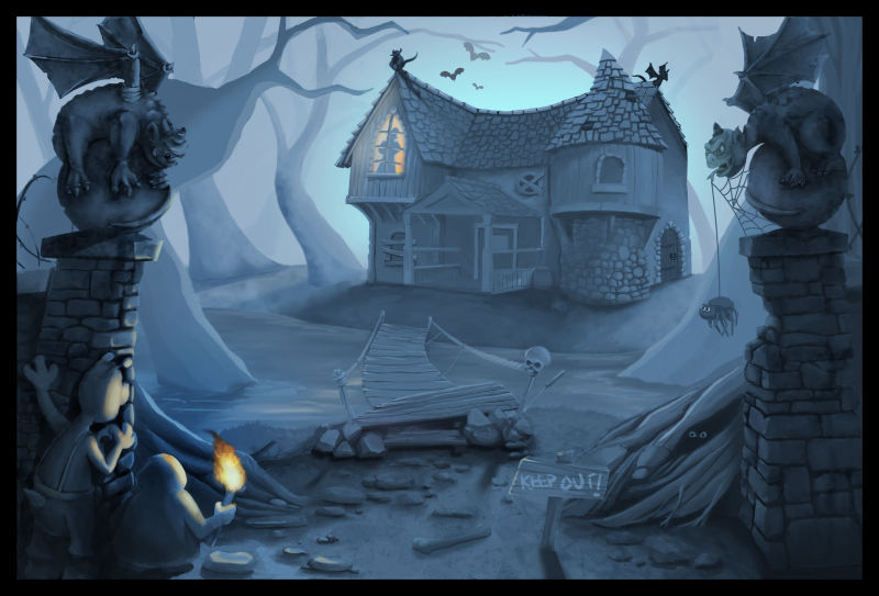
Critique-wise my problem is with the gargoyles. Left gargoyle forms a pretty serious tangent with the house. You can either bump it a smidge to the left to widen the gap, or a smidge to the right so it definitely overlaps the house. Gargoyle on the right is alllllllmost the same value as the tree behind it (that's the nice thing about greyscale; value similarities are easier to spot).
Great piece so far! Lookin' forward to seeing how it turns out

-
Two very good people to learn about this from are Scott Robertson and Artgem. The most important thing really is to know what colors you want to use beforehand and how the values relate otherwise your piece can end up looking washed out. Over all this is super nice work. One tiny point is the Gargoyle on the left is really close to the house, I would make it overlap a bit.
Cheers
-
First of all can i thank you for all for the considered and informative responses. This is my first post on this forum and i can already see what an incredible resource it is. I dread to think how much time i wasted making the same mistakes over and over again without getting any decent feedback.
So, yeah, i was sort of aware of that tangent but in my naivety i though the tiny gap would solve it. I think ill move the gargoyle away from the house, got scope to do that. And ill adust the values to seperate the trees a bit more, its all pretty close.
I rewatched that 10 steps... by Will Terry. That blokes a genius. Took him about 20 mins to get to where i am now after about twelve hours. Made me realise ive spent waaaay too much time rendering the greyscale, i should just have got a polished lineart sketch and then quickly brushed in the shadows and tone. Its exposed my lack of knowledge about layer modes. All my rendering time should have been done in cokour. My crappy bamboo tablet doesnt help though, even Will admits that!
Learnt a lot from one simple forum post, amazing really! Cheers all!
-
I’m sorry I do not have advice for colouring greyscale, but I had to post to say I love this illustration and I hope you post the colour when it’s finished! Good luck

-
This already looks really, really good, and everyone's made great points already. I think my two cents are first, I'd deepen your values just a bit via adjustment; your lighter areas feel pretty muted, which might end up looking a bit washed out once color gets incorporated. I just saw that you mentioned it's a night scene, but from the overall tonal look, I'd read it as murky midday. Just a thought! Can't wait to see how this develops.

-
What a cool idea. I'm not much good at digital painting so can't really contribute there. Maybe the comments have persuaded me to try the course though.
Besides picking a few places for highlights (maybe the window light around the silhouette or the foreground torch?) I think I would overlap both the left gargoyle and the mid-tone right tree on the house. That could give you a bit more depth and solve the tangent problem.
Love the mood and detail. Look forward to seeing the result.
-

-
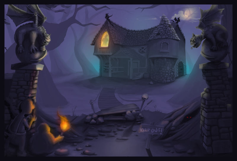
Right, so i've come up with this. Its not exactly as I had it in my head, obviously I could sit and render it till the cows come home, but if anyone's got any thoughts at this stage, they would be very useful and appreciated! I think the washed out comment mentioned above has happened, shame I didn't see that comment till just now! lol. Learnt soooo much from doing this piece, mainly to not watch so many tutorials, turns out it doesn't stick in your head unless your applying it at the same time! Least with me anyway.
-
@gavpartridge Overall this is nice and you do have a nice atmosphere working for you. One thing would be the two characters are still hard to see even with the torch light; you could still have some of the cool sky light on their back edge just to make tem pop out a bit. I know they are hiding but they could also be moved out slightly to the right.
Cheers
-
With the torchlight and warm cool contrast it does seem more solid than in greyscale. Looks nice!
-

-
Thought i'd put this up, I'm much happier with it now, albeit 'finished not perfect' as Jake says! If anyone is interested, In the end I simply shifted the hue of the greyscale towards blue then painted a bit of yellow on here and there, bit of rendering and texture etc. Couldn't work out another way to make it look decent. I'm only just starting to work with colour, having just drawn in pencil pretty much my whole life. Is this monochromatic then? If anyone else has advice on painting colours at night please let me know, Like, how does grass look under a blue moonlight? Just blue right?? I'm rambling now, this stuff melts my brain.
-
@gavpartridge I really like the finished product. Good job.
-
I know this topic is ancient, however thought this would be useful. I actually got an overpaint from Borodante on Youtube, he provides some useful information on colouring greyscale images. Link is below.
-
@gavpartridge this is so cool! I realise watching this how little I really know about digital painting. He just effortlessly moves and distorts parts of your original image - I think I would have been redrawing it all, taking huge amounts of time!
-
@neschof I know, i think thats a large part of digital painting, having a solid workflow and technical knowledge. I waste so much time doing things the long winded way, when theres a often a two second shortcut that would achieve the same thing. Thats why he's on youtube i suppose! Lol.
-
@gavpartridge thats a great link, thx! lucky you
