Boston Skyline - WIP
-
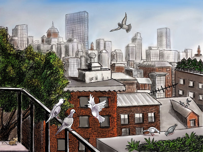
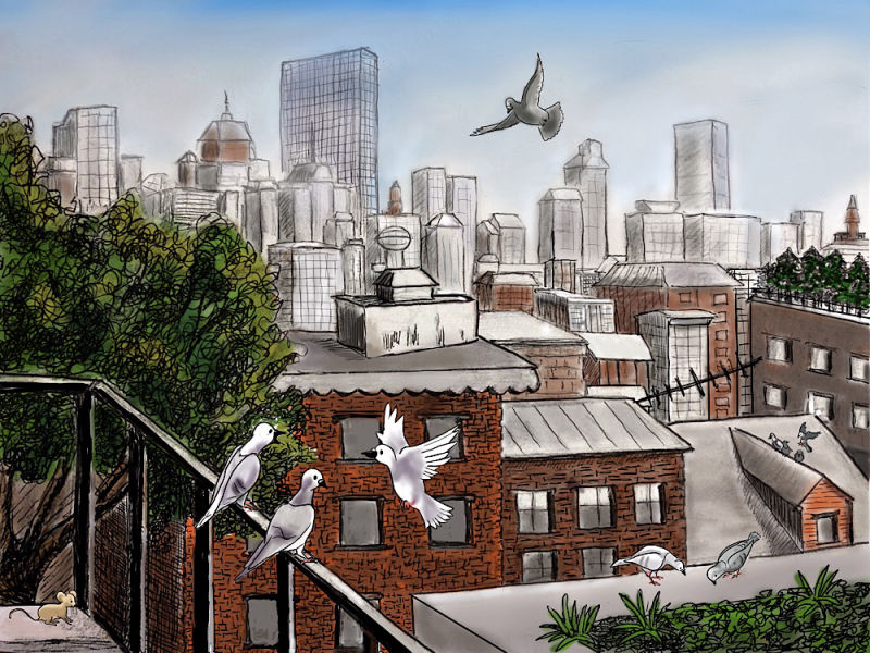
My daughter lives in Boston and while I was visiting, I sketched and inked the view of the skyline from her apartment rooftop. I decided to try making it into an illustration, importing the ink work into Procreate to paint and enhance. This is what I have so far. (The animals are only roughed in.)
Following the suggestion of @davidhohn in another thread, I’ll describe what I am trying to do:
-
This is a present for my daughter, and so I want it to be somewhat recognizable as the view from her apartment buildings roof (which is why I left in the awkward railing on the left.)
-
I wanted to make the brownstones of Beacon Hill where she lives feel warm and alive in contrast to our normal idea of a cold concrete urban landscape and so I used warm colors for the brick work and lots of greenery in the foreground, while leaving the skyline more muted and gray.
-
I added the pigeons to give life to the picture, not only as a focal point, but to emphasize the theme of warmth and life, in an urban setting. I also liked the idea of the birds leading an independent life on the rooftops where human activity is minimal. The mouse on the balcony is because she recently saw a mouse in her apartment and freaked out
")
So that’s what I am trying to do. Is it working? Do you have suggestions for improvement?
-
-
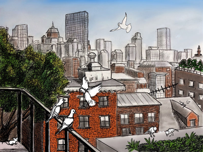
I haven’t had much time to work on this but I sketched in the birds more and also lightened the ink on the far skyline to try to give more atmospheric perspective. I’m trying to decide now whether to leave the sketchiness of the skyline (some pencil still showing, imperfect lines etc.) or to clean it up. Any thoughts?
-
i like it! your process thinking is reasoned and clear. i don't think i could add to anything you're doing here but i love looking at the work!
-
@thecmbutton Thanks. There are some wonky perspective lines I need to fix but I'm always worried about getting so finicky that I lose the spontaneity of a drawing. In other words, I'm not sure I know the difference between "whimsical spontaneity" and "she obviously can't draw a straight line to save her life."
-
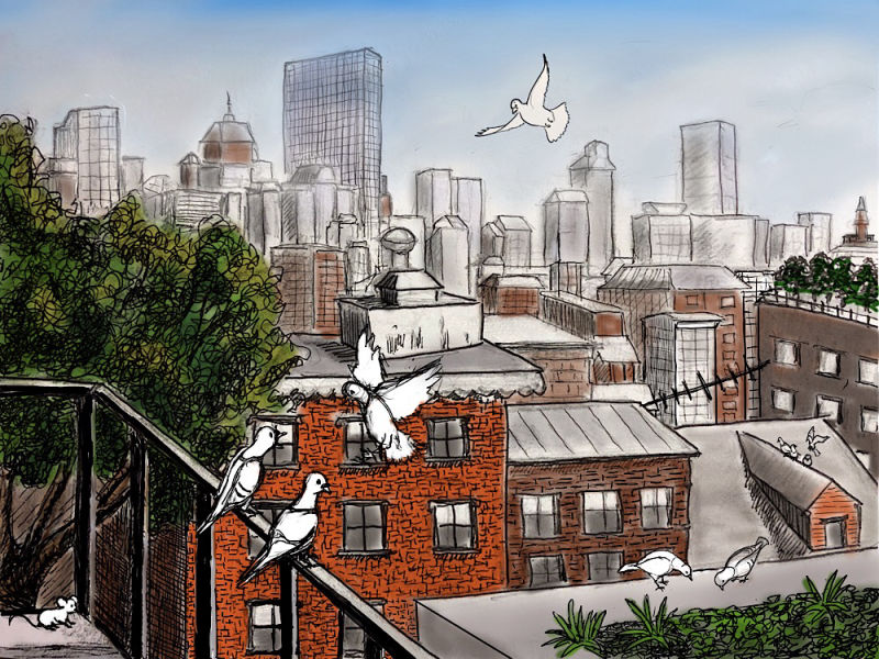
I think I may have to give up on this one unless someone has some suggestions. I can’t seem to get the pigeons to stand out enough against the brownstones of the building. I have a limited array of colors I can use for pigeons (grays, whites, and blacks) without them starting to look like parrots and the values are just not working. The problems is that I started out with a scenery sketch and then added characters, completely changing the focal point. I’ll try adding shadows and see if that anchors them but it won’t help the ones flying.
Laurie DeMott
instagram.com/demotlj -
@demotlj Crop the image to a portrait shape keeping the left side and put the primary bird that you want focused on over the bushes
-
If the birds are on a separate layer you may be able to play with pushing the colors on the buildings/entire drawing a little more grey, to make the birds seem brighter, almost like doing a wash of grey over the background.
-
Also wanted to say, I would imagine your daughter would love such a custom piece of art, regardless of how you work out the color. The line work is beautiful, and it's a really meaningful gift.
-
@annie-barnett Thank you. One of the things I'm struggling with is that I don't want to lose or modify the skyline too much since I did try to reproduce the buildings they can see in their view. I took some liberties but moving things around too much for the sake of the birds would ruin that purpose. I'm going to try everyone's suggestions though and see what I can do. One of the great things about this forum is that I can feel re-inspired by suggestions when I am ready to give it up.
-
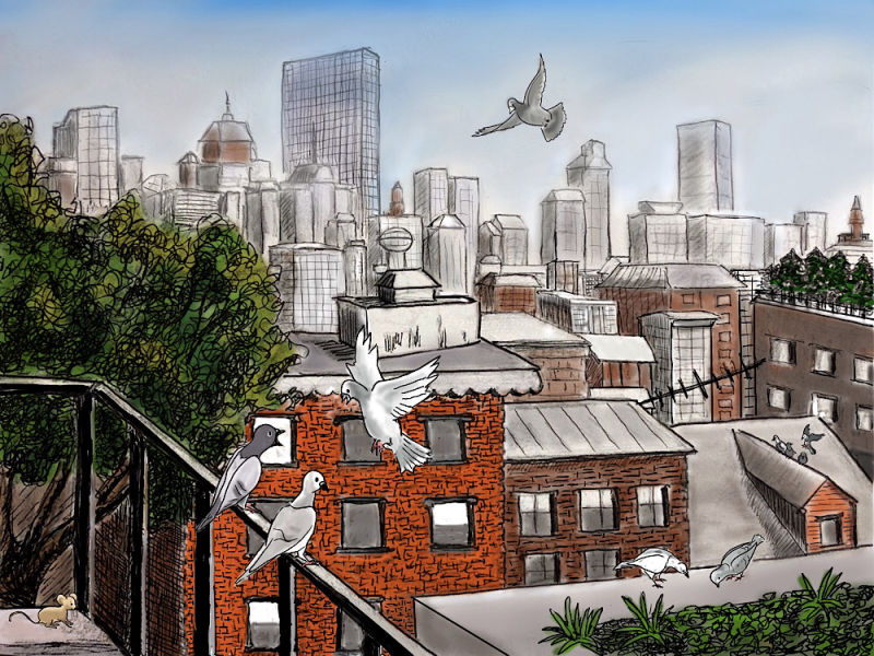
Here is the latest incarnation. I toned down the saturation of the brownstones as @gavpartridge suggested and moved the flying pigeon down so that it wasn’t competing with the roofline. I tried cropping it in a portrait orientation but that lost the sense of skyline but it occurred to me I could move the left pigeon on the railing in front of the foliage as @rcartwright suggested by just extending the tree. I still have to do shadows and render the pigeons more but it’s better I think.
-
I think I’m done although I’m happy to tweak it if you see anything that needs attention. Thanks for everyone’s help.