Feedback needed on 4 illustrations
-
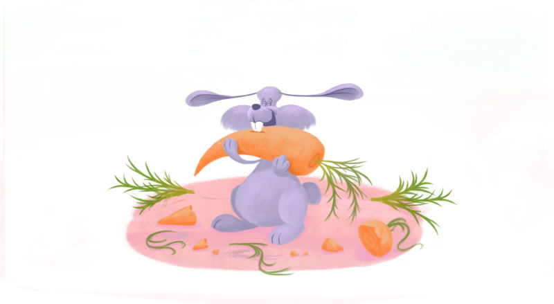
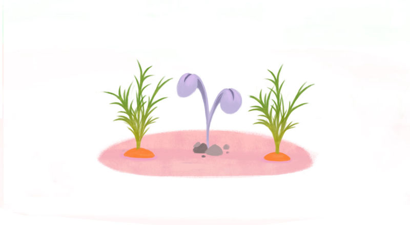
Hello, I'm looking for a feedback on these four illustrations. I will provide you with what were my intentions with these, so that you could give me a focused critique on it.
- I am trying to improve my portfolio by showing that I can draw characters in multiple scenes as I've heard from Will Terry that it's what art directors are particularly looking for.
- Along with this I am trying to convey believable expressions.
- I have attempted having some textures in it as I have noticed that children book illustrations tend to follow that.
- As for the style, I am aiming for the simplicity of this artist: http://hollie-mengert.squarespace.com/ However, I have a feeling that for the characters I would like to strive for Wouter Tulp feeling. So what I wonder is – is Hollie's style suitable for the characters that I would like to lean toward Wouter's style? I will certainly keep the characters simpler than Wouter's as I doubt I can pull off the anatomy. What do you think about that decision? Is it a correct one?
I am honestly asking you for as sharp critique as needed on all mentioned segments and possibly on anything else that you might notice to be off, particularly the fundamentals. I have no problems hearing even the harshest comments.
I have already asked for critique earlier and these are the remarks I have received:
- My textures look random
- I should draw more from life
- I should not try to emulate other artists
- The expressions are not pronounced enough with the rabbit, and I should use his body and eyes to emphasize that.
I have to admit I feel stuck regardless of these comments I have received (except for expressions), because one of my greatest troubles with art have been that for the first two years, I had avoided any stylization and focused instead on studying anatomy, perspective and other things, and then I've realized I can draw nothing that looks even remotely stylized, that I am too bound by what things truly look like. After I had realized that, I have attempted to find inspiration in other artists and have gathered about a dozen that I like, but now I am confused about what is the proper stylization and which elements can be combined from different styles. I am having troubles recognizing what is regarded as a particular characteristic of a particular style.
Thank you very much.
-
Hi Stevan,
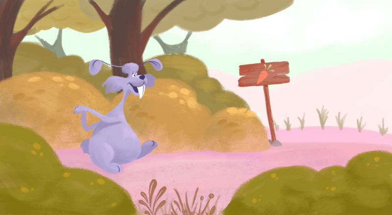
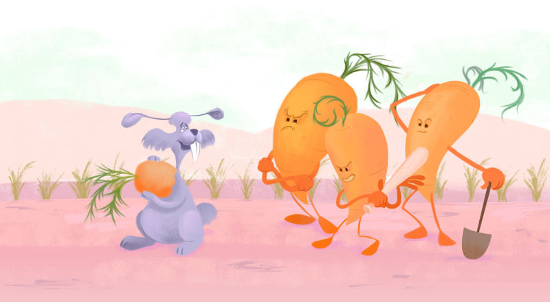
Well firstly, I think you've got your facial expressions spot on, especially with the carrot characters, their faces are great! Your colour palette is lovely and suits children's illustration as it's nice and gentle, I like the colour of the main character too as its a little different and not the usual colour you'd use for a rabbit. I also like the texture brush you've used for the bushes and how simple you've kept the background in the first image. I would lose the little tufts of grass though and maybe move the wooden sign over to the right more so it fills in that negative space.
However, I do find that the illustrations are looking a little bit flat, I think this could be fixed by adding some little details with more textures, shading and shadows. You could also apply that to your main character so that he stands out more too.
I'm also not sure if I like the shape of his teeth. The pointed end makes him appear a little scary - especially to children- and I would look at his legs again because when he's meant to look like he's walking, it doesn't look very believable. But that could just mean changing his body's position or tweaking his posture or something, I would make them slightly longer so that you can see his fluffy bum raised from the ground a bit. Otherwise he looks like he just shuffles along on his bum - unless that's what you were intending? lol!
I think the image with the carrots also needs a little more going on in the scene, either the background or maybe look at the composition again. In all the illustrations, the viewer is looking directly at the scene on a flat line, and art directors tend to find that this can look boring - the more compositions the better! It just shows that you can work from different angles and the practice will benefit you in the long run.It really is lovely work though and I think you're definitely on the right track to producing work similar to Hollie Mengert, I did notice that her colours are a lot bolder though and her shapes are more defined so maybe try that out in your work too.
I think all illustrators emulate other artists, that doesn't mean you should copy as that's a huge no no, but you should look at other artists work and pick what you like about it so that you can use it in your own unique way or try to do it even better. There's that famous quote by Picasso:
"Good artists copy, great artists steal"Sorry I've gone on a bit there, I hope it's been a little bit helpful anyway! Keep up the great work though, looking forward to seeing where you take it next

-
Hi Stevan!
Stylization is not an easy beast to tackle because it has nearly everything to do with....style! That is, it´s one of the core elements of your own personal style and that emerges a little bit unpredictably...sometimes after years and years of doing art. You cannot really force it. Imitating other artists is always a good exercise and it´s part of the journey. Copying other artists even and trying to understand how their work is put together helped me enormously over the years. There is absolutely nothing wrong about it: it´s a common exercise even in art school. In due time, all the artists you admire, their influence and your own personality will coalesce to form your own personal style. You cannot analyze it. Asking wether Wouter Tulp and Hollie Mengert can be merged doesn’t have a yes-or-no answer. If you like both and you let yourself be inspired by both and do lots of art all the time, something will emerge from it that is neither one nor the other...it`s your style.
All the goals you´ve set yourself are worthy ones. You don’t need to tackle them all at once, and you’re not likely to reach them all within one set of illustrations.Looking at the ones you shared the one point I would focus on first is composition and values. Your colors are nice, but your values are so close to each other that your images fall flat. I´ve put one of yours close to one by Hollie and removed the color:
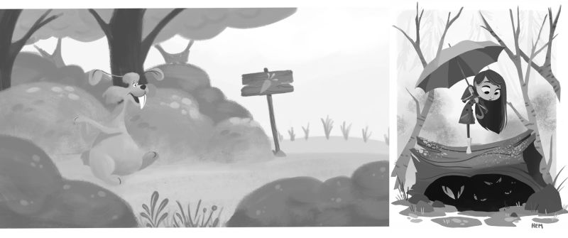
You can see that Hollie pulls some nice punch with the darks, has a mid-gray value on almost everything else and a very light background - she uses the full value scale. She also places the strongest point of contrast around the girl´s face: that pulls the focus there. Your image, on the other hand, is so homogeneous in value that you can barely see the rabbit against the background. The stronger contrast is on the tree trunks, which are most definitely not your focus.
There is a nice course here on SVS on composition that talks extensively about these concepts - maybe it could be an interesting watch.
Another observation that come from the comparison is that Hollie´s shapes and edges are very sharp and well defined in the foreground, with very soft, fuzzy shapes in the background. Your edges are all fuzzy, nothing is clearly delineated and that also makes it loose focus and look unfinished. Edge control is another core element of composition that you may want to dedicate some attention to.In general, putting your art besides that of artist you admire is a very good way to analyze what works and what doesn’t and can really help growth!
Looking forward to seeing more of your work! -
People, you are truly amazing!
Instead of writing a reply, I'll try to fix stuff and post them here.
Thank you so much!
