Fall - wip critiques welcomed
-
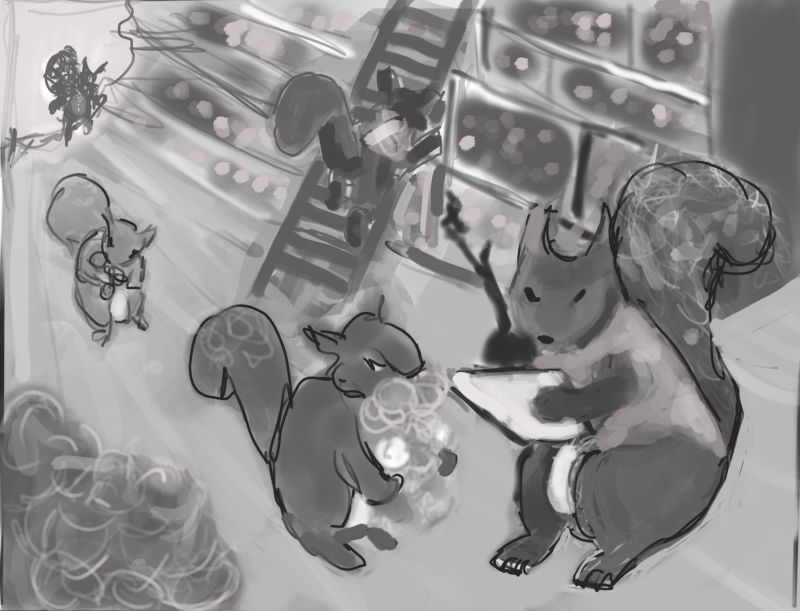
Taking a break from inktober prep thought I’d give this prompt a try.
Did a bunch of different thumbnails but settled on this idea of squirrels stocking up inventory for winter in fall. Wanted to convey idea of busyness of this time of year for them but might.still look too ordered.
I was thinking they are inside a hollow log being used as a warehouse and a light source coming from outside in but that doesn’t help me highlight main squirrel boss guy so was thinking of doing an overhead light - maybe coming from hole in log above him?
My perspective is a bit off I think - especially the ladder. I am not sure what I am doing wrong.
Thanks in advance for any thoughts/help you can provide!
-
I like your idea of the outside of the log as the light source, and correct me if I'm wrong but there should be an opening on the other side too that you could use to highlight the boss! You'd have to be careful of using 2 light sources so they don't cancel each other out, but the back one can really be more of a patch of light color rather than actually "radiating" light, if you know what I mean. As for your ladder, it's just pulled out too much! Right now it's close to a 45 degree angle to the wall, try more of a 20 degrees angle and everything should work out
") Also, you can really differentiate your tones more. Darker shadows, lighter lights! Right now everything is sort of middle ground. This is a fun concept and I wish you the best of luck with it! Can't wait to see the final!
Also, you can really differentiate your tones more. Darker shadows, lighter lights! Right now everything is sort of middle ground. This is a fun concept and I wish you the best of luck with it! Can't wait to see the final!vanessastoilova.com
instagram.com/vanessa.stoilova/Check out my Youtube channel for tips on how to start your career in illustration! www.youtube.com/c/ArtBusinesswithNess
-
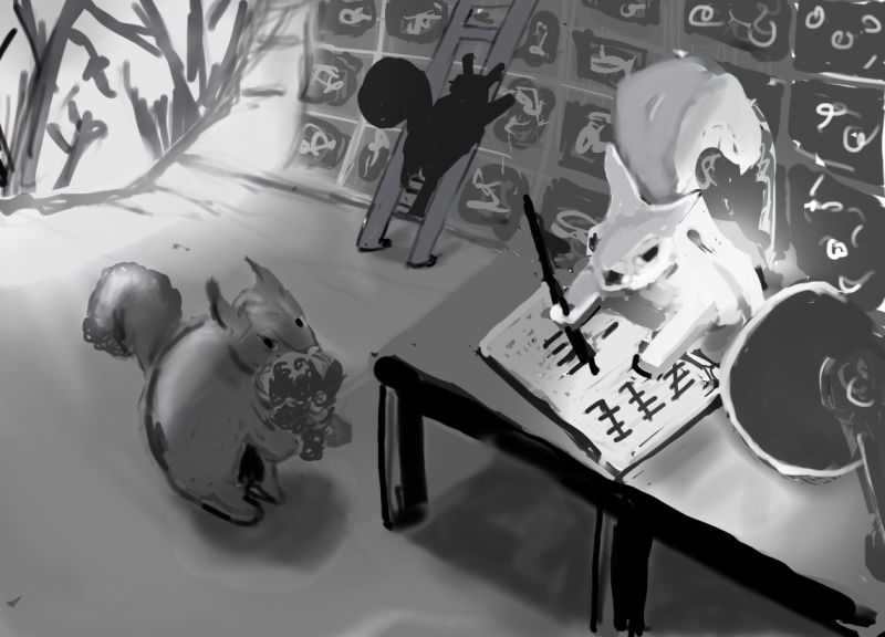
@nessillustration thanks so much! I see what you mean about the ladder - duh!
Never thought about other end of log - isn’t that funny lol got so focused on one thought.
I do struggle feeling everything is too dark to me so tend to be afraid of dark values but I do admire other people whose images have that range. So shall push myself and see what it looks like. Thanks again for taking the time to give feedback.
  Much appreciated!
 -
To me this seems like it would take place in a tree not a log which is what I thought at first. Maybe making the shelves rounded as they move up. Also watch the value on the light source at the end because if there is to much contrast it will draw away from the focus. Just an idea but put the head squirrel at a desk with a candle and a warm light source sort of like a book keeper.
-
@rcartwright really good ideas! Will do some more thumbnails to test them out. Thanks for the feedback!
-
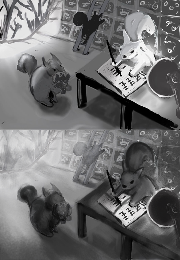
I think my head is going to explode so I shall take a break lol
Not sure if my values are clear enough or if it is still too middle of the road? Maybe the 2 light sources are unnecessary
-
Hi @MissMushy Big improvements! The perspective is more convincing and interesting. I'll make some suggestions about values. I feel like you're placing too much contrast throughout the whole piece. If you are going to have two light sources like this, make them more distinct. The light from the outside can wash out the background a bit so it's still readable, but lets the foreground squirrels demand more attention. If we lessen the intensity of the lamp light and keep the foreground squirrel's values darker, they can stand out from the washed out background.
Maybe something like this, thought it still needs work:
Website: www.tessawrathall.com
Instagram: www.instagram.com/tessawrathall_art/
-
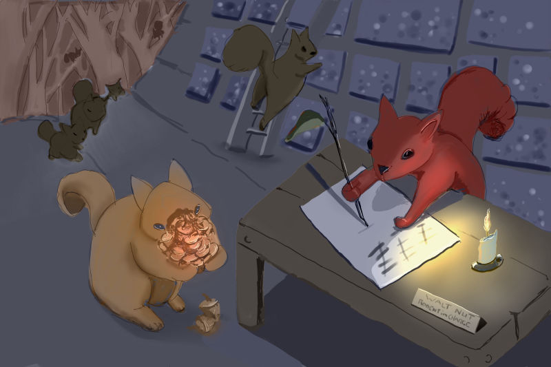
@tessaw ahhh I see what you mean. Thanks! I will continue to play with it
-
Not sure if I have made it better or worse

-
I'd say the fact that the log is blue, it doesn't really read as a log!
I like that you're making the squirrels different colors Good progress so far!