Consistent? Cute? Improvements?
-
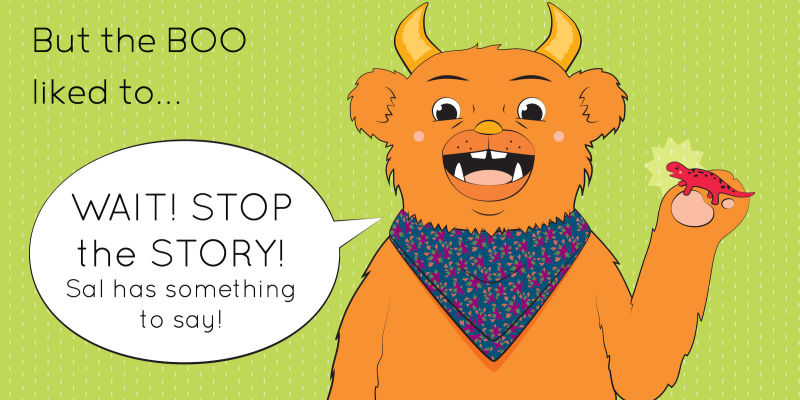
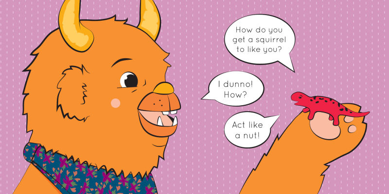
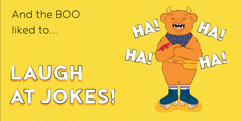
Hi, I'm working on a book dummy- I work totally in AI, and I personally like the look of flat color, but I'm worried this is missing something (I know texture might improve it, does it feel necessary?). Also, does the character (the monster) look consistent? I think the salamander needs some adjustments. TIA!


-
If flat colors are what you really like, I think that's what you should do and not worry about textures
 There is a big market for the flat shapes look in younger target markets like board books and preschool educational stuff. It's a hard style, though! While texture and shading can somewhat hide weaknesses in drawing or character design, the flat look leaves it bare and in the open for everyone to see. I think it's maybe why you feel like something is "missing", it may be you just need to refine your drawing a bit more until your designs solidly stand on their own! Right now, while they are very nice I feel like they look a little bit... generic? I think you could exaggerate some shapes to make the design stand out more
-
Hi! Yes, it is consistent. Too cosistent perhaps. I looks like you just made one image and just resized a cropped it here and there. Don’t be afraid to incoporate gestures to you characters otherwise, they’ll look really stiiff. Just like when the Boo is laughing. Make him wipe a tear of joy from his eye. Make him crunch holding his belly in glee. Use another view/ angle. Rather than drawing the character face on, have him stand at 3/4 view, change the angle of the shot, use bird eye view and so on. You;ve definitely achieve in making your character consistent but to the extent that he’s too bland. Try different things. I hope this helps. Keep up the good work.
-
@nessillustration Thanks! That's helpful feedback- and I do think I need to keep pushing until the art feels more complete...just not sure what route to take to achieve that at the moment.
-
@nyrrylcadiz Thanks, that does make sense!
-
Your images feel a little generic and the cute factor if that is what you are going for can be improved. You can find some good info on this in the designing children's book videos as well as Ytube Arron Blaise has a good free video on the subject. I notice you have some varying line widths but they don't seem to have a purpose like overlapping shapes or indication of shadows to give weight to areas. in your drawings try to avoid a straight on view unless it is for an important reason. The last thing you could look as is something call "apposing curves theory" it will help with your shape language.
-
I would have to agree with @nyrrylcadiz especially when it comes to your gesture. I like the style overall, but for some reason the linework is not quite hitting the mark for me, but that could just be a personal thing. I think it could use a bit more personality with weight or texture.
If you don't know the illustrator Brian Biggs, give him a look! He might be a good artist to study for your intended style. When I saw your use of color and pattern it reminded me of the Brownie and Pearl books- a series I loved reading to my daughter. I loved the illustrations in that series.