Portfolio piece in progress feedback
-
Hey all!
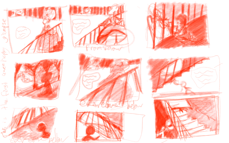
I've been working on this piece off and on for a few weeks, I'd like to do more thumbnails but frankly, time/energy/self-imposed-deadlines, this is as good as it's gonna get! Unless I get some ideas from feedback..!What you need to know about the scene. It's the first time the little boy sees a beautiful awe inspiring queen/princess. I want the sight of her to floor this kid. Which thumbnail does that best? Is there anything I could do to push it more? The bottom three you just see the hem of her skirt.
Thanks for taking the time to read this!

-
@emilym I am liking row one, the first one and row 2 the first one. I think those read the best to me.
-
@chip-valecek thanks for the feedback!
-
I think the first one is good. Being able to see his expression so we know what to feel. And her face maybe in three quarter view, not quite revealed, like a tease. You could have the next illustration be just her, in all her beautiful glory. Bigger impact.
-
Personally i like the middle thumbnail at the top. I can’t wait to see your progress.
-
Second row, first thumbnail is my fav.
I would work it so that the kid is silhouetted between two banisters instead of having one directly behind his head. Though this may make it a little too perfectly framed...
Ayhoo, nice work so far!
-
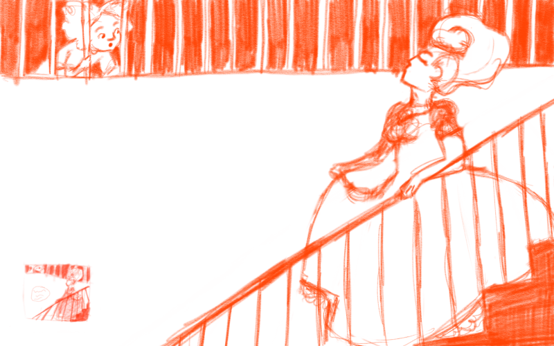
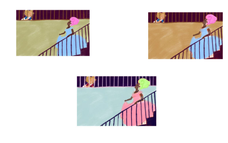
Thanks so much for the feedback so afar! Here's an update, I worked the first thumbnail up into a sketch. Then did a few color studies. The top left color study you can see I fixed the composition just a smidge. Feedback is welcome and appreciated! What's working and what's not?


-
I like the colors and composition of the first one! The open space of the wall is nice.
 The queen's head a bit lower, as you have in the first image, reads well. If you do go with this composition, I would just suggest scaling the size of the boy as well so their sizes seem proportional.
 -
Yup yup, totally agree with that. Thanks for the feedback! I noticed the size difference after I posted, will for sure fix that.
