Hidden WIP critiques please
-
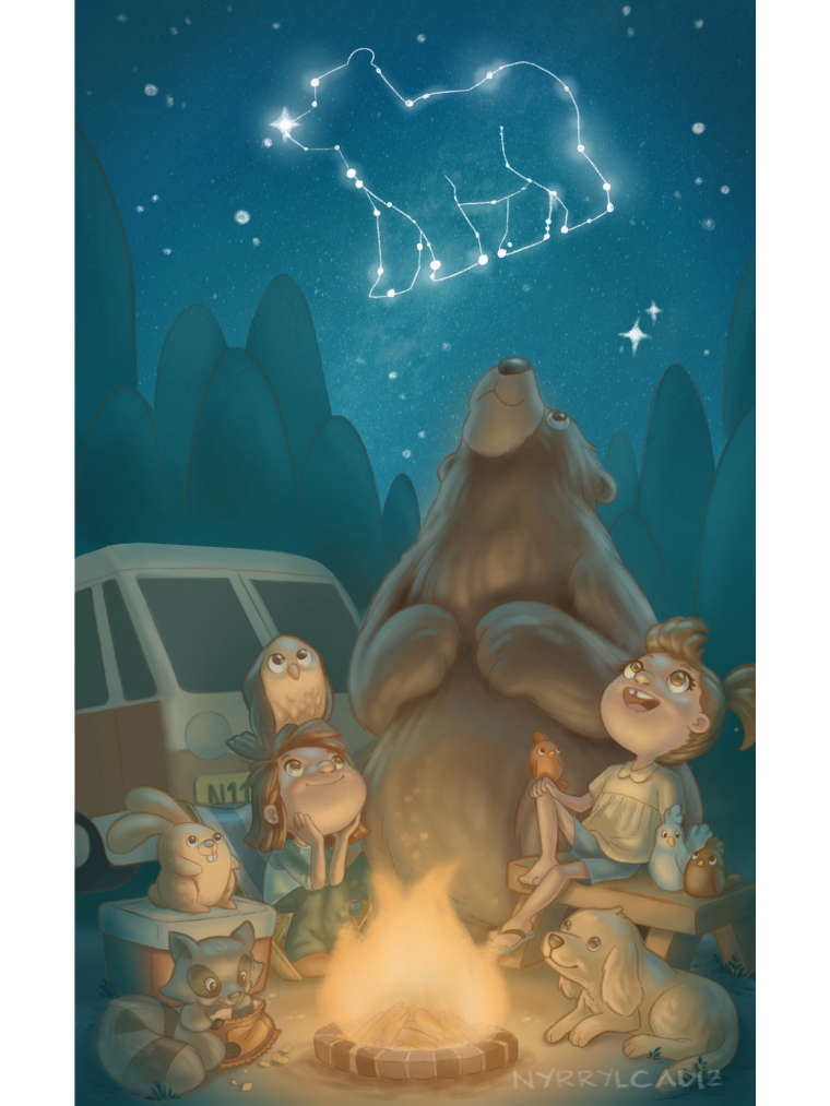
Hi everybody! After a failed attempt last month to join the svs contest, i finally had the time to finish a piece. It has been a while since i joined. I think the last time was last year. Anyway, i apologize for this last minute post but i need your critique guys. My piece is about the Hidden masterpiece of the heavens which we can only appreciate mostly at night. And even then, we still find it hard to connect the dots/stars and appreciate it’s great beauty.
For thIs illustration i wanted to beef up my portfolio with animals so i set the scene in a forest camping site with a lot of furries. I hope you guys like it. Please share to me your crtiqiues. It’s a bit late but i’ll take whatever you can give and try to improve my piece as much as i can thank you.
Here it is: iles/1532877267655-b1240c9d-4ba3-4f14-8638-6bf504479e85-resized.jpeg)
Portfolio: nyrrylcadiz.com
Instagram: https://www.instagram.com/nyrryl_cadiz/
YouTube: https://www.youtube.com/channel/UCbJCF1Im8ZO7hpGWTKOJMuA -
@nyrryl-cadiz Really nice work!
-
I think it's really nicely done. I like the composition and idea, your animals/figures are really cute and full of character, and I like the textures you've got going. My one suggestion would be to up the contrast a little (particularly darken some areas in the background like under the van and behind the animal characters) to make the firelight really pop. Additionally I might give the van a specific shadow or reduce the lighting on the bottom of the wheel or something because it's giving the impression that the van is sort of floating and not grounded.
-
This is awesome!
-
@kevin-longueil Thank you. It means a lot to me.
-
@juliekitzes hi julie! Thank you so much!. I’ll make sure to take note all that you said. Thanks!
-
@eric-castleman hi, eric! Thank you so much!
-
Wow, great work! I'm relatively novice with color, but I can see what you've done here is appropriate, and your forms generally seem well-done. As with some of the other critiques, I might suggest beefing up the contrast, especially with the lower shadows. The colors all seem to be fairly midtone-based, which works well for the light of a campfire, but contrast will emphasize it and make the image more punchy
") Other than that, the subtlety of the fur looks good and puffy to me! (though others might have more useful critique for the texture. My spidey sense is tingling)
Other than that, the subtlety of the fur looks good and puffy to me! (though others might have more useful critique for the texture. My spidey sense is tingling)I can't wait to see what you'll do with this already well-positioned piece!
Pax
-
@jabbernewt hi, jabber! Thank you so much. I’ll definitely consider your critique. I’m currently working on the contrast. I might be able to post the piece in a short while. Again, thank you!
-
Here’s the revised illustration:
-
I darkened the shadows, added brighter higlights, improved the grounds, added a few details to the van, and brigthen the stars. I hope you guys like it.
-
beautiful piece, idea and concept.
If I can give you a little comment, I think you could add more contrast only in the trees so you can separate the front with the background.