Critique for portfolio wip
-
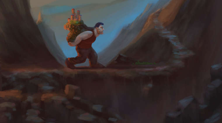
Hey I'm working on this piece about a giant carrying a castle of people, this is his journey to a better place. Do you have any thoughts for this please feel free to add them below thanks
")
-
I like the giant and you have framed him well with the mountains but I feel like everything is in the mid ground so overall there doesn't seem to be much depth. I think you could separate the farther away mountains more with a lighter value and consider something to add to the foreground. You also use a slightly harder edge on your mid ground mountains.
-
@rcartwright thanks for your thoughts. I plan on tightening the foreground up a little bit.

-
Hi, Jason! I like your colors and concept. However, i can’t help but feel detached from the scene. I think it’s because the giant is too far in the midground that i can’t seem to empathize with him. I can’t seem to relate to his hardships because i can’t clearly see his reactions and emotions. Perhaps bringing him closer would create a stronger connection with the audience. Also it would make the fact that he’s carrying a castle clearer. I’m viewing your post on a phone and i can’t quite make out the castle, not right away at least. So to sum up, just bring him closer. That’s my advice. I really hope this helps.
Portfolio: nyrrylcadiz.com
Instagram: https://www.instagram.com/nyrryl_cadiz/
YouTube: https://www.youtube.com/channel/UCbJCF1Im8ZO7hpGWTKOJMuA -
Without reading your description, my first view was of a man carrying a bag of mushrooms. Your challenge is to both clarify that it's a giant (with scale of something clearly small - maybe person or little flora/fauna) and clarify that it's a castle with earth he's carrying. Skillwise, you have beautiful ambiance and wonderful color choices... now you need clarity of concept and composition.
www.adrianabergstrom.com
IG/Twi/Pin/etc @adriprints -
I love the concept and you have a good balance of cold and warm colors. Some things that I would consider for improvement:
- You have the classic “theater stage” layout - the background is flat, the character is in perfect profile and walks from the left side to the right in a straight line. This composition can work, but it also flattens the space and has little drama. I’d suggest to try out some thumbnails where you have more depth in the scene - maybe the charter is in 3/4 view and walks towards us or he walks away into the image but is turning around (so we can see his face and there is some nice twist in the upper body). Try to add movement and dynamic in his pose. Try different viewpoints: seeing him from below, for example (as suggested by the position of the horizon), would emphasize his scale.
- Same with the background. There are some perspective issues: the front part seems to fall down vertically rather than come towards us. Try adding some big rocks at the front that overlay the rest of the image and have progressively smaller rocks as you move towards the giant. This is a worm´s view perspective on the giant, so there should be a strong size progression of environment elements from foreground to background.
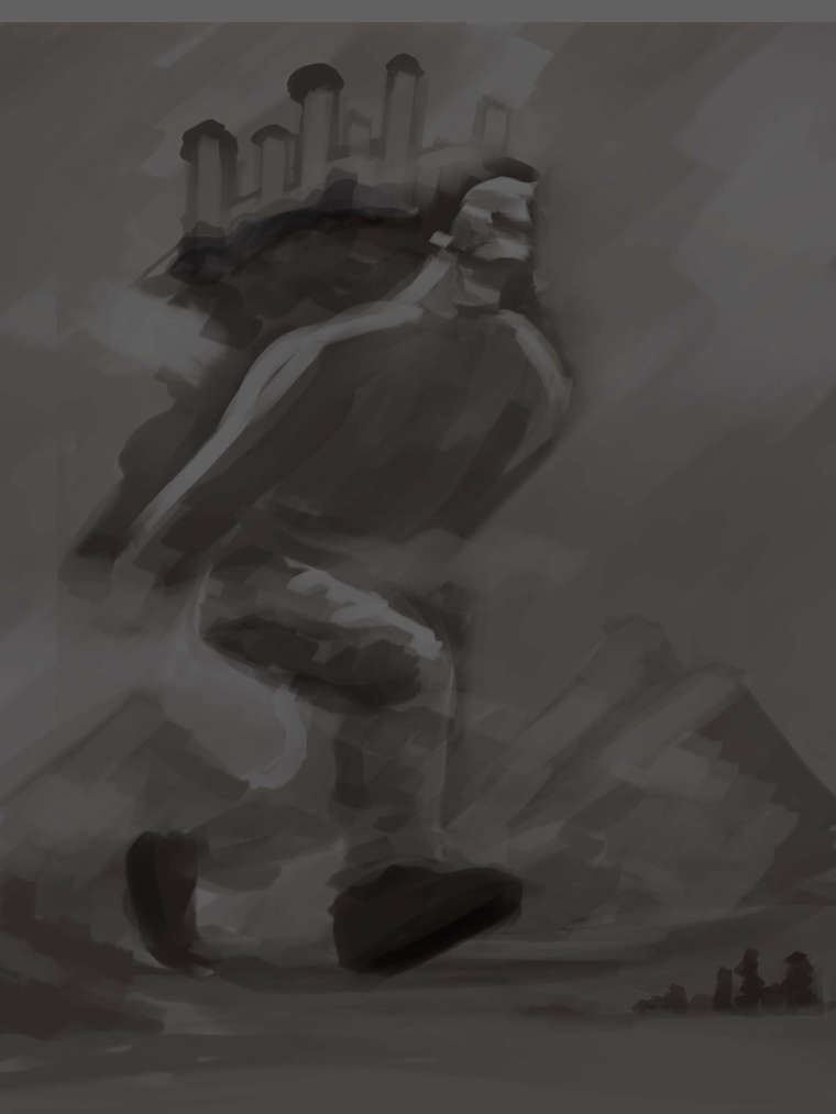
The “horizon” is smack in the middle of the image - that´s something to avoid, generally, as it feels very static. Try moving it down (to emphasize the worm´s view perspective). There doesn’t seem to be anything interesting in the bottom half of the image, so you can probably sacrifice it. - The choice of colors is nice, but the image feels “muddy” because your value range is very narrow (and very dark). Basically everthing is close to the same level of darkness. This is just a suggestion: paint a value scale on top of your image that goes from white to black: something like this:
I say to paint it on top rather than have it as reference because you can better judge your image against the value scale.
A well balanced “realistic” image should have all values from around 2-3 to 7-8. Of course it can be mainly in the 2-4 range (high key) or mainly in the 6-8 range (low key) for design reason (though it will not feel “realistic” if you don’t have a wide range), but successful images almost always have at least some elements that span across the value range. Our eyes and brains are very sensitive to light and dark contrast (much more than to colors), and images that contain a good value contrast catch our interest much more than narrow-range images.
Hope this helps! -
@nyrryl-cadiz Thanks for your thoughts. I think your right I need to push it a bit more to make it clearer. I am probably going to take him out of this environment into somewhere else.
-
@adriana-bergstrom thanks, the storytelling is definitely something I need to make clearer rather than just making something. The next thing I am working on.
-
@smceccarelli Thanks for the tips I am going to try turning him around and give him more of a giant look lowering the camera. I have to admit I did this straight out of my head and painted myself into a dead end... I have some ideas to work with now thanks.
-
adding to what has been said, you need to think of your light source. where is it? is there more than one source? describe your light source: is it strong or weak? cool or warm? far or close? and how many sources are there?
looking at your art, I'm confused about the direction of the light...
is it coming from behind the mountain? if so why is the man not darker?or is it coming from our left? then why isn't the side of the mountain in front of the giant, which is more or less the same height as the town, still dark?
or is it coming from the foreground in, as if the light and the camera are at the same place? because there are highlights on the giants right side of the face.
plan everything. block the shadows before you start coloring.
-
I'm going down this road now, really pushing my brain haha
-
@heidi-ahmad Yeah I know what you mean but I like to paint like a traditional painter on photoshop because that's how I think. The new one I will have everything improved... hopefully haha