Hidden WIP
-
I know I don't do this properly but I am learning and loving how different brushes work. Next time I hope to get a WIP in earlier. But I figured instead of just entering something each month, I would look for comments first and then see if I am able to make adjustments. Still working in pencil, paper, watercolor, and Photoshop with an old Bamboo tablet. I know I should start out by doing several sketch ideas first but still stuck in the "do one view and then adjust it." Thanks for any thoughts.
Drew up my idea but then remembered to not include main action in the center.
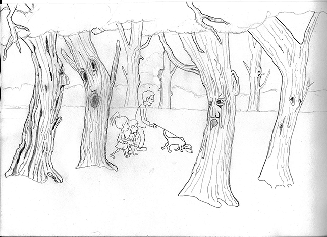
So I moved the people out of the center, got rid of tree arms and colored it.
-
No thoughts yet from anyone ... but I now was wondering if having the little girl look as if she "thinks" she sees something might be of more interest. I know I'm kinda doing this one backwards but have high hopes for changing my ways with next month's challenge. Any comments? Thanks.
-
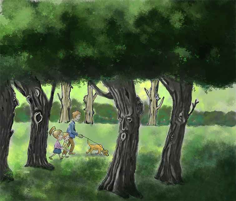
@maureen The faces on the trees are really interesting! I like your idea of having one of the characters noticing that something is different!
-
@Maureen I like the tree on the far left looking at "the visitors".
I know you like trying out different brushes but early on I would keep to one or two max. I wish there were more variety of weight and height to your tree foliage, it looks static and clumped together. I also miss the clean lines in your original line drawing, the faces were more clear. If you could clean those up more. And are you working on the same layer, or different layers? The foreground grass on the right reminds me more of bushes or possibly taller grass, because of the value change is not so subtle and it might be the brush your using. Also the two trees in the foreground are sitting on more white patches of grass than lighter green and the those two look like they are glowing with whiter edges.
I like your dog investigating the ground. To push the story further if you continued maybe he would be the one to discover the true nature of the trees. And I like the angle of your people mimicking the angle of the two trees on the right is nice too.
I hope this helps,
") Heather B.
Heather B.Instagram: www.instagram.com/heatherboyd.illustration/
Website: https://heatherboydillustration.ca
Shop: https://www.inprnt.com/search/products?q=HeatherBoydIllustration
Ko-Fi: https://ko-fi.com/heatherboydillustrationBe blessed,
-
Sorry you got overlooked before! Don't be afraid to bump your post. Would you mind if I did a paint-over?
Website: www.tessawrathall.com
Instagram: www.instagram.com/tessawrathall_art/
-
Thank you @juliepeelart I appreciate your comments. I like the idea of something noticing, too. Will continue work on it.
-
Hi @heather-boyd Thanks! I love all the constructive help. You made many good points. I will attempt to improve it with your ideas in mind.
-
Hi @tessaw Are you kidding? That would be great. I'm here to learn. I look forward to seeing your paint-over. Thanks.
-
@Maureen Thanks!
First off, I really like this idea and I think you've done well overall. My main critique and paintover has to do with your values, so please forgive if I've altered some of your cool faces on the trees, I was mainly focusing on manipulating the values. I think they could be organized so that the picture reads more clearly, and that our initial focus is on the family, but then we notice there is something fishy going on with the trees. To do this, I think that we could think of the painting in three main areas: 1.Background 2. Middle Ground 3. Foreground
-
Background: This is the least important, and so it shouldn't have very much contrast-including line work. To do this, we could compress it toward the lighter range where it never reaches those darker tones at all.
-
Middleground with the family. I propose that this is the first thing we should notice, so it should get the biggest value range/contrast. It should have some very light values, all the way to very dark (line work).
-
Foreground with the trees- I propose that this should be the second thing we notice and we should compress the value range similar to the background, but keep it on the darker side. They will still have a strong silhouette against the middleground and background, so they will still stand out, but they will be a bit more mysterious.
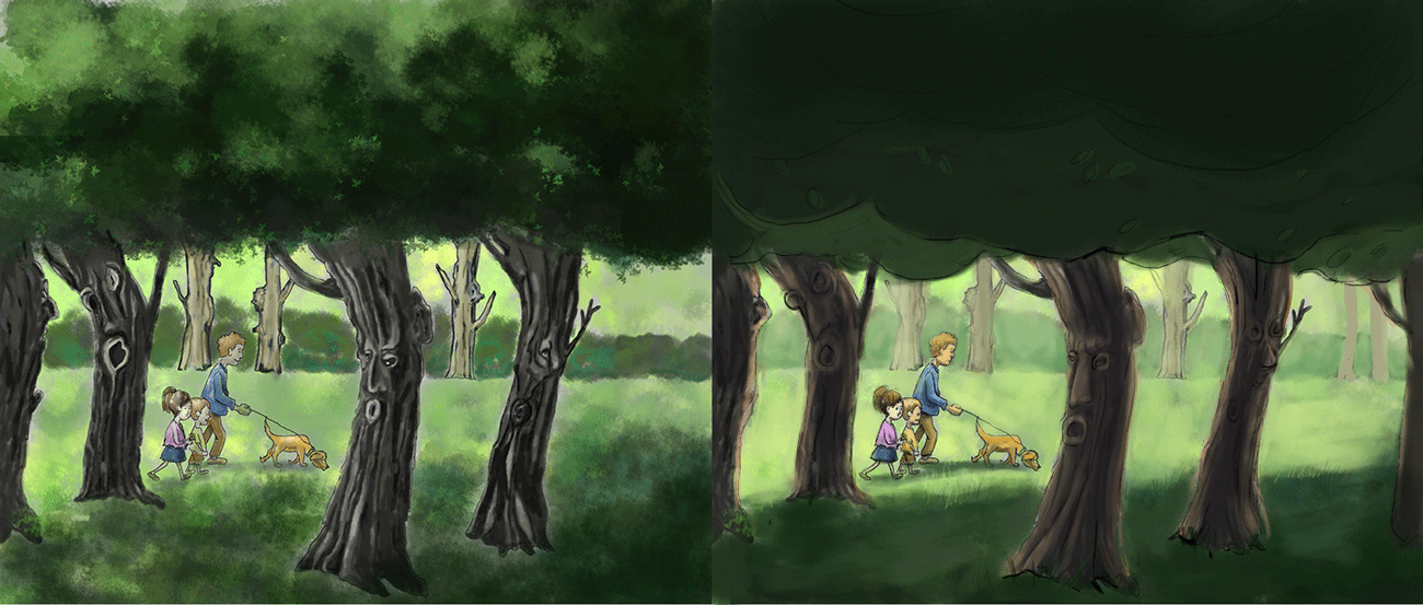
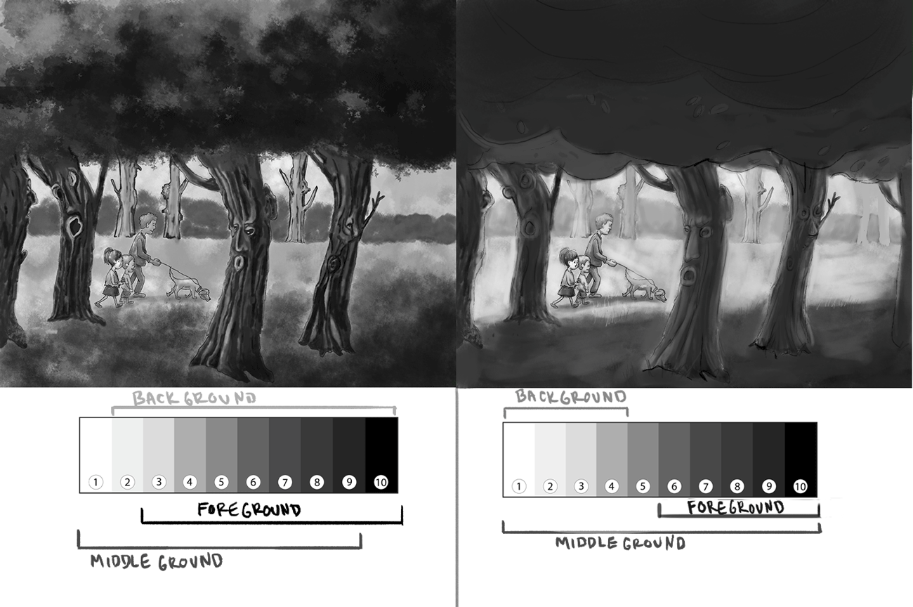
I've turned your original and the paintover to grayscale, and I've sample the lights and darks from each area to show the range they have. The darkest part of each area is the linework. In the original, each area has almost the whole range of value included. In the paintover, the background and foreground uses about half of the value range, while the middleground uses most of it.
Website: www.tessawrathall.com
Instagram: www.instagram.com/tessawrathall_art/
-
-
Thank you, @tessaw That is so kind of you to make the time to help me learn. I really appreciate it and I can see the difference. Now I have a new way of thinking about a composition and can work toward being able to do what you have done so well. I'll work on it this weekend and see where I can take it.
-
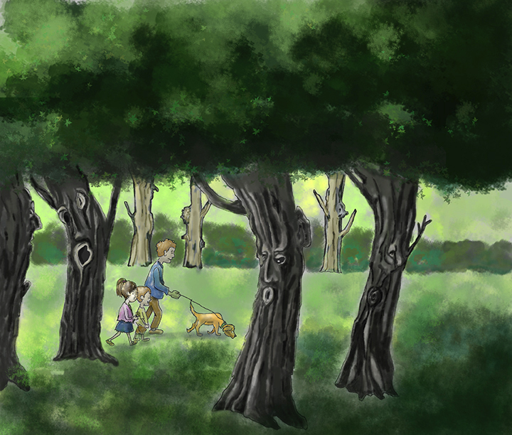
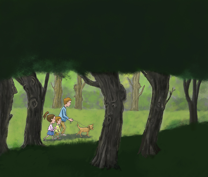
I hope I am making progress on this. Took the suggestions and am now wondering if this latest is better? Your thoughts, please.
-
I think it reads a lot more clearly now- well done! I like how you've brought the lightest parts of the foreground trees darker in value, but I feel you could go a bit darker with their form and occlusion shadows now.
Website: www.tessawrathall.com
Instagram: www.instagram.com/tessawrathall_art/
-
Thanks, @tessaw and everyone. I made more changes and am ready to post it for this month. The comments really helped. Will have to ask for help again.