Which sharkman is better?
-
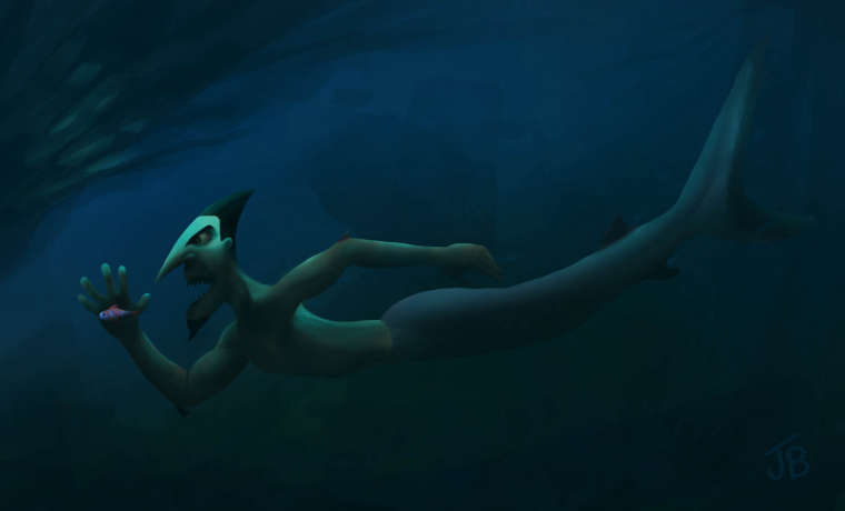
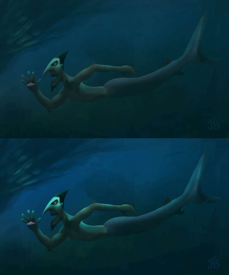
I am currently looking at my character I created for an imaginary big budget movie lol, and I painted it and thought it looked ok but after looking at it again I thought it needed more contrast... which one do you think is the best? first or second. Thanks for any thoughts.
-
I prefer the second one. Both are great. I think the brighter contrast along the lighted surfaces creates an enhanced sense of magic or intrigue. Love the style, either way.
-
@jason-bowen I prefer the second one. I like the lighting on top of his head.
-
I like a combination of the two. I like the eeriness of the darker tones in the first but definitely more light or glow with the shark man in the second. I think just a bit more light hitting the shark man in the first one, in my opinion.
=)@Jason-Bowen
-
I prefer the second one and would encourage you to pump up the value contrast even more on the body to match the head.
-
I think (like most other folk) the second is the stronger. The contrast on the face creates a strong focal point.
-
Thanks for everyone's thoughts. I'm going to go with the brighter one with a little tweak. Trying to keep a bit of the eerie scary look of it.