Comic cover feedback
-
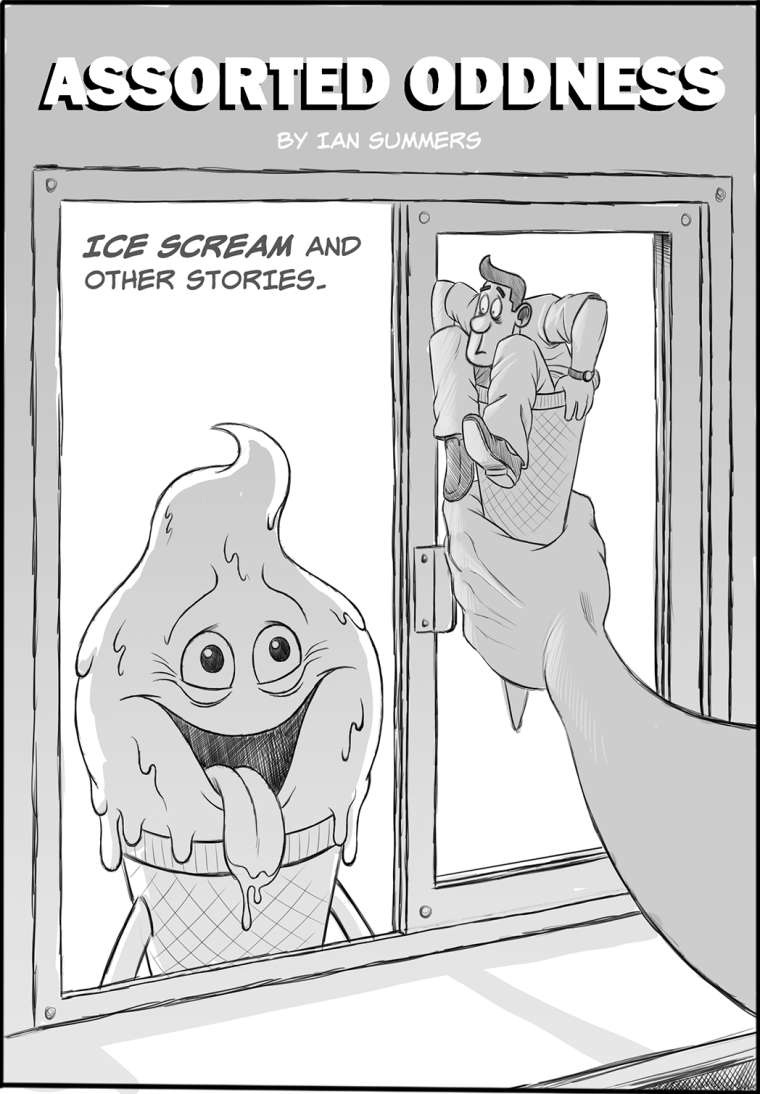
Hi guys. I'm working on a cover for my first comic and could use a little feedback. Any thoughts on the composition etc would be most welcome. Thanks.
-
Great job on the characters and their expressions. Will this remain black and white?
I personally think the title could be larger and your name is kind of getting lost a bit. If you want to keep your values very simple, I would at least think about possibly darkening the wall. It will create some variety and framing. I also think that the guy's silhouette could be stronger on the left side. Right now it's creating a very straight line between his arm, leg, and the large hand holding him up.
This looks like a really fun comic! I'm excited to see more.
-
@tessaw Thanks for the feedback! It's really helpful especially regarding the silhouette, which is something I don't think about as much as I should. Cheers!
-
This is so cool! The frame of the window is cutting into the figure of the guy in the cone a little much for me, I'd love to see him with the whole window behind him, and agree with Tessa about the arm and leg line.
-
Cheers @lollyw!
-
@ians At first I read it as a door vs a drive up window. Maybe if you showed more of the counter inside? Or maybe even have the cone reaching into the window to grab the man-cone.
-
I would be careful with a few of the near tangent lines that is created by the window and the character inside the cone. The edges are very close together. I really like both of the expressions!
-
@Chip-Valecek makes a good point. Up until I read his comment, I didn't realize that it was a drive up window. I thought it was the doorway of a shop front and the counter was a sidewalk. Looking at it again, of course it makes way more sense that it's a drive up/walk up window, but nonetheless, it's not what I was reading it as.
-
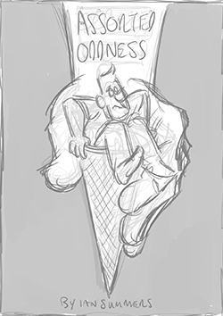
I decided to change things up and try something different as it wasn't working. Here's a thumbnail of what I'm thinking. Let me know what you think!
-
@IanS I really like your original concept. It has more story telling involved than the newer version. The first one is so obvious that the man is in an ice cream cone whereas without the hungry ice cream character the concept may be lost and just look a bit more like a graphic element decision. The big thing that I don't like about the composition is that the window panes divide the illustration in half without a lot of overlap. My quick remedy would be to incorporate the arms of the ice cream character so that he's eagerly reaching into the window (either with open hands or a fist full of cash?) It would help bring both sides together into a cohesive image and add some more depth to the piece. Additionally you might kick out the leg of the man in the cone that is currently pointing down to add another point of over-lapping. In general I think it's funny and cute and is a very clever and well communicated idea.
-
I also like the original comp. I don't think it needs much change at all to really strengthen it. Just break up that middle line @juliekitzes suggestions are good, and maybe put something on the counter to clarify the setting- a cup of straws, the edge of a cash register, a receipt spike, etc.
-
I liked the original more as well. My only issue is the face of the "ice cream", it's very flat looking in that the mouth and the eyes do not wrap around the sphere. I might also try and tilt or move the cone/hand a bit to the left to break the symmetry of the window lines. Also, maybe more reaction of the man in the cone?
-
Cool illustration! I really like it - It's got a old Sci-fi Amazing / Astounding Stories kind of vibe to it. That being said I think that the title font and word mark could be more funky as like when you look at Astonishing Stories, their title logo is a word on a swoosh, the swoop along the top implies dynamic movement and thus a "rush" thrilling adventure and or like the Twilight Zone Logo - the letters are all wonky and don't quite line up to each other implying strange, odd, and weird things. Although it's not an illustration issue, and it is more a graphic design thing, you still need to address it in some way if you are planning to publish, you may just want to leave out the wordmark and just leave some space for the wording to go but it needs to be addressed somehow.
Good job! Keep working at it!
-
Thanks for all the feedback. It's been really helpful! I'll let you know how things shape up.
-
Hi, Ian! I really love your first version. It had more humor and the over all scene was more interesting. It looked like something i’d buy from a rack rather than the latter. The second one still looks good though but it’s kinda generic (for me atleast). But if you do decide to follow through with the new design, you can draw it such that the ice cream character is the one holding the tiny man in the cone, licking his ice cream lips in the background. Perhaps blurr the ice cream character a little. That way the humor is still present.