Which version reads better
-
So I've got some illustration work (yay)
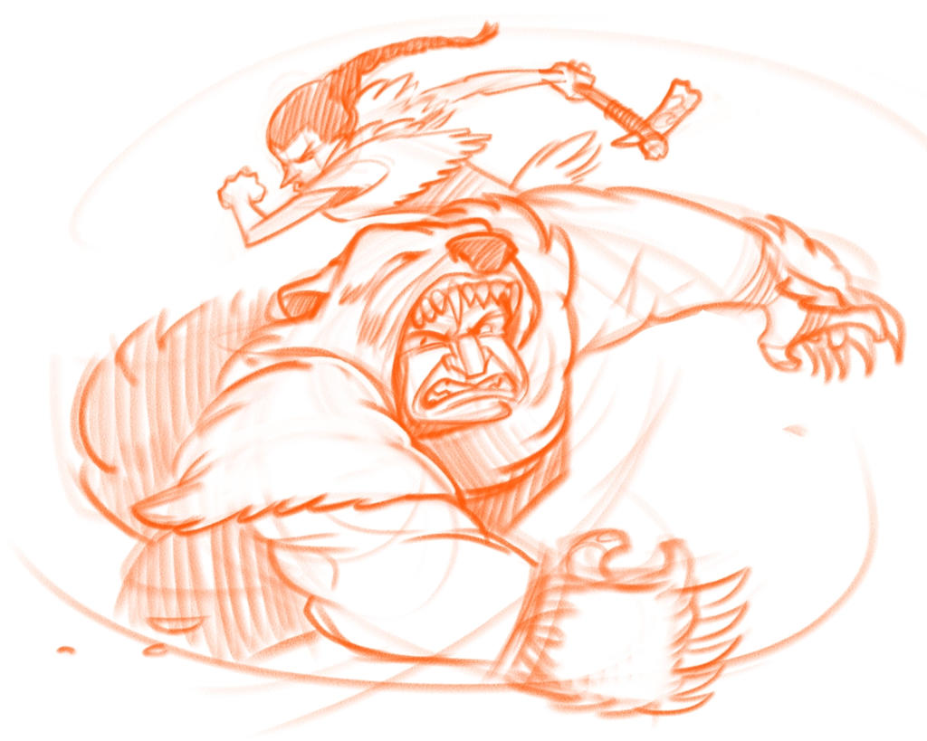
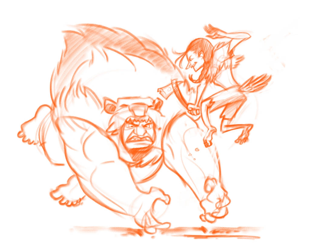
I did a few thumbnails for this particular piece and there are two options I sketched out quickly. Which option reads better?
Story behind it is that (through a series of magical salmon-related mishaps) Grizzly is attempting to murder Wren. Since Wren is fleet of foot he manages to dodge around grizzly and bash him in the head with his tomahawk.
So what I'm going for is Grizzly attacking, Wren dodging nimbly, and an imminent axe to the head.
Thanks!
-
They're both fantastic!
I think number two makes the dodging very clear. But the movement in number one is so great, and would also stand up better to a silhouette-test.
I think that I would choose number two, but if Wren had a more extreme pose, like in number one. -
@art-of-b I agree with @Embla number 1 has a much more dynamic feel to it, however if you maybe bring the arm back with the tomahawk in 2 like he is just starting to swing it, it might make it feel more dynamic. Something with how the arm is extended but the tomahawk is up makes it feel stiff.
-
I agree that #2 clearly shows Wren's swift escape. I like how the poses are based on the animals.
-
One is more dynamic, but I think two meets your goals more. I agree with @Chip-Valecek If you bring the arm back in #2, it might be even better.
-
Thanks everyone for the feed back
")
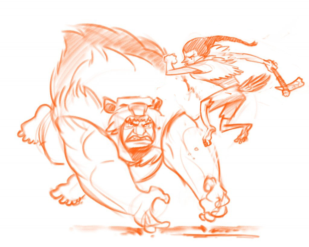
I'll fiddle about with number two and see if I can't make Wren's pose a bit more dynamic.
-
I think 1 seems more serious and about the speed and power of the character and the killing blow that is about to be dealt. If the next image shows the point at which the tomahawk connects then it would fit it well.
2 seems more comical, as though Wren is toying with Grizzly. I think the pose doesn't really show him about to hit Grizzly over the head, but more of a "hehe can't can't me" feeling.
I really like 1 overall, but I think if the pose in 2 was reworked it would look great too.
-
number 1. But I like both.
-
Both really cool, but personally, I would go with 2 with a small change. I would position the arm with the axe above Wren's head, so she's at the apex of a deadly double-handed blow. Nice work!
-
I'd say the first pic would work better in a series of sequential images e.g. comic or illustrated book. It doesn't really work as a standalone image
The second pic... one of the first 'how to' books I read was 'How to Draw Comics the Marvel Way' and the following drawing is vividly embedded in my brain to this day...
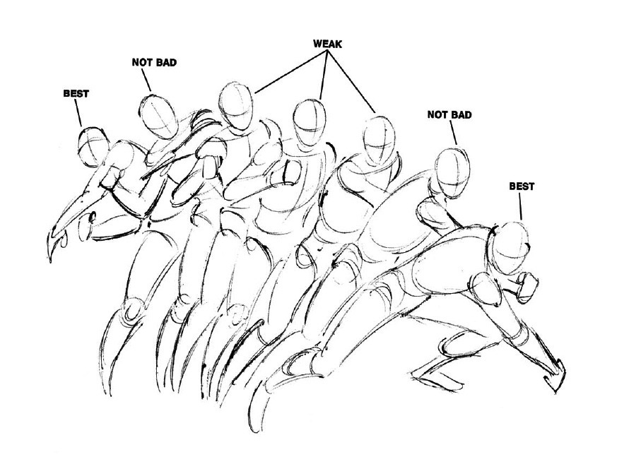
If you are drawing an action either draw the very beginning of the movement or the very end, anything in-between lacks energy or impact, which is something other people have picked up on. So if you combine the first pic and the second pic you get something with a bit more movement...
I also made them them look at each other. It doesn't matter what composition you use if there's a face in the image your eye will go straight for it and then your eye will look at what the face is looking at. So when they look at each other it's makes more of a fluid composition