WIP Feedback Requested
-
I didn't fully flesh out my entry for April's contest and shortly after it was over I had other ideas come to mind. I didn't post a WIP for that piece as it came so late in the game but I enjoyed the process of inking and watercoloring that I wanted to try it again without the pressure of the competition.
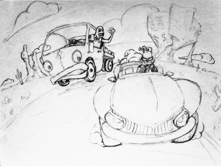
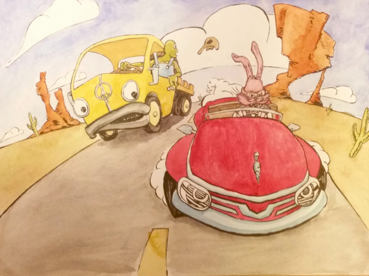
Now I'm looking for feedback. This is a play on the classic Tortoise and the Hare race. Does this style of line art and color look interesting using watercolor in place of traditional markers as Jake Parker and most others use? Are the characters interesting? Is the environment boring? Please ignore any tonal values that are showing up in this poorly taken photo as I'm trying to get the line work down first. Thanks for looking and if you have a comment or critique please let me know how to improve this.
-
For style reference this is the piece I did for April's contest.

-
@jon-anderson I like the layout of this piece, visually I do find it interesting and I think the composition works as well. If I had to find an issue, I'd say what catches my eye is the rabbits car. The image is done in a great fish eye view, but the rabbits car doesn't seem to followithe correct tilt. Maybe the left tire just comes down a bit low? But just a small amount.
-
@jon-anderson I agree with the fisheye lens look on the rabbits car. Question, are you keeping the bottom left open for text? If not I would suggest adding something in that area. It seems a little light. Even like a tumble weed or even a snake/scorpion in shock of the rabbits car.
-
The watercolor & line work looks good!
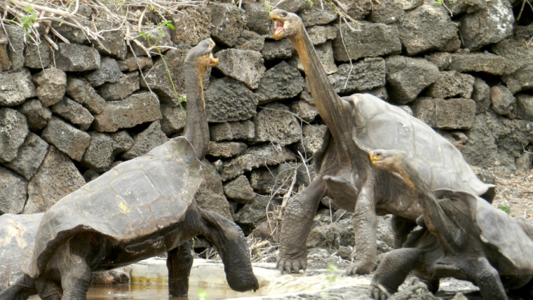
In the concept with the cars, I wouldn't have known it's a tortoise, since I can't see the shell. Since the arms & fingers are very cartoon/anthropomorphized, it's hard to tell exactly what he is (a tortoise has much thicker legs, very stubby toes--with claws, and the elbow joint bends the other way). Also, they can stick their necks out surprisingly far (at least in the case of the Galápagos Tortoise).
I thought you might find this interesting:

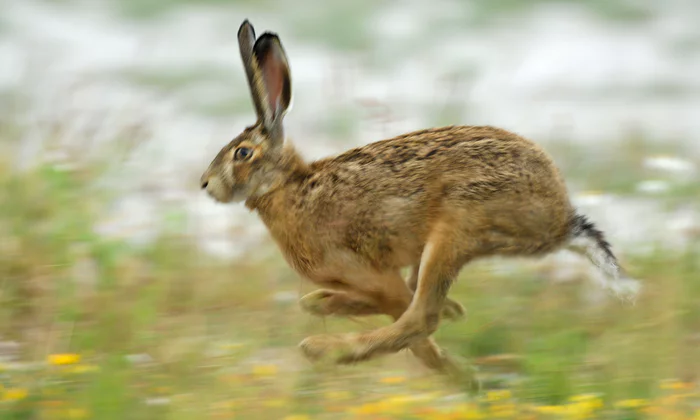
(This 90-year-old Welsh tortoise was attacked by a rat and needed wheels to compensate for her injured legs.)For the hare, the shape of the ears waving in the wind could also be horns (like a ram). I think the ears on a hare are larger, more rounded, and stiff, so they wouldn't ripple in the wind. A hare's ears are usually straight up--even when they are running.
Of course, you have artistic license to change your characters however you like. I guess I just like the "You have to know the rules before you can break them." kind of a method, so I thought these might help you think about your shapes, and how you want to copy or distort them compared to reality.Maybe a carrot-shaped hood ornament could also help, or a racing rabbit/hare emblem (like the SVS logo).
Personally, the fighting concepts for this theme don't really resonate with me, because the idea of "slow & steady wins the race" makes me think of careful and patient, rather than competitive and angry.
I like how the curved horizon / fish-eye distortion adds a lot of movement and a sense of action. I think the scenery looks good. The rock formation behind the hare's car is a little harder to read, but color would probably help with that. I like how the clouds vaguely resemble carrots, and the shape also adds to the action of the scene.
-
@adrian-k Thanks for offering feedback! I foolishly tried making the rabbit car break the perspective and it didn't work for me. Without completely redrawing the car I tried to rotate it to the right and round it off more hoping that makes it fit with the horizon on that side.
@Chip-Valecek I appreciate your noticing the open area in the bottom left. While I don't have text there I am intentionally trying to leave room for text. If it doesn't read that way or if I really did a bad job of it I'll try adding a snake trying to get out of the way. I really like that idea.
@Miriam Thank you for your detailed critique. You are right about knowing the rules first and my artistic license made the characters a hard read. While I didn't alter much of the turtles design I'm hoping that the colors can help when I get there. I took to heart your comments about the mood and the turtle's appropriate response. I also loved the hood ornament idea but I'm not sure if it reads as well as I've designed it.
Again, critiques are welcome.
-
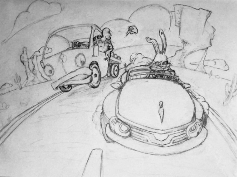
@jon-anderson
He's looking much more like a turtle / tortoise now! That little bit of shell is all you need, and yes, color will help as well. The change to his posture is great! The arm isn't very different, but it looks more turtle-ish now. I like that the straps of the overalls connect to the shell--that's a fun play on the clothes & shell. I didn't notice this before, but the arm on the steering wheel seems longer than the one resting on the car door. Maybe you could move the hand to the other side of the wheel (closer to his body)? I can tell that he's looking at something that has blown away, but I'm not sure what it is.Oh! I realized what you can do for the hood ornament for the turtle's van--just change the peace sign to a turtle shell! Also, if it's a peace sign and you don't like this idea, the symbol looks like this:

Though--on second thought, a peace symbol works nicely, since the turtle is the peaceful character in the story.Hmm, the carrot hood ornament is sleek-looking, which is appropriate for a hood ornament, but yeah, I'm not sure whether or not it looks like a carrot to me because I already know what it is. Maybe try adding a little leaf to each side kind of like this?:
I think the rabbit / hare's ears are looking good. I like both the earlier and the newer design for the rabbit's face and goggles. The eyes seem different from each other in the second one, though. One of the side mirrors on the rabbit's car is a bit pointier than the one on the other side. I really like the changes to the rabbit's car! It looks faster now!
You've really put a lot of work into this!
-
@miriam I am so impressed with the length you go to when helping others in the forum. It is a breath of fresh air and I really appreciate the effort and good thoughts. I've actually already finished this piece traditionally but am using it as a way to practice digitally. I totally rushed it too but I'll get into that later. I have taken the idea and changed it as well as redesigned the characters. I hope to get those sketches posted soon.
-
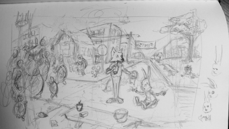
I call this my successful failure. I rushed it. I dove in on the colors with a new set of paints without experimenting first. About halfway through painting I finally realized that if this concept was going to work it wasn't going to be with this image. So I finished it and I'm not happy with the image but I am happy with the results. I think tried to force to much detail into too little of space. I just don't think it was simple enough. Now I have a new direction, a story that might work, and I think better character design. I know the process can take time and it's best to work though several iterations to find what works. I scanned the Inked line work for digital practice and have already cropped the image to make it more cohesive. If anyone wants to leave a comment or advice on anything like design, technique, or something else please do so.
I'm sure there's much I overlooked that will help me get better. Tough love works. -
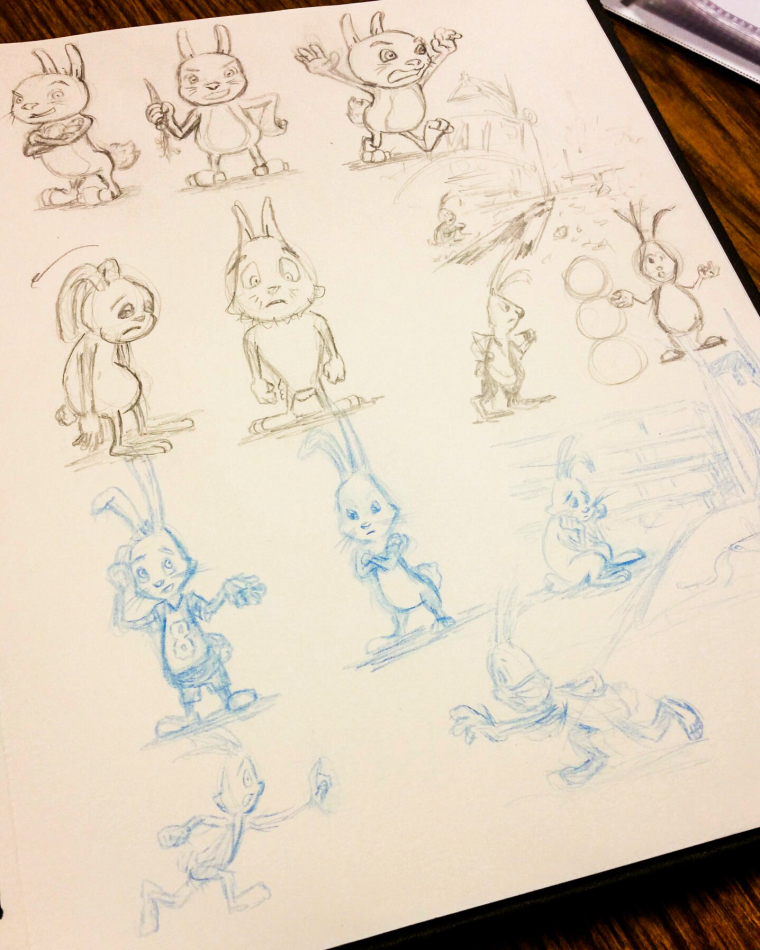
The rabbit in blue pencil is the design I like best. Unsure about clothing bit I'm thinking of just a hoodie if do put clothes on him.
I've completely changed the story. Instead of altering the race itself I want to explore what happens when the race is over. I think I got carried away with the composition and plan to crop it down and try to keep it simple. Critiques of course are welcome.