Travel WIP - tips welcome
-
Hi All,
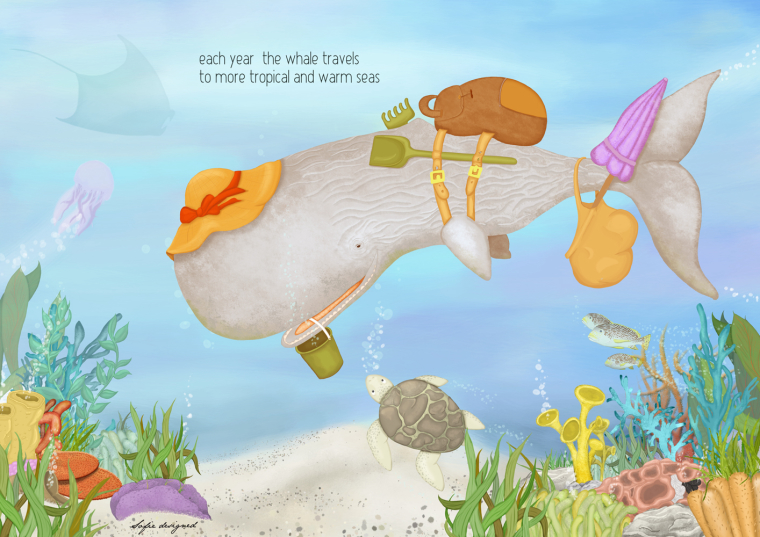
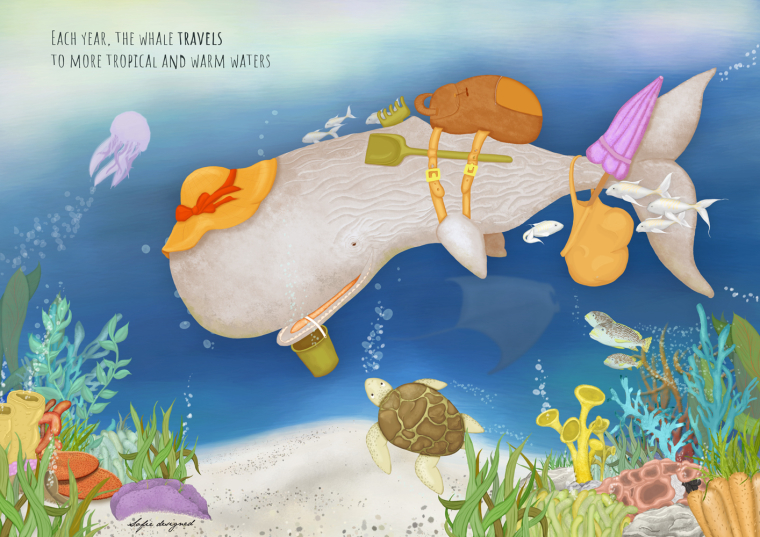
I'm new here and for the fist time I would like to submit something: the travel contest. The idea is a whale that travels to more tropical waters, taking his beach stuff with him for a vacation
 I am struggeling with the colours of my whale to make it pop out some more. All tips and critiques are appriciated, let me know what you think!
-
I really like the whale character because he looks very friendly! I also like the concept, it's fun!
probably you can use a little bit more contrast colors to make him pop out. Because your scene seems in the deep ocean, maybe it should be a bit darker or the whale darker and there's some light through the ocean upon him. It just some ideas, CMIIW. Anyway, I really think it's lovely concept!
-
I agree about darkening the ocean. The values of the whale and ocean water are about the same right now and I think changing the value contrast will help more than changing the colors. It’s a fun painting.
-
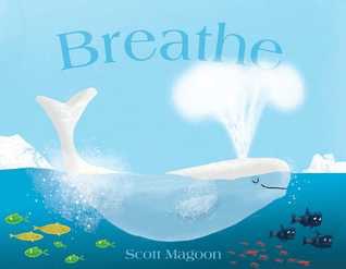
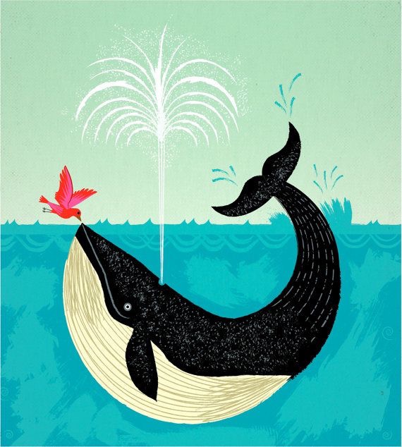
I seond what @lenwen said. As a tip, turn your image to greyscale to see how well the image reads in black and white. I would also recommend looking at how other artists have tackled painting whales. Have you thought about changing the whale so that would stand out more, either by it's color/tone or by having a darker/lighter surrounding?
Here are some examples of whale images that may be of help
-
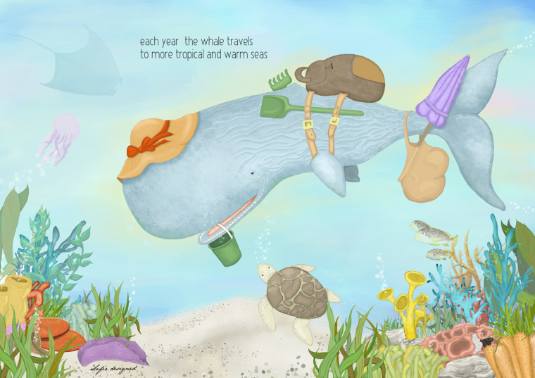
Thanks a million for your replies! I took it into account and feel it looks better already. If not, feel free to tell me

-
@Gary-Wilkinson, I really wanted a sperm whale and I will not have time to change it to another type of whale, but it's not a bad idea :-).
Also thanks for the grayscale tip, I feel my whale pops more now, CMIIW. -
-
@sofie_designed I think this is much better. Not only does the whale stand out more but the setting feels more like the deep ocean.
-
@sofie_designed this look like really in the ocean now! I also thought @Gary-Wilkinson tips will complete to make it even better

the latest thing, I think the whale's color or tone is a bit too warm.. maybe can make it more greenish or move to colder tone (CMIW)

looking forward for the finish piece!

-
@lenwen I made the whale in a warmer colour so that it would stand out more against the background... maybe that was not the best idea... I'll work on it some more

-
I think the warm on cool and light on dark silhouette of the whale is working really well! Its a really great piece.
-
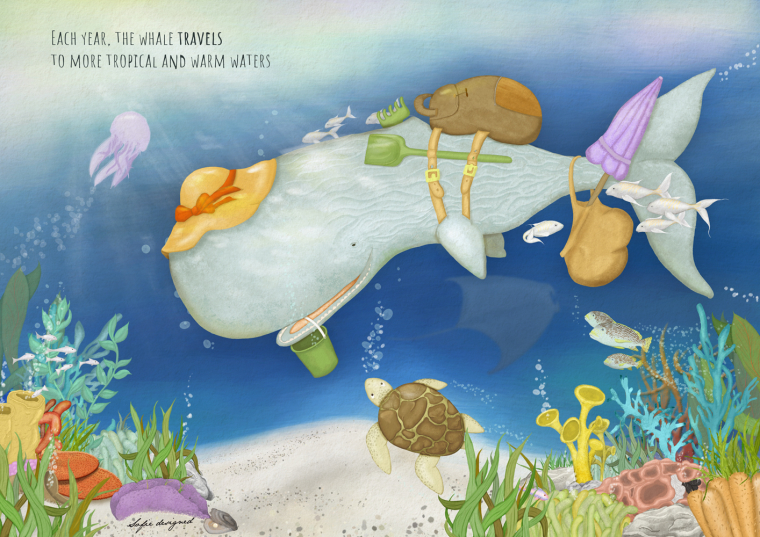
Well, I think this is it... I could keep on working it for another month I think, but at one time I must call it a day... Just not sure if I should put the texture on... I'll sit on that for one more day

-
@sofie_designed I think it looks much better! I can feel it in the ocean already

Looking forward for the final post!
-
@sofie_designed Love how this one developed. Your values looks great and I like you left room for text. It's a wonderful illustration.
-
@johanna-kim thanks a lot!!
-
Please disregard if I'm too late and you are finished with this--
I just was a little confused at first by the fish behind the rake. It took me a bit to figure out what was going on there. At first glance, it looked like a funky dorsal fin, since it kind of blends with the color of the whale.
Are you able to move the fish? I was thinking it should be moved completely away from the rake, but if you really like the overlap (it is cool to see it through the tines), it might work to move it just a little higher and little further forward so you are able to see most of the fish.
It's just a tiny detail, so don't worry if you can't change it.Overall, it looks really good!
-
@miriam I finished it and sent it in but I get what you mean! Thanks! I thought the little fish behind the whale would give it some more depth but I didn't take the colours into account. Something to think about next time
