Travel WIP - critiques please
-
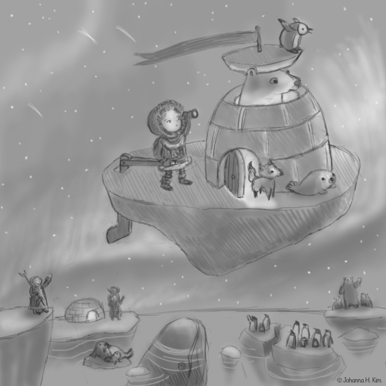
Here's my rough sketch for this topic. I've been researching Inuit culture and animals in the north pole for this one. The wavy lines in the sky are meant to be aurora lights. Any critiques, esp. on composition, are much appreciated.
Thanks in advance,
Johanna Kim
-
Okay, now I want to travel by flying iceberg. One small thing for me - you have five characters on the main iceberg all looking off in the same direction. I would have one of them looking down, maybe a couple looking at each other or over the edge and back at the people waving. Just a thought. I love how all of your background characters are staggered around the bottom third of the piece, it leads the eye nicely.
-
I like the concept and it really seems to fit your style. Be careful of the perspective of your objects though, the woman standing on the ice to the left is either really small or everything else is giant. Also I would presume the flying iceberg is tilting to it's right, which is fine but your characters would probably have to hold onto something so they don't slip off if that's that case.
-
@gary-wilkinson Thanks for your comments. Totally agree and I'm working to fix the issues with perspective, scale and the iceberg's safety features.
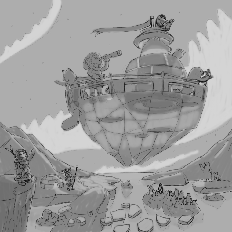
@RHirsch You point to an issue that has been bugging me, as well. I agree that the five characters need to be doing more than staring off in the same direction. I've also been wondering why these characters? Perhaps they have special navigation/survival skills for traveling via iceberg? And where are they headed? As usual, what started as a simple concept has started to evolve into more story development. I'll keep tinkering.
-
I hope I haven't made this worse. Decided to change the composition and perspective of the iceberg a lot. My concept is that the travelers are on an expedition to find out why the glaciers are melting more than usual; thus their serious expressions. Will step away for a few hours and see if this ready to move forward to color. Again, any feedback is much appreciated.
-
@johanna-kim Oh yeah, that's always the way isn't it?
-
I think the new version looks much better. I would question the need for the lady on the left though as you already have a group next to the igloo. Lovely composition though
-
I too like the new version better and I love the fish frozen in the bottom of the flying igloo. Having the fox (dog?) waving goodbye also creates more interaction between the people on the igloo and those left behind so you can tell there is a relationship there and not just people on land waving to random travelers overhead.
-
I love this concept, and your revision is so much more dinamic. It really pulls you in.
-
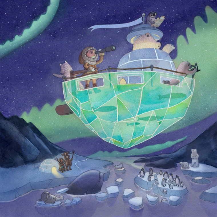
I think this one is pretty well-baked. Would love some fresh eyes on this and feedback before I submit. Thanks in advance!
-
@johanna-kim
I just saw this thread, so I'm seeing all of this at once. It's too bad you had to let go of the enthusiastic penguin on the original--maybe you can use that for something else. He's really cute!The last version looks really great. One thing I would change is to make the Aurora Borealis wispy on the top edges instead of the hard wavy lines, and I would make the curve in the upper left fainter, so it draws less attention. Also, the whale blends into the ice behind it, but it's pretty minor, so I'm not sure if that really matters.
You did a good job fitting the shapes of the landscape with the bottom of the floating ice. The chiseled shapes and how you can see the fish and person's boots through the ice is cool, and glow from the igloos is nice as well. I also like the softer shapes and colors contrasted against the more intense shapes and color of the floating ice. Good work!
-
I really like it!! I just saw it, coloured already, and it looks great. I would maybe put some shade on the side of the floating iceberg, to make it more 'round' but over all it's a really cool piece!
-
@miriam Thanks so much for your feedback. I actually did try making the tops of the aurora lights wispy in an earlier iteration but found that I preferred this more stylized version better. I think that I was partly influenced by this Instagram image from Sophie Blackall of a wave: https://www.instagram.com/p/Bg8tVvyntoB/?taken-by=sophieblackall
Regarding your other notes, I'll definitely try them out. And yes, I miss that joyful looking penguin and he's on my list of ideas for future paintings.
-
@johanna-kim sorry Johanna, I didn't get the time to come back to the updated color version of this. It's a lovely piece and it's moved on so much (in a good way) from the first sketch. Hope you don't mind me adding some critiques after you submitted it already, but I just had a few thoughts that may help influence the direction of any future pieces. (btw I'm not saying my suggestions are the right thing to do, it's just how I would adjust the painting if it were my own)
By removing the lady on the cliff on the left side it has made a lot of empty space, which now unbalances the piece slightly as the piece is now heavily weighted to the right side. I think if the canvas was a bit higher, you could move the iceberg to the upper center part of the picture and have the spectators nicely balanced on the left and right side of the ice below, whilst keeping the bottom center area less busy so the viewer's eye is directed to the upper area. (hope that makes sense, and I know it was me who suggested removing the lady, which I still feel was right, but it may have needed other things doing to even it back out)
The flow of the northern lights could also be adjusted to frame the subject. Lines in a painting, such a thin cloud or branch are really powerful subconsciously in directing the viewer's eye. At the moment the northern lights are converging to the left of the frame and I feel you could probably utilize them to direct the eye a bit better.
One last thing is that it is hard to feel the depth and scale of the objects and characters as very little is overlapping. If something was in the foreground of the floating iceberg or behind it, it will better help cement the feeling of the size of it.
-
This is a favorite for me Johanna! I love the sense of adventure in this so much..developed wonderfully. I love that tiny little hopeful polar bear in the lower right. A spouse?
") So wonderful.
So wonderful. -
@gary-wilkinson Thanks so much. I always appreciate your feedback and feel that I learn something valuable every time. Next time I have a free moment, I'll revisit the illustration and try making the changes you describe, just to make sure I understand and cement these tips in my brain for when I compose my next piece. Composition is an area that I'm working on improving.