WIP Color
-
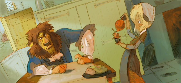
I just started coloring this kind of random idea I had. I am really working with experimenting with color and really want to develop allot further in it. This piece I tried to use limited colors with some highlight colors. Any advice on the color??
Tyson
-
I like the colors, everything feels nicely balanced and flows well. I do think that you could really go to town on making full use of that light coming from the side window to make the oranges in the lion really shine and give it a realistic lighting appearance. Be careful of the bread at the edge of the table, it looks like it's about to fall!
-
It's good to see your work in the forums again! I agree with everything @Gary-Wilkinson said.
-
@tyson-ranes I'm a big believer in limited colors. I really love the colors here. I would keep on doing what your doing. It's really working.
-
@tyson-ranes Really nice!
-
Hi Tyson! Glad to see you posting again. I think that overall it's very successful in terms of color. I do have a few personal preferences, which you may or not agree with, but I'll throw them out there!
-
I think the color you've chosen for the bread makes it look moldy. A warmer color may help.
-
I would experiment with making the yellow of the Lion's face a bit warmer, like the colors you've chosen for his paws. Right now his face is straying toward green, which I know it in harmony with the rest of the painting, but I think warming it up a bit would still look good within the scene and make it correspond to the foreground elements better and make him pop out a bit more from that door behind him.
-
I know you are going for a limited palette, but I think adding a few little bits of an additional accent color or two into the foreground elements would look really good. Maybe into some embroidery on the cloth elements, or onto the tea set. Not very much at all. Maybe a muted red. This is a technique I see a lot with limited color palettes and it give the pieces a little extra somethin'.
Anyway, as always, really good job! You continue to impress me with your skills in gesture and expression.
-
-
Thank you a million times!!!!
-
@tyson-ranes @Gary-Wilkinson @Jon-Anderson @TessaW @Tom-Shannon
Dude...... Thank you!!! I took into account everything said..... Let me know if you sees anything else. Thanks again!
-
@tyson-ranes Just wanted to say how lovely the color is in this piece!
-
I really love this piece and my only comment is that it took me a minute to read the face of the sheep (?) on the right. I didn't see her mouth at first and thought her nose was her chin and so wasn't even sure what kind of animal it was at first. It's better in the last one you did because the mouth is darker so the contrast is better though it still disappears a little. Other than that, I love the colors, the poses, and the whole composition.
Laurie DeMott
instagram.com/demotlj -
@Tyson-Ranes, I just wanted to say how DANG GOOD you are!! Always love your stuff, glad to see you back
-
@demotlj thank you! I’m going to work that spot.
-
@eli thank you so much for the encouragement! It’s good to be back on the forums. It’s crazy how much everyone can help each other grow.