Lion, Ocean and Submarine
-
@Ace-Connell Also, I do like the two children and the seal are creating a triangle that's pointing to the lion. Nice composition there

Ace
-
@Ace-Connell LOL
-
@Leontine and @Ace-Connell - yes I could not agree with both of you more. It's funny because I had some adjustment layers (for the submarines glass) that i kept turning on/off as I just was not sure if cooling off the Lion's colors a bit worked or if we lost him too much. But after reading your comments I agree and will definitely be making that adjustment for this piece in my portfolio and those postcards I plan to make. Thanks so much for the input!
And it would not be one of my pieces if it did not need a color toned down a bit - I told you those deliciously saturated colors get me every time!! Ha!
-
@Rich-Green whahaha! we all have our issues LOL Good luck at your presentation at SCWI.
-
Hey Rich, This is a cool concept and I love all the work you did to it. That environment is stunning!
In fact, the environment might be too stunning. What I mean is that the environment is painted in a much different style than the people, so it gives the appearance of the characters being placed on a background instead of really integrated with it. So that leaves you with two choices. Either go super realistic with the people and lion, or go more cartoony with the environment (which is the easier of the two).
Good luck. I love seeing all your progress!
-
@Lee-White Thanks for the feedback Lee - I read this the other day and I have just been letting it stir around in my brain a little bit trying to figure out which way to go. The look I have here is reminiscent of old 2D animation - which had those beautifully painted backgrounds with the outlined more flat cell characters layered over the top. And its no secret I am heavily influenced by that look and feel. But I can also see how this is jarring in a single illustration and also how this is not the norm in the illustrated books I enjoy or the images I save as inspiration from online. So I think the best thing for me to do will be try try taking this one illustration in both of those directions (super realistic characters to match the background and a version where the background is more cartoony to match the characters and see what happens). This might take me a little time to do with some client projects I am also working on currently but I will definitely share the updates here along the way.
Thanks for making me face this head on - I needed that!
Rich
-
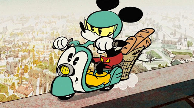
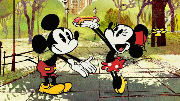
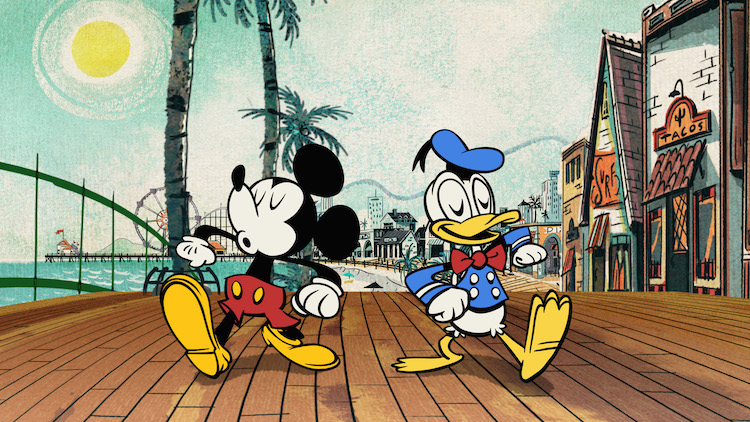
@Rich-Green I get what you're saying and you know how much I love those old cartoons as well. I think the difference here though is that they had beautifully painted backgrounds and the difference was vast to the characters. Here, the characters are in between a flat, animated look and realistic. If you look at any of the new Mickey Mouse shorts (some of the most creative storylines that animation have seen since the 40s/50s in my opinion). The backgrounds are so painterly and gorgeous and the characters are super flat and super stylised. Doing it that way, where the difference is extreme works really well but like I said at the top, I feel your characters are in-between (or tween if we're getting animation geeky on that word haha)?
Ace


-
@Ace-Connell - oh yes I completely get what you are saying - these are so intentionally stylized but at the same time do have a feeling of belonging in the environments which also share some similarities like black outlines or that they are flat shapes just heavily textured in contrast to the more simple color blocked characters of Mickey, Donald, Minnie etc. So while they are not the same they do have similarities in common to tie them together enough to make them believable for lack of a better word.
-
@Rich-Green P.S. Here are a link to the cartoons if you've not seen them... they are stunning and really, really creative - https://www.youtube.com/playlist?list=PLC6qIbU1olyXQe1WOKt8UJ4hErx3D7qt8
Ace
-
Wow, so much development in this piece, Rich. I like how you painted the aquarium, values seems awesome too! Nice job!
About the background, I may be wrong but maybe you just need to figure out a little bit of linework and shape simplification on your background, so they can match your characters.
Just my opinion, I really don't think I'm in position of giving critiques, since I'm such a newcomer to this. Hehehe.
-
Hi @joyce_carmo - all feedback, suggestions etc are welcome and I value yours very much. So thank you for taking the time to reply and give me your insight. As a matter of fact - I think you could be right that just a few outlines and such on the background could tie it into the characters more without having to veer too much away from what I have so far. Your idea has really inspired me - thank you!!!
-
@Rich-Green you're welcome! I'm glad if it's useful somehow!
