Chicago Treasure - Cinderella Concept for Input
-
Hi Everyone,
I am going to take a different approach on the next piece I am working on for that Chicago Treasure project. This time around I am going to share my steps in real time - in hopes that with some other expert sets of eyes (that's all of you!) on this I can make it the best I've ever done.
First I will give you the rough sketch I had provided to the photographer for a proposed Cinderella scene. This scene was purposely drawn in hopes that we could get a young girl who is wheelchair bound. I just kept thinking that every little girl dreams of being a princess and there is the part of the story where the Prince is trying the glass slipper on to Cinderella which meant she would be seated - so this is a perfect setup for one of the students in a wheelchair.
(Not drawn in yet are the animal friends (mice, birds, etc) that I am going to include in the scene.
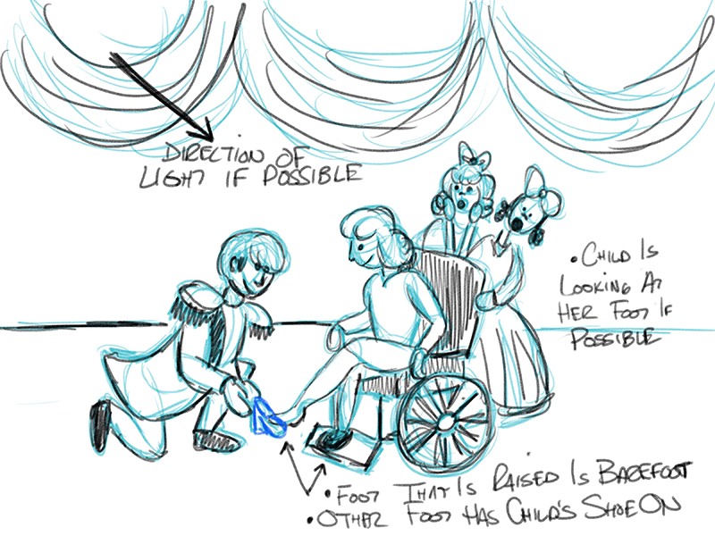
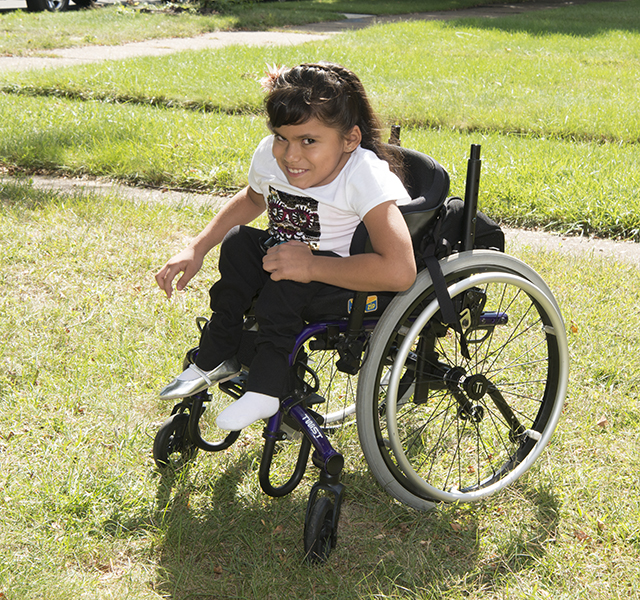
As it turns out the photo was shot outdoors again (which is going to make for some more lighting challenges as the light is once again behind the subject and I was hoping it could have been shot with the light in front of the subject - but that's alright I will figure this out!). What s also going to make it a bit fun will be the blades of grass by the wheels and tires that I am going to photoshop away as this illustration is not going to appear outdoors.
I started working on a drawing around the photo of the girl and here is where I am at so far. This includes the start to a color scheme.
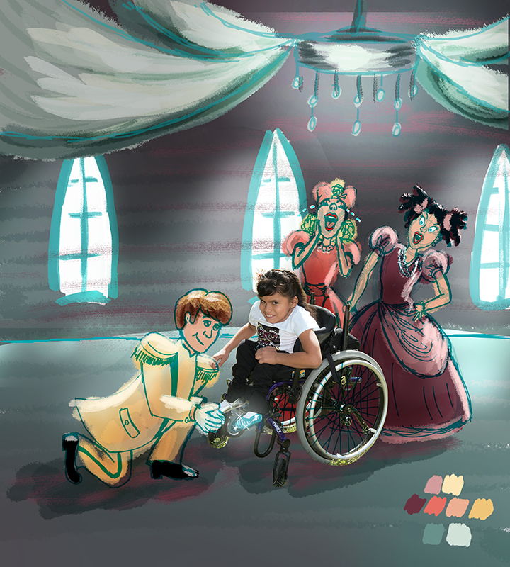
The dimensions for this book are roughly 9" wide and 10" tall - so I need to include some royal looking fabric swags and a perhaps a chandelier in the middle of them to add drama and fill in some of the vertical space of page. And then I thought that perhaps putting in windows that were allowing bright daylight to flood in would help give the backlighting highlights in the photo a source. And I tried to show those same sort of highlights on the characters that will be sharing the scene.
I purposely placed a window directly behind our Cinderella to help make sure her face pulls forward and does not get lost in a a dark backdrop and it also helps with the bright highlights on her hair. She is wearing white and black so I do not really have any colors from her to pull from for the rest of the image to help provide a cohesive look. So I am trying to use colors that would fit a cool stone castle for the environment. And they pops of color on the crazy step sisters without having them be so bold they steal the show.
As for Prince Charming - I thought maybe a pale yellowish/whitish suit would be nice - but I am not sure if this will make him too bright against our girl. That said I also do not want to make him too dark either because of all of the black areas the girl has with the pants and wheelchair parts. So I feel like some contrast between them is needed. And he also needs to be brighter in terms of him being this idealistic dreamy Prince and not dark and moody like the evil step sisters.
Anyone have any thoughts on this so far?
-
I would suggest you paint the girl in the same style as the painting.
-
I think the prince charming need to change his angle a bit, he looks ok on the first drawing you did. I really like this idea and I think it's awesome!
-
Hi @Steve-Young this project is to combine the photographers photo of the children from the school of the Chicago Lighthouse group into illustrated fairy tale scenes. It should be like the child has landed into the world of the fairy tale. So she can not be painted over.
-
Hi @Naroth-Kean I think maybe he also needs to be moved back a little bit like I had him in sketch drawing. Thanks for the feedback I will definitely work on adjusting him for the next revision! Thank you!
-
wonderful start Rich! Beautiful little girl
 You made the step sisters too cute i think, i would derp them up hehe. I agree there is something a bit off about the prince, i don't know if it is the line of his back or that his left foot and right knee look like they are on the same line, if that makes any sense. I love the overall feel of the painting
 ")
-
What a fun idea! I like what you have going so far. I think the yellow isn't bad for the prince, but I'm wondering if a medium blue might work with the color scheme better--not a dark moody blue, but a nice blue. Just an idea, the yellow isn't bad.
I can't tell if the prince is supposed to be looking at the camera like the girl, or it he is supposed to be looking up at her. If he is looking up at her, I think turning his head more toward her, maybe even all the way in profile, would help that to read better.
-
Hi @Sarah-LuAnn - I will be sure to clarify the Prince as I want it to appear as though he is looking up at our Cinderella and only have her looking at the viewer.
And I like your suggestion of going with more of a medium blue and keeping the room lighter and happier. As opposed to the moodier version I had been starting out here with.
I am so glad I have shared this one early on so I can get feedback and other sets of eyes on it.
I am not sure how others feel but it can be a bit lonely doing freelance work from home all the time. I miss the camaraderie of working in an office with a good team (like I did in my former career) and just being able to have someone stop by your desk for some advice or input.
So thanks to everyone who has "stopped by" here!
-
Welcome to your new office
you won't get interrupted and we won't drink all of your coffee 
-
Hi Rich, The concept is wonderfull, especially like the singing sisters!
-
Hi Everyone,
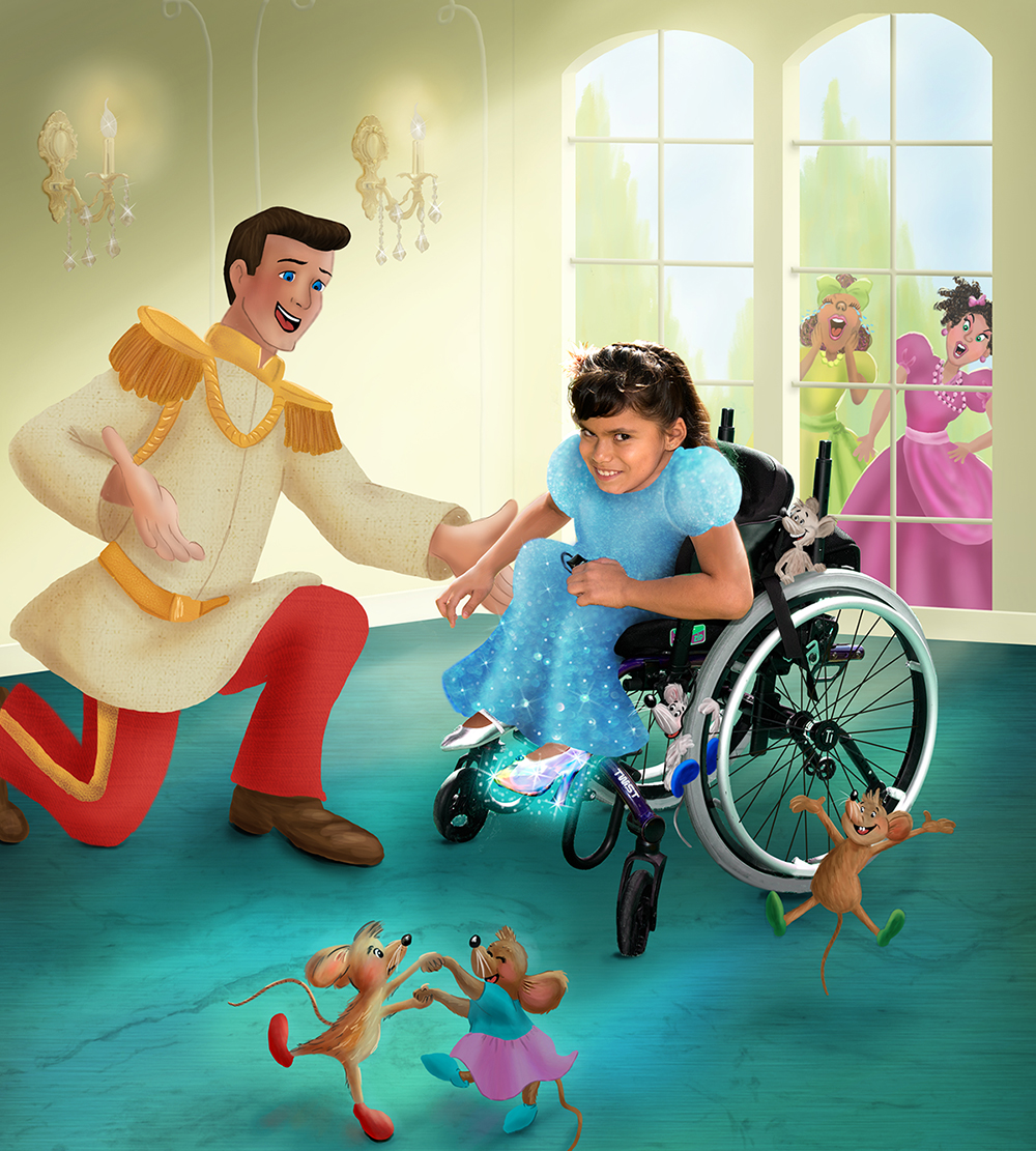
I wanted to circle back around here and show you all how the Cinderella piece turned out. I took the input I had received from all of you when I first posted the original concepts and really reworked it.
Everything is now taking place in a much lighter and brighter room. Still with the large windows letting in all kinds of sunlight (to go with the real lighting that was on the little girl) and I think it works really well. The color scheme of the room also changes to a pale yellow wall and a teal blue looking floor.
The big challenges were getting rid of all the grass along the wheels in the original photo as well as adjusting the tint of the colors that were reflecting off the wheels. In the original they reflect that yellow/green of the grass but now they match the tones of the floor.
Also the client wanted me to make her look as though she has on the fancy somewhat magical dress to help bring more color and shine to the main character. All of the black she had on, plus that black of the chair was really getting lost a bit in a colorful setting. It took me a while to get the illusion of the dress to follow the position of her body (her high knees for example). While you can still tell its a drawn dress and not the real thing I think that works with overall scene, keeping in mind its supposed to look like these kids have found themselves in the imaginary world.
It also took a while to make out that she is holding a remote (with part of the cord showing) in her hand that controls her wheelchair. I left that showing as that is true to her and life.
To keep the scene positive and happy we moved the upset step sisters into the background by placing them outside looking in. I think it works really well to tell more of what is going on in the scene but keeping the focus on the outstanding smile of the little girl.
I really enjoyed putting all of the little mice into the scene and am particularly happy with the two that are on the wheel of her chair.
You will also notice that I redid the prince to make him more upright and clearly looking at her with excitement as some of you had mentioned that was not so clear in those original sketches.
And I know that this work is not fully original in that it has direct nods to iconic Disney characters (without being exact replica's) but I still fully enjoy working on these as they do present so many challenges with lighting, perspective, storytelling etc. And that just helps push me to keep getting better.
-
@Rich-Green It is delightful and the girl's dress plus the mice are a nice touch. Love that you put the two awful step sisters outside!
Happy Creating
www.charlieeveryan.com -
@Charlie-Eve-Ryan Thank you so much, I really appreciate it!
-
This is so much better! There's a nice consistency of style across the piece. Having the mice climb the wheelchair is a nice touch
Also agree it works much better with the step-sisters shut outside.. -
@Dulcie Thanks so much Dulcie!
-
The client sent this image over to the girl's mother (and he will also be sending her a framed print) and it had her in tears. And that is why the challenges in getting these just right and pushing to get better and give my best possible output is all worth it. Reading her reply was just so rewarding on so many levels.
When the book with these images launches sometime next year - the kids and their families are all going to be at the launch event. I am really looking forward to meeting each of them.
-
That is awesome, @Rich-Green!!
-
Hi Rich, its just wonderful! love the sparkles! awesome! well done man!