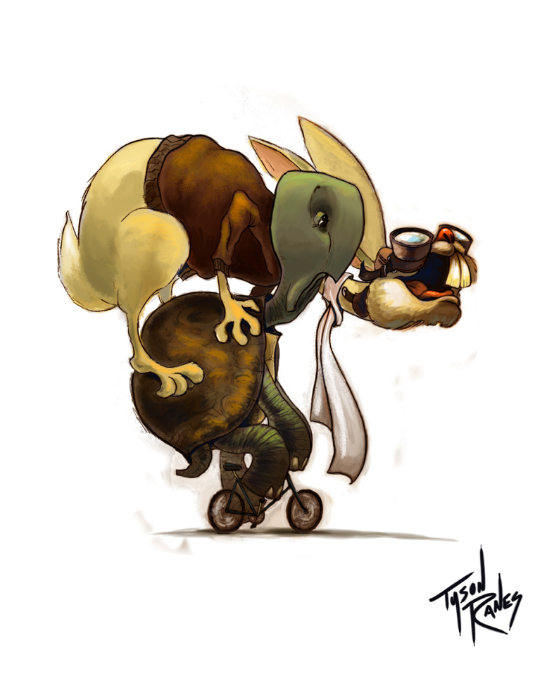
WIP Transportation
-
The colors all seem to blend and the lower half needs clean up and maybe a lil more bright. Do you think making the rabbits coat more of a blue would be problematic? Not sure of my problem areas. Im also thinking of putting in a little background like maybe a short chain link fence knee high and some wild unkept yard. Any help before I send final would be appreciated......Thank y'all!

-
@tyson-ranes Hey Tyson - Great piece! For me it took maybe 5 seconds to figure out what was going on.... what was happening for me was that the head of the tortoise seemed to belong to the body of the hare -and then i figured it out - i think adjusting the the values of the two characters so there is more separation between them would be all i might suggest

-
@tyson-ranes This is great! Love the expressions and idea. Maybe a few highlights on the turtle's head to give some separation from the rabbit, and a highlight on the turtle's right back leg to separate it from his front right. And you have the back right leg lighter than the legs in the foreground which seems odd; same on the rabbit's back left leg. The bike looks unfinished, even if it is small. Other than that, nice!
-
@Tyson-Ranes Hey great piece love the concept, I think the blacks are to black they are muddying up your colours. for example in the mouth, on the knee, and on the jumper and shell.
-
Hi Tyson,
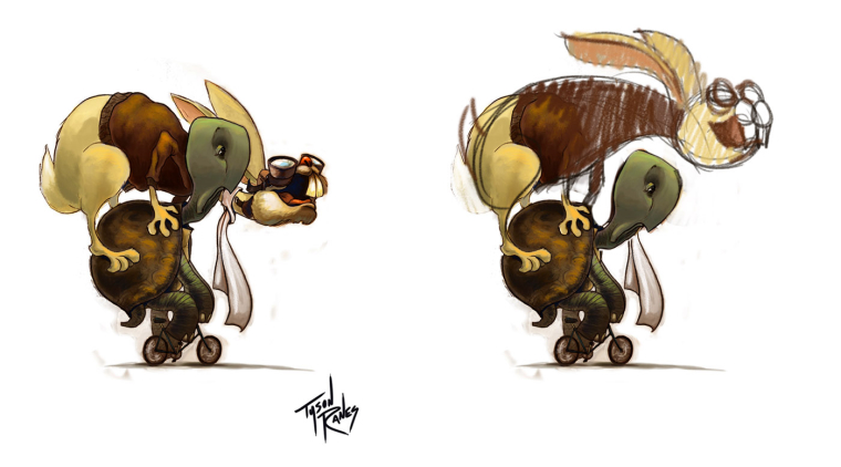
I basically drew what ^these guys were saying. I love this piece! I think you can make it a little more legible by either separating the silhouettes OR by giving the rabbit high key values and keeping the low key values on the tortoise and keeping the overlap. Great!!!

-
I agree with Kevin, It took me a bit to figure out what was going on with the heads. It reminded me of that Liev Schreiber and Naomi Watts optical illusion.
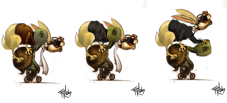
Right now the sweater is a warm saturated color and that is competing for attention over the less saturated tortoise head. I would consider toning down the sweater and punching up the saturation in the head. I would also consider allowing for more of a silhouette to come through on the tortoise's neck and also tone down the line work on the hare's scarf right by the tortoise head. Maybe also soften up the underside of the hare's sweater to let the tortoise head stand out.
Hope you don't mind that I did a paint over to show you what I mean. The third one, I was just playing around, because your scenario is hilarious.

Great job overall! This is so fun!
-
Well now I feel weird posting after Will Terry. Whoops.
-
@tessw We were on the same page

-
@will-terry & @TessW
Thank y'all! If I change the values do you think I can salvage the piece without having to change the pose?? Reason being I did this with pencil on paper and I would have to completely redraw it and I don't have the time within my schedule. I really want this to be a killer piece hope the value changes and maybe a few other adjustments might do the trick. Yeah? I think for one I am going to go with lighter value and more of a blue on the rabbit flight jacket and also might change out the rabbits hidden arm to further silhouette the turtles neck. Thank you to everybody for your critique, you all make these pieces 10 times better, it's always a pleasure to refine with the sight and minds of a multitude. I had to correct foot in mouth -
Yeah, I think you can! Just make sure that tortoise head it standing out from the hare. If it's not working just go through the list to see if you can tweak anything:
Color
Value
Saturation
Hard or soft edges
Highlights or linework