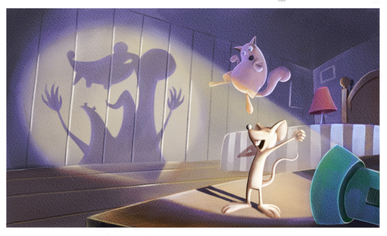
Worst fear WIP
-
So here is the half finished piece I am working on for this month's competition. Any thoughts or changes you might see before I waste much more time on it?
-
Also, I made it too big, and when I resize it for the forums it looks kinda like poo. @smceccarelli any suggestions on how I can work around that?
-
@eric-castleman so awesome!!! Great composition super strong
-
@tyson-ranes thanks! After seeing yours I knew I needed to bring my A game
")
-
@eric-castleman I am not sure what kind of issue you have. I normally use the "save for web" feature of PS to save jpg format for all work. You can change the pixel size there as well as control the quality. It makes files that are nicely small even with a lot of pixels, so they are great for posting on the web of send via e-mail....and since the main issue with submissions is file size and not pixel size, sometimes I ignore the pixel limits
This is a very nice illustration, though I am not totally sure the narrative is clear. Is their combined shadow that is projected on the wall? It does not look like they could make that shadow shape, but maybe I am reading it wrong. The ellipse of the lamp may need a little tweaking. -
@smceccarelli I just purchased Affinity Photo for the ipad, and have yet to really know what I am doing. I do know it offers CYMK, and that I can change my procreate rgb images to cymk, and I am sure the sizing can be done there as well.
I'm not sure I understand what you are getting at about the flashlight and the shadow..
-
@smceccarelli oh ok, I think I know whst you are saying. I think the shadow is suppose to be more or less the way the cat sees it.
-
I think the story is that the silhouette on the wall appears so big that it looks like a monster to the cat (perhaps seen from the cats point of view)
I can understand why it might be a bit confusing though. I think it would be better if the mouse was intentionally trying to make a scary pose to frighten the cat. Also it's a little hard to understand the position of the cat. I think having the cat on the table with its hair standing on end as it looks at the shadow might make it clearer and more readable.
-
This post is deleted! -
@eric-castleman Oh, I understand. I do not use Affinity, so I cannot help there.
I think the issue I had with reading the illustration is that the cat does not look scared...to me he looks like he is happily jumping or dancing. Maybe you could push the scared expression to make it more clear? -
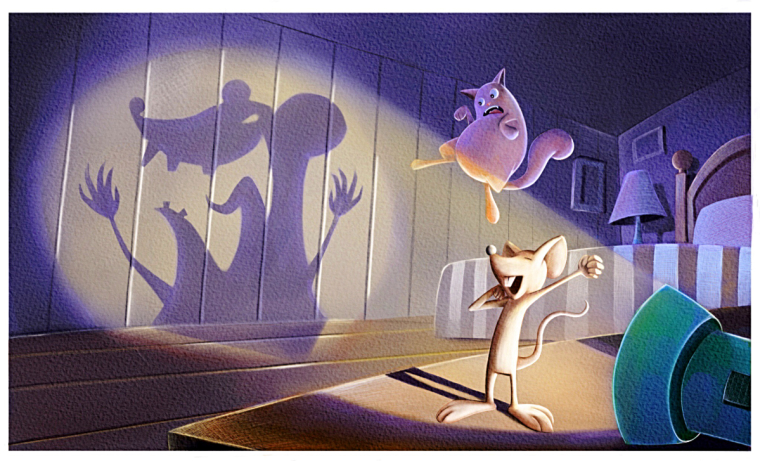
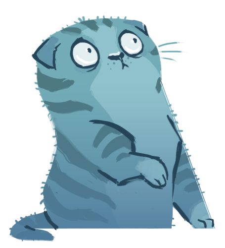
I think you could push the scare in the cat much more... cats fur raises up when startled or frightened... incorporate spiky fur somehow?
-
Is the cat's reaction looking better?
P.s I hate how blury it turns out when I resize it. I am terrible at sizing stuff.
-
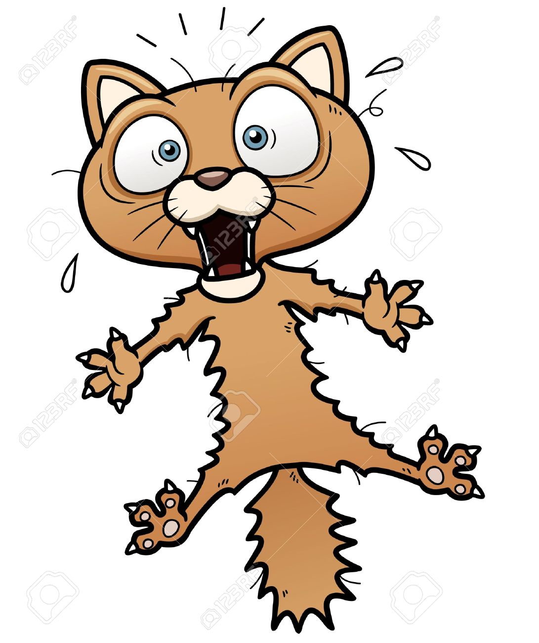
I like the concept a lot, but it looks like the cat is trying to judo kick the shadow rather than recoiling in terror. Maybe make the cat's pupils smaller, his eyes larger, and his mouth open more. Have his 2 front paws stretched out like his back legs, and his tail straight. Below are a few images for reference that might help.
-
@eric-castleman for resizing it helps to reduce the height and width but keep the same dpi
-
@tombarrettillo agreed I think this change will have a huge impact on this illustration > I like the direction of the second cat very readable expressive body language and expression > dyno......mite!