New Sketch
-
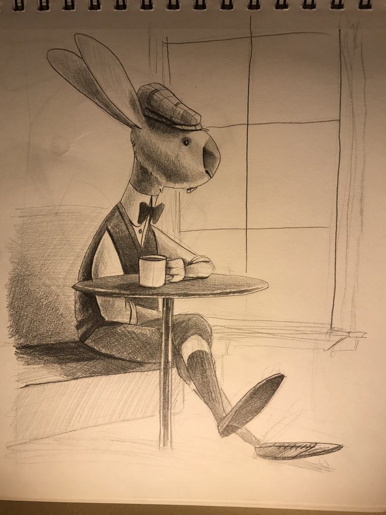
Im about to start working on rendering this sketch tonight. It is a Rabbit having tea thinking about where he is going to come up with enough carrots to feed his 15 children.
-
I like the sketch but I think the pose doesn't really convey his serous thoughts don't be afraid to exaggerate your pose
-
@tyson-ranes
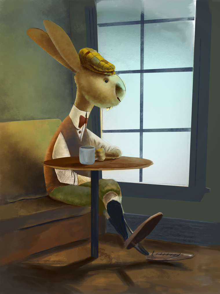
Update: Here is the direction in rendering I'm going with it (not finished) still have a ways to go. Any help/critique/direction is appreciated.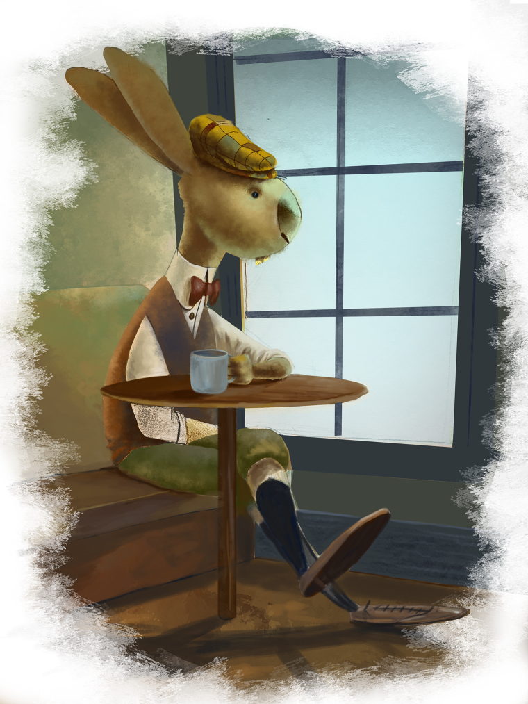
-
I love the rendering, love the design of the rabbit and the color choice! It depends on what you want to make of this image. Is it just a sketch or do you want to make it into a portfolio piece ? If so, I agree with @rcartwright that the story needs to be clearer.... Maybe he could have bills on the table in front of him and we could see all his children playing outside by the window ?
noemiegionetlandry.squarespace.com
noemie_illustration on Instagram -
@tyson-ranes I like it. A very heady and tough subject to try and illustrate I commend you on attempting this.
This is just an observation; The color seems a bit-to muddy. Your rabbit is getting lost in the background.An Illustrator loving this Artist community.
www.bobszesnat.com | https://www.facebook.com/bobszesnatart/ -
@nowayme Thank you for the encouragement! I hope to make it a portfolio piece. I'm going to adapt the story to the drawing because its just a single stand alone illustration so that whoever sees it can make what story they believe it to be telling.
-
@bob-szesnat Thank you. I'm going to see how I can tweak that.
-
@tyson-ranes if you have the svs subscription Will Terry just did a video series about color and story telling. It helped me so much with defining things in my paintings with color. you might want to check it out.
An Illustrator loving this Artist community.
www.bobszesnat.com | https://www.facebook.com/bobszesnatart/ -
Awesome, thanks @bob-szesnat
-
Just my opinion, but I think it looks really good as a black and white piece. I would consider keeping it that way and maybe redoing it on nicer paper. I guess it all depends on what you want to do with your work and your portfolio.
Don't get me wrong, I also think it works as a colored piece. I would amp up the shadows on the colored version to create the moody feel you're aiming for.
Can't wait to see where you go with this. It seems like you have really strong drawing skills!
Website: www.tessawrathall.com
Instagram: www.instagram.com/tessawrathall_art/
-
@tessw Thank you! Especially on the shadow remark, it helped a bunch. My strong suit is just pencil color is a struggle for me. Here is newest update hopefully one more session with it or 2 and I'll be done. (piece still in messy sketchy mode at the moment)
-
I love your illustration too. Others have given good advice.
-
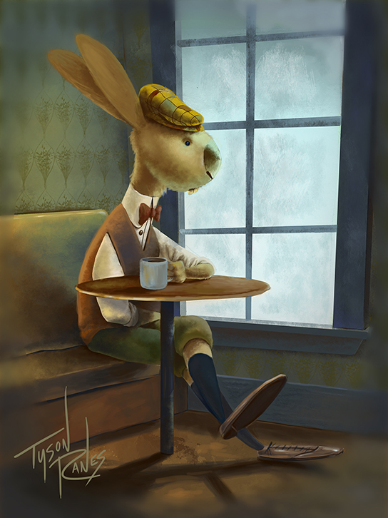
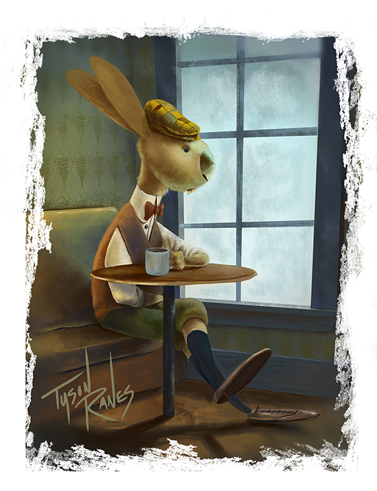
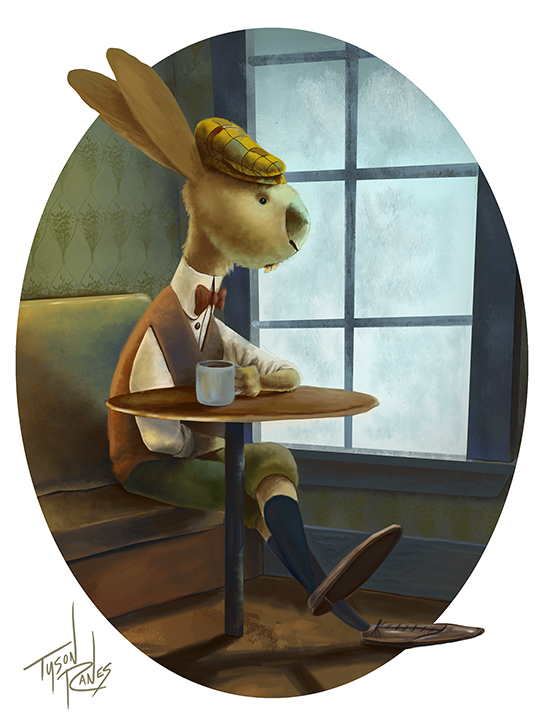
Here is an update open for critique> I initially did this with the thought in mind of the oval so the outer drawing was always mean to be trimmed but now I'm not sure. Help me pick which might be best Im considering putting it in my portfolio.
-
-
-
@tyson-ranes I like the oval the best.
-
I like the oval one too, especially with the ears and feet breaking the oval. Maybe if you fade the whole edge of the oval you get a more dreamy feeling, as that's the message you want to give? Also your signature is way cooler on that one haha.
-
Oval one. And just a thought. . .adding steam rising from the mug might give it a bit more mood.
Great work, Tyson!
Website: www.tessawrathall.com
Instagram: www.instagram.com/tessawrathall_art/
-
@tessw yeehaw! Thank you. Yeah I'm going with that one.
-
@tyson-ranes said in New Sketch:
@tessw yeehaw! Thank you. Yeah I'm going with that one.
Yeehaw! Giddy-up cowboy!
Website: www.tessawrathall.com
Instagram: www.instagram.com/tessawrathall_art/