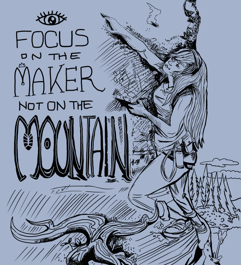
Working on an inked illustration piece with hand drawn lettering. Looking for feed back.
-
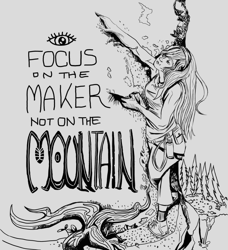
Any feedback is welcomed.
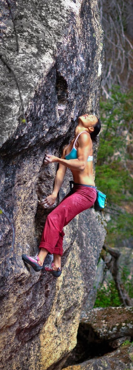
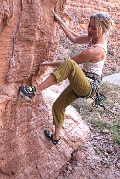
I am interested in hearing if you feel the woman's body looks accurate. My reference was a more bird's eye view and I turned it more straight on. The following is the main reference I used.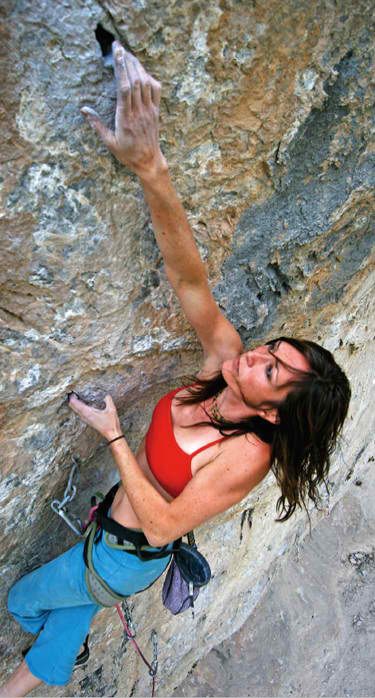
The lettering is hand done, what do you think of it? Thanks in advance to you guys.
-
Nice inking. I believe the legs could use some work. They look a bit twisted in the wrong direction and the foot too. Maybe someone who is digital could show you with a draw over. The hand lettering depends on what you're going for. If you want it to look like it isn't hand lettered, then you might want to use a ruler and straighten things up to be more uniform. If you want it to look hand lettered by an artistic human they look good! I think you did a great job on the word mountain especially! Is this done with ink or is it a digital drawing? I am just barely trying out digital myself. It's a lot more work to redo things traditionally, but, sometimes we have to do it. Now, theer are probably others with better help to give but these are a couple of things I noticed right away.
Marsha Ottum Owen
-
I'm really loving the overall feeling of this piece! I do think that the figure is not quite working because of the combination of the pose and the angle.
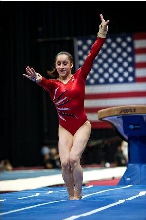
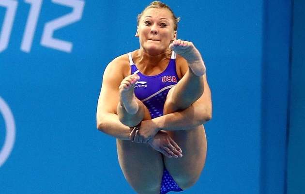
If you've seen sports photography, there are certain poses and angles that really sell the idea of that certain sport. . . in contrast, have you seen some sports photography where the athlete is in an awkward pose or photographed at an awkward angle? I feel like in those cases the photo is not about the sport and athleticism any more, but it's about a strange pose. It really affect the feeling and purpose of an image.
Here's an example of how pose affects the feel of an image . . .
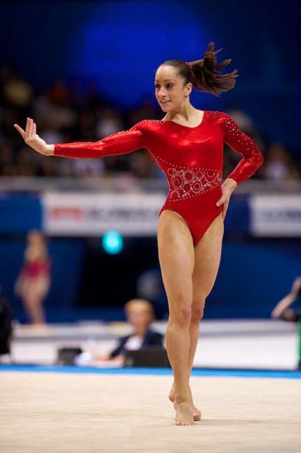
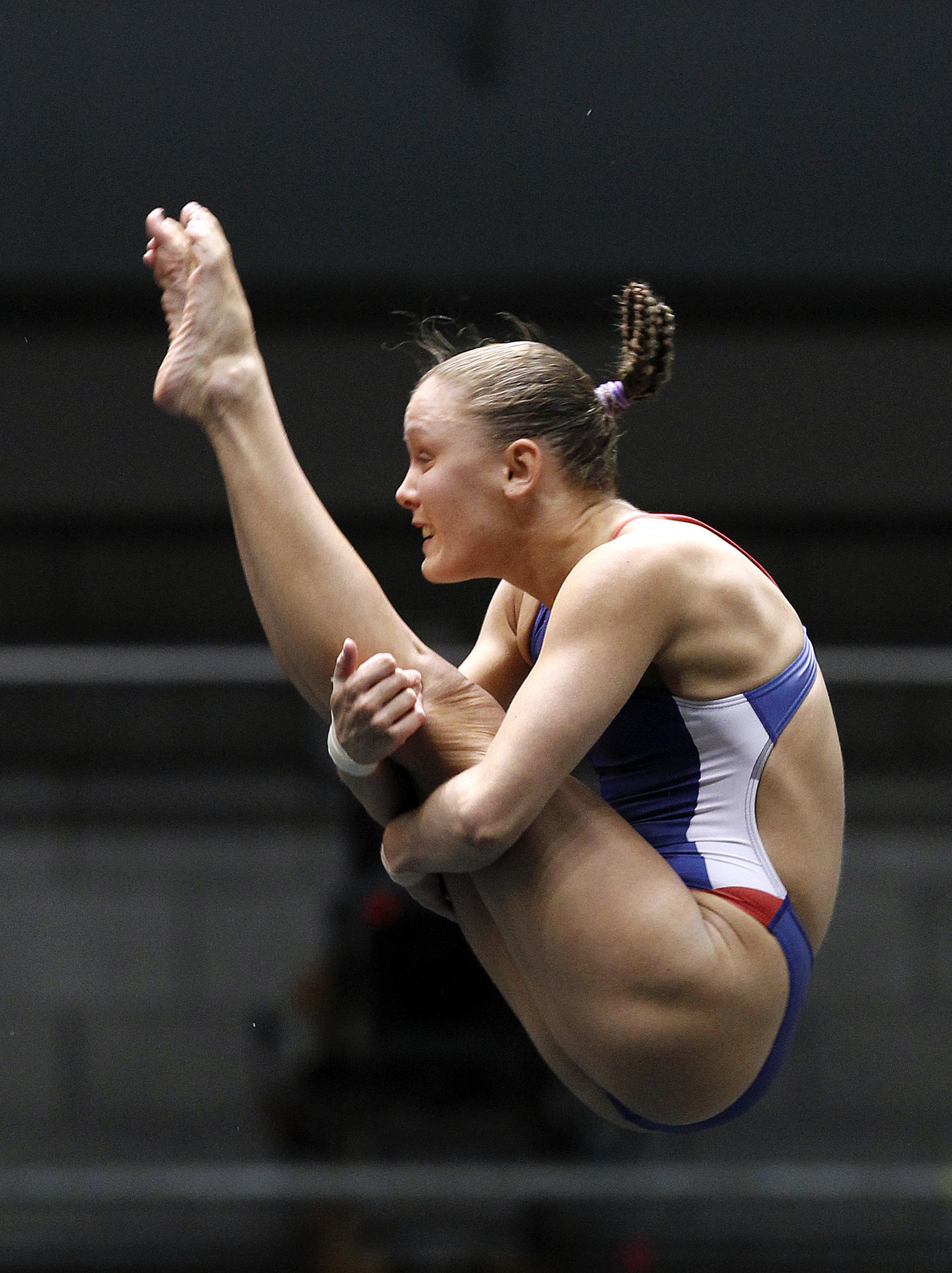
Here's an example of how angle affects the feel. . .
I feel like having her legs crossed kind of wanders into this realm, though not as extreme as these examples. In your reference photo it looks like she is on a diagonal, in a fairly precarious situation. The perspective and the ledge in your illustration makes it look like she is standing straight up on a ledge and she has just lifted up her arms to start climbing and for some reason she decided to cross her leg over the other. It's not how I'd expect a rock climber to start a climb.
If you'd like to improve the image without changing the pose, I'd suggest removing the ledge she's standing on and make her foot rest on a small protrusion or crack in the rock face.. If you're up for it, I would change her legs completely to a pose that sells the idea of rock climbing more convincingly.
Love the lettering you have, especially for "mountain". Really love the way you've rendered her hands. Thanks for sharing!
Website: www.tessawrathall.com
Instagram: www.instagram.com/tessawrathall_art/
-
Disney artists said "Some things are better left undrawn". They were referring to the fact that certain point of views and poses simply look bad in drawings, no matter how good the artist is: it is in the nature of how the brain perceives a photo vs a drawing. In this case, I agree with @TessW that her pose is not working, especially the legs. It is also not the best pose to feature, as Tess pointed out. One way to go is to ask yourself what kind of emotion you want to convey in your pose. Determination? Courage? Self-confidence? Harmony with nature? Some poses will be better suited to represent any of these feelings than others.
I love the lettering, especially how you wrote "mountain"! -
@Marsha-Kay-Ottum-Owen Thanks for your kind words and advice. Yes, it is done digitally. Changes are easily made.
The reference/model had her legs crossed and so when the perspective changed from being more of a top down view to more of a side view it made the legs look odd. It's nice to know what other people see and feel about it before I do corrections.
I'm glad you like the hand lettering. Unsure if the Mountain type looks good with the top part of the text. What do you think?
Thanks so much for replying.An Illustrator loving this Artist community.
www.bobszesnat.com | https://www.facebook.com/bobszesnatart/ -
@TessW Thanks for taking the time to give such a thoughtful reply and thanks for showing your point in the gymnastic photos. Yes, I totally see what you mean about the added edge making the pose seem strange when she is just standing on a standard ledge. I guess that most be my brain trying to fill in the gaps. Thanks for pointing that out. I can now make it much dynamic image once I correct it.
Thanks for liking my lettering as well. Doing lettering is so much fun, I hope to get better at it. -
@smceccarelli Thanks. I never heard that quote before and I'm glad you brought it up. I am realizing that I am attracted, subconsciously, to those dynamic angled photos and they aren't what I should be depended on while using reference. They are great Photos but that doesn't make them great drawings. I am starting to understand this. I looked for some new images of women holding on to rocks that are more straight on.
-
@Bob-Szesnat I think it looks good together.
-
I fixed the legs. She still seems to be on a ledge. Though I think she looks like she belongs there (not as odd, like the earlier version). Thanks for the input everyone.
An Illustrator loving this Artist community.
www.bobszesnat.com | https://www.facebook.com/bobszesnatart/ -
@Bob-Szesnat I am loving the font and linework on this piece. Great work.
-
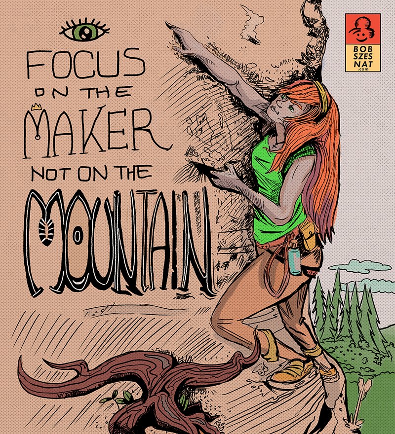
Hi folks, thanks so much for all the awesome feedback. I really think the piece is stronger because of it.
An Illustrator loving this Artist community.
www.bobszesnat.com | https://www.facebook.com/bobszesnatart/ -
@joslyn-schmitt Thanks for kind words
")
-
@bob-szesnat Hi, looking cool:-) If you don't mind, i might suggest one more change. Perhaps you could try to take texture off the sky, so its doesn't mix with the rest.