Feedback on composition
-
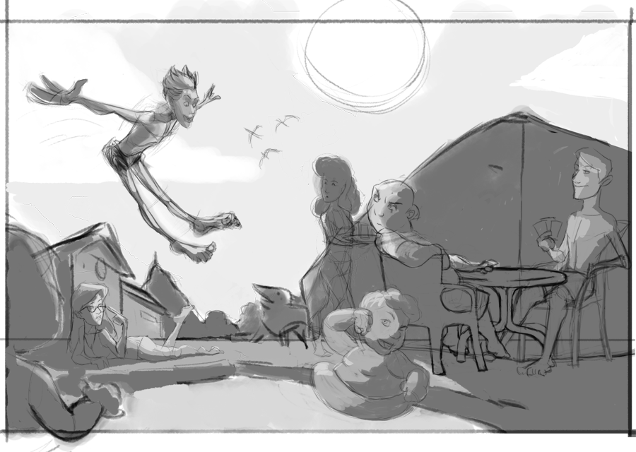
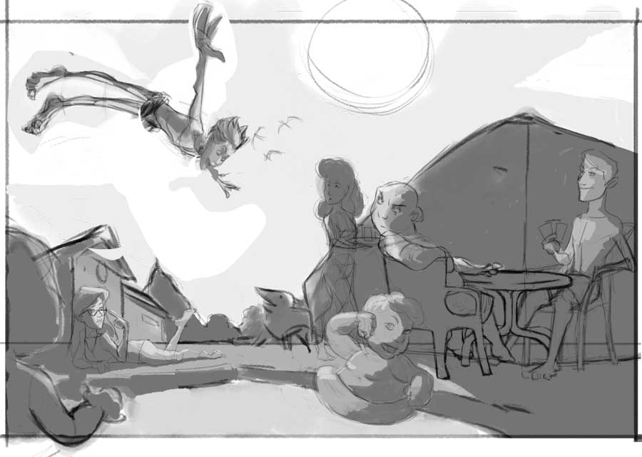
Hi everybody! I'm working on an illustration and before continuing with it I wanted to get some feedback on the composition. I made some thumbnails, then I proceeded with a rough sketch/values. This is what I came up with (I hope you can understand it, some lines are very rough):
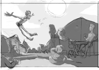
And here it is as a thumbnail:
I believe it reads well, but I'd really appreciate your input. Thanks!
-
Reads well to me! Love the guy jumping into the pool
") Nicely done!
Nicely done! -
values and composition work well. Good job there!
The pose of the guy jumping doesn't look natural to me. Maybe try some other poses...
Good luck!
-
@Marsha-Kay-Ottum-Owen Thank you!!
")
-
@Lee-White Thanks! I really like that pose, but I will try a couple more.
-
@Javier-Algarra I think if you rotate him so his head is in front of his feet it would feel more natural.
-
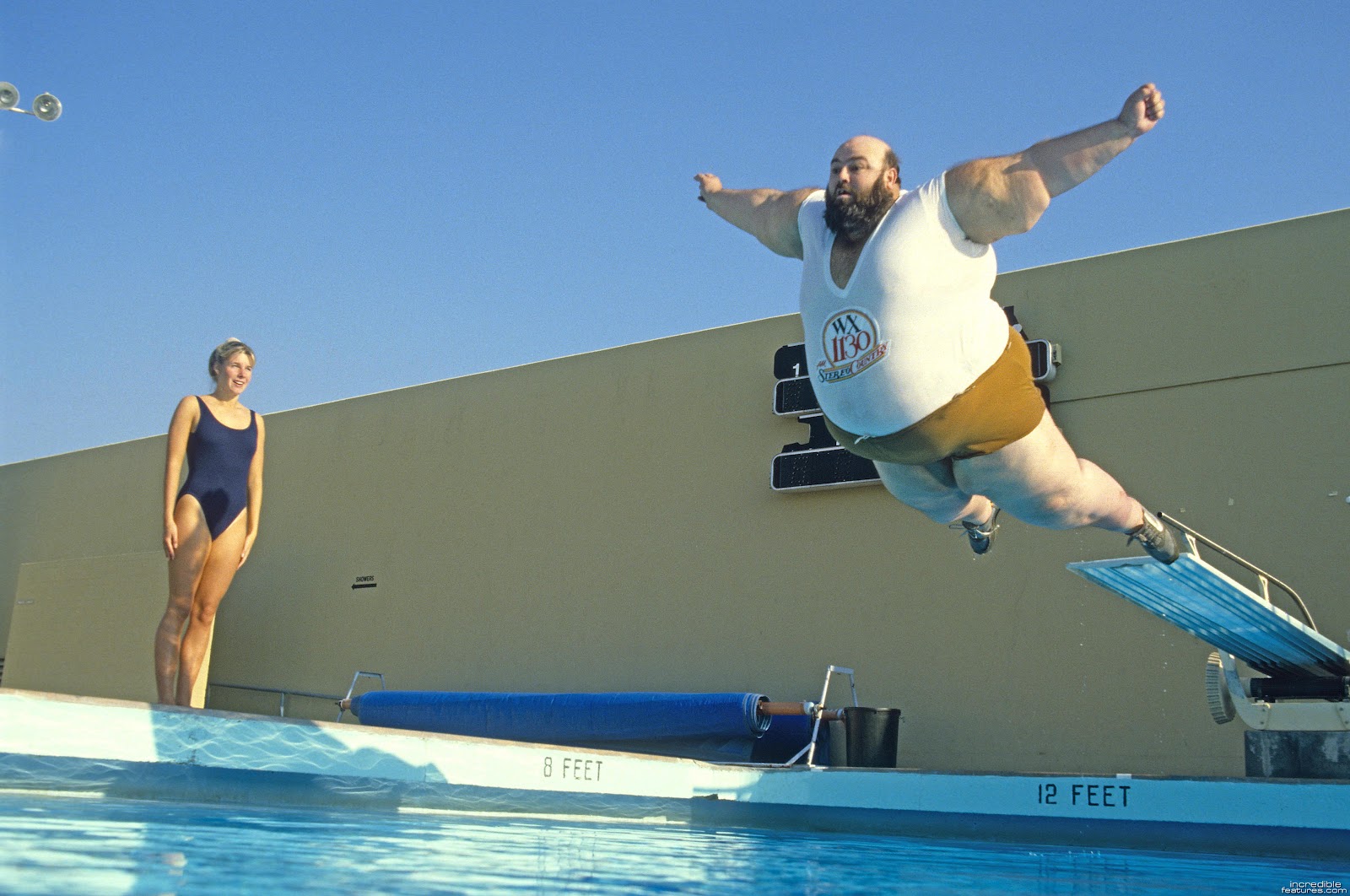
I think the problem is that pose looks like it's right in between an out of control jump, and a dive. His feet being forward is the problem. So you need to figure out if this guy is in control or not, and then design the pose accordingly. Right now it's right in the middle of the two so it doesn't work as well as it could. If he's out of control, make him REALLY out of control. If he's in control, that needs to show as well.
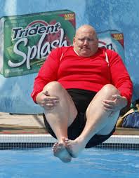
Here's some samples of cannonballs, bellyflops, etc.
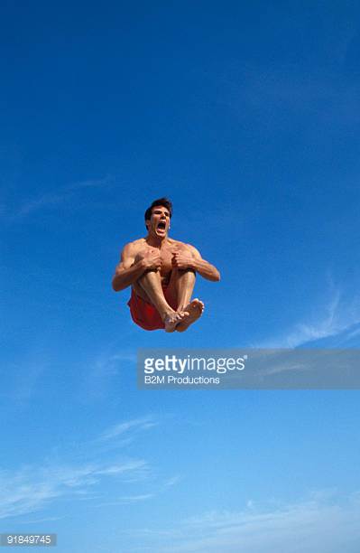
SVS Faculty Instructor
www.leewhiteillustration.com -
@Lee-White oh that bottom picture... ouch
-
Yes, I agree with Lee. I thought the character was going upwards like he was jumping on a trampoline. The cannonball pose would really work much better imho.
-
maybe like this idea...
-
@Lee-White Amazing! That actually works a lot better. I think Im going to try that pose. Thanks!
-
OK, I reworked it with different poses:
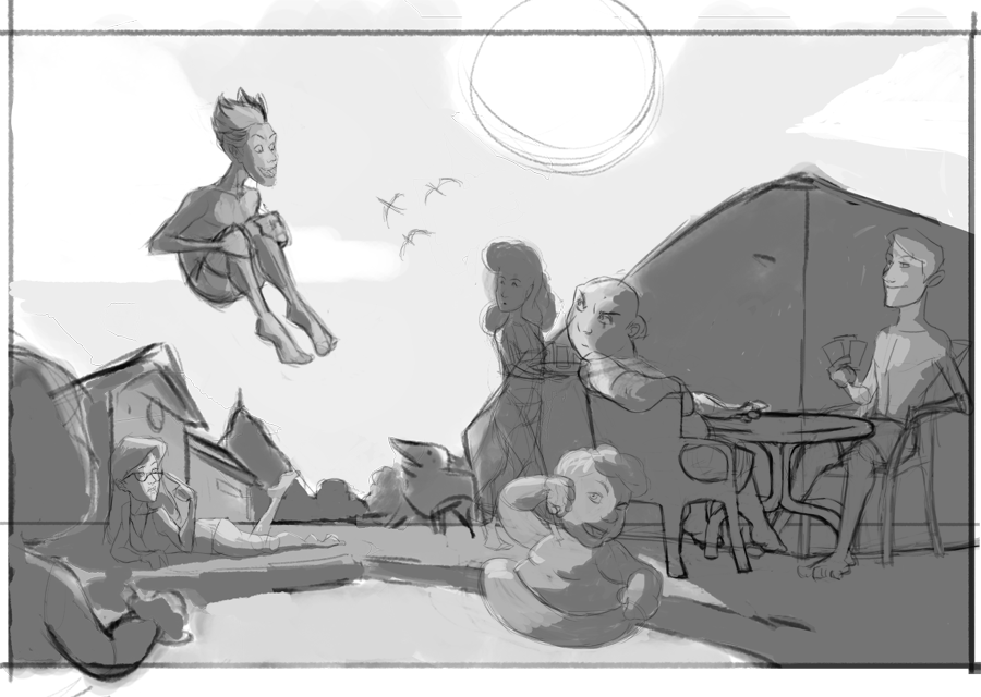
The first and second are the same, just with different angles. I think the second one works the best, but I'm having doubts with the height of the jump. I think it's too high, but at the same time if I lower the jump, it may brake the composition. I think I'd rather have more of an unrealistic jump that works, than the other way around.
-
@Javier-Algarra Great work!! I would go with #2 or #3, I like both!
One thing, I know it's not a final sketch and maybe you are planning to change that already, but the head of your characters (especially the 2 guys at the table and the lady in the water) are really big! I would make them significantly smaller!
Otherwise, it looks good!
-
@NoWayMe Thanks! Yeah I noticed the heads sizes, it's a problem I constantly have, the lady in the water is actually a little girl, that's why the big head
-
@Javier-Algarra You're welcome. I guess Lee knows better though...good thing he saw it!
-
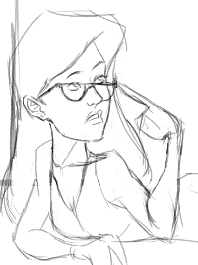
This is something small in comparison to the main action of the character jumping, but the girl the glasses appears to be the only character not looking at him jump. Yet the way she is adjusting her glasses makes it seem as though she has been startled by what I can presume in the announcement of a cannonball. Value wise I think you are set for a nice composition as well. Nice work on that.
-
@Tyler-Hallstrom Yes! That was the idea. I think it'll look better with the details:
-
@Javier-Algarra Excellent! Just what I was thinking, this will look really nice once it is fleshed out.