Treehouse WIP for critique :)
-
Hello everyone!
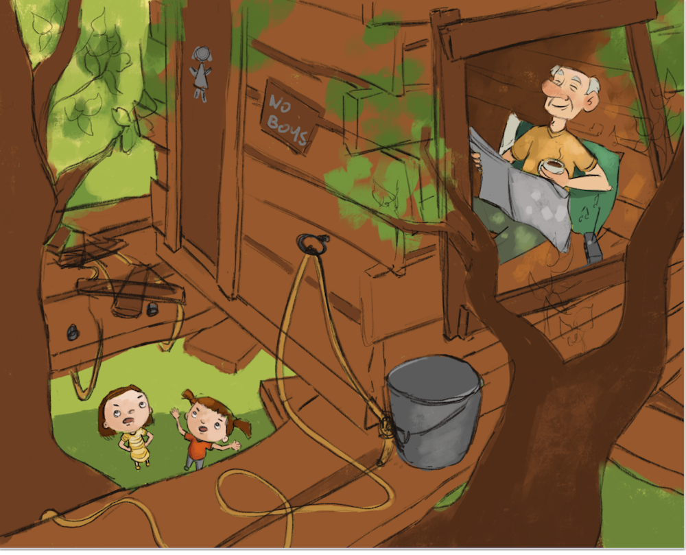
I spent all day working on my treehouse illustration. I made dozens of thumbnails and finally came up with a composition that I like. Then I made a sketch (still very rough), then value study and finally a color study.
I thought I would share it here to see if anyone had tips on how I could improve it before diving into my detailled sketch and final color. I am going for "dappled light" coming through the tree branches.
Thanks!
noemiegionetlandry.squarespace.com
noemie_illustration on Instagram -
Hello! I think this is a nice composition, and I think it will be a great piece to learn about dappled lighting with. My main suggestion would be to lookout for tangent lines. There are a few places where some edge lines are running into each other. (Old man fingers and wood frame , Childs hand and wood, etc.) Moving these things slightly will make things more legible.
Additionally, I would consider making the children smaller. I cannot tell for sure because of the style you have chosen (which is great by the way) whether or not the distance from the ground up into the tree has been taken into account. If the children were a little bit smaller, it might make the tree feel taller (if that is something you are trying to covey.)
Best of luck!
-
Love the concept! Only thing I can see at this point is to watch how you handle the tree branch on the far left. I would darken it up a bit maybe. My eye kind of gets trapped there and I think maybe because of the value and how flat it is at the moment. I'd also think about adding more kid stuff around and in the tree house. A flag, books, toys, carvings or drawings, stuff like that.
Really love the composition so far. It's so fun!
-
@NoWayMe Looking forwrd to swwing it done. I love the composition and teh colors you chose!
-
I agree with about adding more kid stuff to the tree house. Love the grandpa finally getting his peace and quiet up there. Super cute.
-
@NoWayMe I love this idea. It made me giggle when I saw it. Personally, I think it reads well, though I'm struggling to understand composition myself, so I'm not necessarily the best to give input on that.
 The one thought I had was that when you're finishing it, maybe do something with texture or color to distinguish a bit more between the house and the tree. Contact shadows will help too. They are just very similar right now and it makes them sort of smoosh together a bit visually. Good job though! It's looking awesome. And the idea is unique.
 -
I love the idea and the composition is very clever with the double framing. Focal points are spot on on the thirds and if you handle values and contrast as you have started out, it will work out very well.
It took me a few seconds to understand the situation though. I am wondering if there are ways to make it clearer. Maybe you could put a scribbled paper with "no kids" attached with cello tape on top of the "no boys" sign? Also, granpa´s closed eyes are confusing me. Is he sleeping or enjoying? I would try out how it looks with eyes open, reading the paper with a big smile.
Way to go, anyhow - it looks great! I am still wondering if I have time to do anything at all, but I am very tempted.... -
@NoWayMe Maybe swap the girls positions and turn them so they are looking in the direction of the grandpa. I might even have the grandpa sipping his coffee (with eyes open, as was suggested), to make it more clear he is going to have "his" time in the treehouse.
-
@NoWayMe I love it! What a clever idea and the composition is well done.
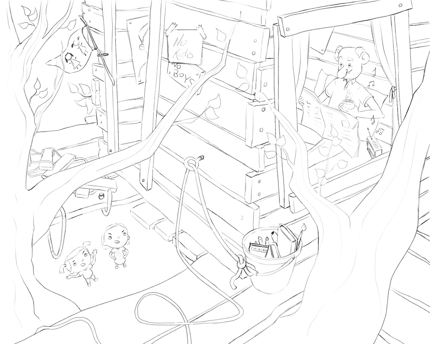
I agree with what others have said before me but just two additional things stand out to me. I think you could give a bit more definition to the ladder (which is of course part of the storytelling!). I'm confused why the wood is attached to the rope in an X manner - why not just single wooden planks across? The X's would be hard to climb up.
The second thing is - and this may be a personal preference thing (which you can then ignore if you want!) - but I find there's a heck of a lot of brown happening in the piece. And it's expected - you'd expect a tree to be brown and a wooden tree house to be brown (just as you have the grass and leaves green too). I'm wondering if you might consider pushing your palette - do something unexpected with the colour. Maybe it'll bring greater interest and unification to the piece. Right now your colour choices seem quite elementary (although I do love the spot of red and yellow on the girls to help draw the eye).
I can't wait to see the final!")
https://danettebyatt.com
Twitter @DanetteDraws
Instagram @DanetteDraws -
I think the treehouse would have a shadow side and a light side even if you have dappled lighting, that would create some variation in the brown color, plus I assume there will be more variation with all the "dappling"?
-
@DanetteDraws Thanks for the comment! For the ladder, this was just my rough sketch, so I fixed it already in my semi-final sketch
For the color, I agree that there is a lot of green and brown! But in the final I have added a lot of kids toys and we see posters decorating the inside of the treehouse so I think it will look better! But it's a very good point! Thanks

-
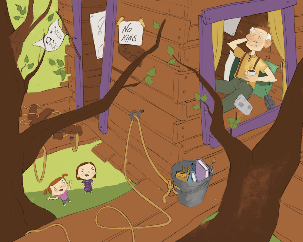
Here is my final sketch!!!
Thanks for the critiques everyone, you all had great points! I did a version with the grandpa's eyes closed, and another one open. Which one do you prefer ?Critiques are still welcome!
noemiegionetlandry.squarespace.com
noemie_illustration on Instagram -
I say closed, he looks so much happier.
-
@NoWayMe My vote would be for closed as well. Just fits the treehouse vibe nicely.
-
@NoWayMe Awesome! I love all the details you've added in. My vote is for closed eyes too.
-
Love this sketch! I'd vote for closed, too, but not holding a newspaper. Maybe with his arms behind his head, cup next to the radio, like he's totally relaxing in the seat. If the newspaper is important to the story, then looking at it with eyes open makes more sense to me.
And I love the "no kids" sign - very funny!
-
Another update! Flat colors
Edit: I just saw a tangent between his hair and the curtain, I will fix that!
@Kat - Thanks for the idea of having his arm behind his head! Great idea! I went with just one arm and still holding his cup of coffee, but you're right that the newspaper was not that important in the story.
noemiegionetlandry.squarespace.com
noemie_illustration on Instagram -
I love it - the storytelling is great!
-
Love it! And I'm glad the suggestion was useful. This is a great story, very fun!
-
Maybe open the girls' mouths more, as if yelling loudly, over the music. And the pink shirt girl's eyebrows need to be a bit more angry (at least the left one). The Grandpa is perfect!