My new illustration style and book
-
Hi everyone. I hope you are well and happy. I am just embarking on my own project, It's been in the works since 2012. I am wondering if you would give me some feedback on my new work. I would really appreciate it.
Thank you in advance.
Have a great day.
Pete
-
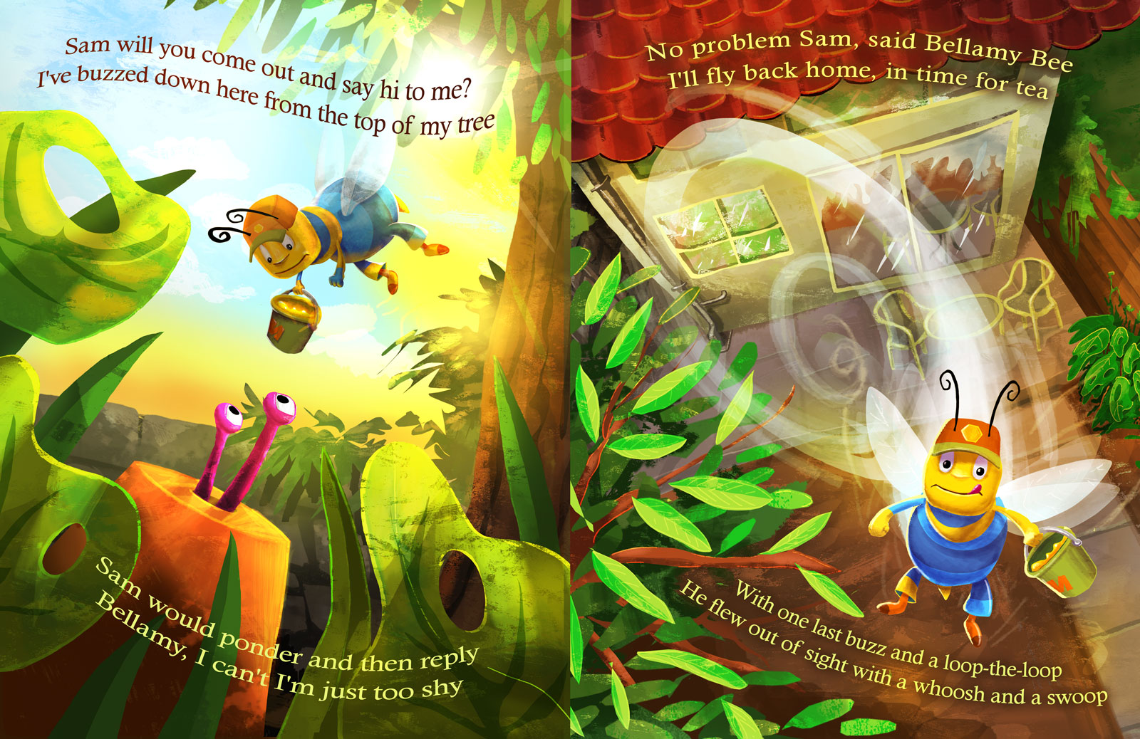
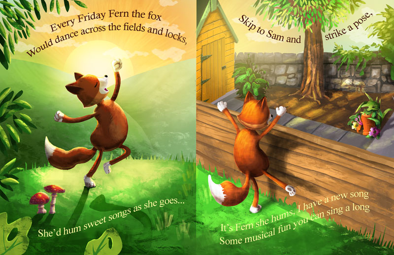
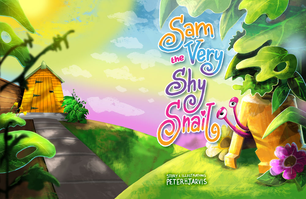
I think this is beautiful! I love the vibrant colors and the character design. The only things I notice that could use a bit of tweaking is the shadow of the fox in the first image is a bit too crisp, a simple bit of blurring should take care of that, and some of the text gets a bit hard to read, it matches the background too well hehe. Now I want to see the rest of the snail!
-
@Lynn-Larson Thank you so much for your reply and lovely compliments. I see what you mean about the shadow. I will have a look at that now. Sam is very shy, you may have to wait a little while.
") Have a great day.
Have a great day. -
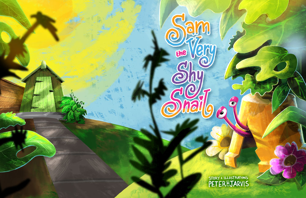
@Peter-Jarvis Very colorful. For the cover/back cover I would remove the foreground plants. My eye keeps going to them vs the character. For the second set, I would give the text more space. Not sure if the text being bent/wrapped is working. It may be hard for a young child to read that.
-
@Chip-Valecek Thank you for your comments. I will make the changes and re-upload to see what works. I'll have another look at the text. As the words were about movement, I wanted to emphasise that. It may not work. Thank you.
-
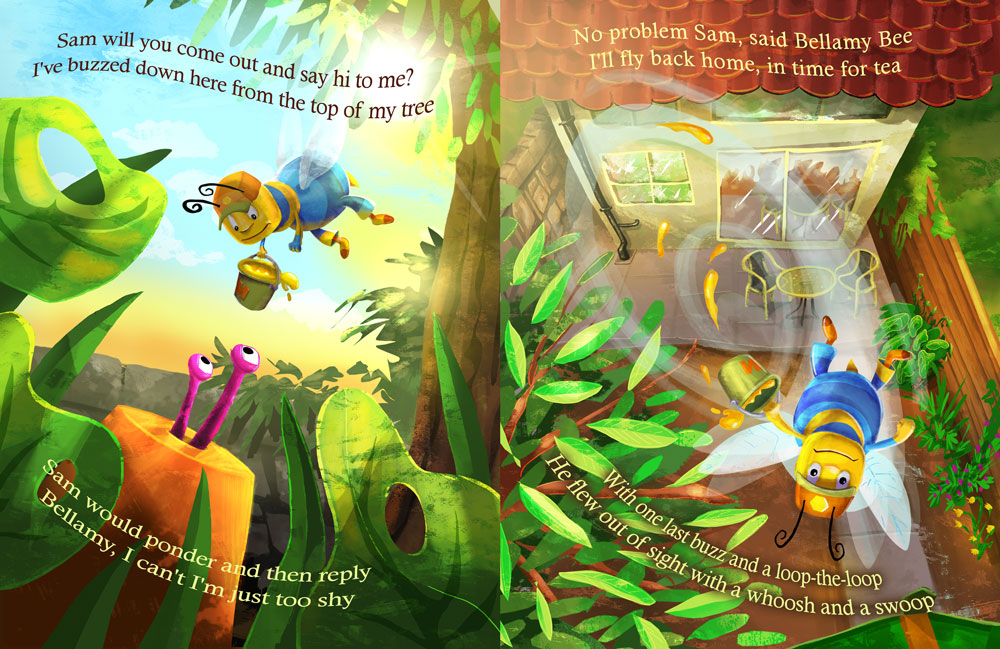
Very cute! I feel that there might be some competition with all the extra details on the first couple of pages. There's so much to look at (and it looks good! You have some cool techniques going on with that swirling bee, etc.) but, it might be a little too overwhelming. The page with Fern, the fox, is really nice. She is the focal point and the background isn't quite as distracting. One more thing that bothers me a little (and it might just be me) but I would like to see the bee that is flying off with her head in the up position facing me..just flipped around. I don't want that bucket of honey to spill! I love the colors and the glowing sun, etc. looking forward to seeing more!
Marsha Ottum Owen
-
@Marsha-Kay-Ottum-Owen Thank you so much for taking the time to reply. I really appreciate it. The swirling bee page has been perplexing me. It probably is that there is too much going on. I'll take another look at it. I had a version with Bellamy the Bee's face the other way around. I will make some changes and upload new versions. Thanks again. Have a great day. Pete.
-
@Peter-Jarvis This is really cute, love the colors and characters. I think the cover would work better without the dark, blurred foreground foliage. It's a bit distracting and feels out of place, removing them may help open up space and let the text breathe. I really love all the texture too!
Happy Creating
www.charlieeveryan.com -
@Charlie-Eve-Ryan Thank you Charlie. Appreciate your comments. I will definitely remove it. Have a great day. Pete
-
Very happy illustrations:) i love the one with the fox. He looks like a cool character
-
@Peter-Jarvis Anytime! I just realized Chip and I were distracted by the same issue.
 Good to have multiple eyes on a piece. Nice work!
Happy Creating
www.charlieeveryan.com -
@Charlie-Eve-Ryan I agree. I have removed it and it works so much better. Thank you. The foliage was to break up the front of the book from the back, but it isn't needed at all. Thanks again.
-
@Chip-Valecek said in My new illustration style and book:
@Peter-Jarvis Very colorful. For the cover/back cover I would remove the foreground plants. My eye keeps going to them vs the character.
I think this is because those plants are the darkest value on the page:
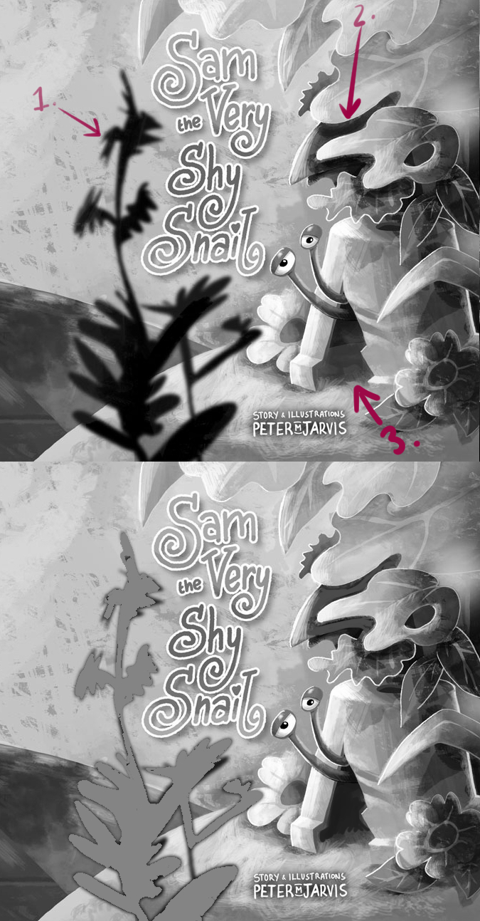
Quick little paint over to show you some areas where I think you could dial back or push the contrast.
-
Super dark plant (and the largest amount of the darkest value in your image)--if you lighten it then it won't stand out as much maybe?
-
The shadowing below these very light leaves is very high contrast, and competes with the snail for attention. Maybe dial back that contrast just a bit?
-
Since this is the focal point, it might help to increase the contrast there. I get the sense that on such a bright day, you'd not really see into the interior of that pot at all--it would be super dark. The snail eye balls are the most high contrast part of your image, so that's working really well I think!
This is just my two cents, and I'm not nearly as good a painter as you, so take it with a grain of salt.

I love the summary colour palette you're using!
-
-
@K.-W. Thank you so much for taking the time to do the value paint overs. I really appreciate it. I totally see what you mean. I'll take a look at it now and re-upload. Cheers. Pete.
-
@Peter-Jarvis Haha your post didn't load until after I replied. xD It looks more spacious without the plant, which works, too!
-
@K.-W. I still think you are correct about the values. I am working on them now. thanks again.
-
With the advances in digital media it is too easy to not do a quick value check on the color illustrations and paintings. I too often still do not take the time or effort and am amazed time and time again how important it is. I might suggest you also look at your text to make sure it has a good contrast from the background, the full range of color in both text and background is going to make it tough to ensure it pops out from the page and is easy to read. Your name at the bottom should be easy enough to put more green around to keep it readily legible. Thank you for sharing your new work and taking us all along for a ride as you are listening to the advice from forum friends and taking your work from great to amazing! These illustrations look awesome and I'm looking forward to seeing more!
-
@WhiteboardJim thank you so much for your suggestions. I really appreciate it.
I have implemented the changes.
Given the text it's own space, checked the levels so that the eyes of the character are the main focus, removed the splashes from the bucket, etc.
I would love to know what everyone thinks. Have I interpreted them correctly?