Sketching Blue Cat
-
Here is my attempt. I think your shapes have more true form and your texture is free, so when you make a line cutting through to define contrast you want the same rules to apply. So an intentional line with free texture.

-
@Eric-Castleman Ohhh, I like that!
-
Really nice simplicity yet appealing design! Is this for your new book?
-
love love your work-thanks for sharing!
-
@natiwata Thanks Nat! This is a BB idea I am working up and freshening up my portfolio.
-
@lmrush Blush, thanks!!
-
@Charlie-Eve-Ryan Beautiful work, as always!
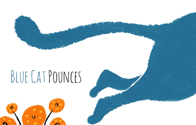
My graphic designer side is SO loving your layout and type treatment too (it's hand-lettered I take it?). Especially the 'Blue Cat Pounces' spread - the layout is wonderful! And I really like @Eric-Castleman's solution to the white line separator.
Just wondering - is the black border supposed to be a graphic element on the page, or just to define where the page edges would be since the background is white? If it's the latter, I'd suggest going back to the simple smooth line, but make it much, MUCH lighter/thinner. There's far too much attention drawn to it right now. On all of my own white background pieces I'll make the stroke about a 50% grey and I think it's around a .25" thickness (for example, one of mine). That way, you can see where the edge of the page is, but it doesn't call attention to itself.
-
Great!
And you are right about the border! Are you trying to give me a heart attack??!!! thanks for including it in the next posts. ; )
-
@DanetteDraws Thanks so much, Danette.
 The font is called Amatic. I don't have a graphic designer background but I do like playing with simple shapes, space, and text. I really should take a class on it at some point. I would probably enjoy it.
Great tip on the border too, I'll try that!
-
@Lee-White Lol I thought of you the second it loaded. I know you are itching to fix that first post!!
My tablet Clip Studio Paint program background is charcoal gray so everything looks "framed" when I paint it and then I post it to a white background and the whole design gets lost. Grr, sorry
