Postcard mailer
-
Hey guys, been a busy couple of months so I haven't been on as much, but was hoping to get some feedback.
My agent is going to be sending out a postcard to 200+ editors/art directors in the next few weeks and I need to send her the art soon. Instead of repurposing an old illustration I decided to make a new one that had a few elements that I felt were lacking in my portfolio: action, interior scene, perspective.
Now I'm down to trying to name placement. Which of these do you think works best for this, ranging from simple to more creative? Thanks!

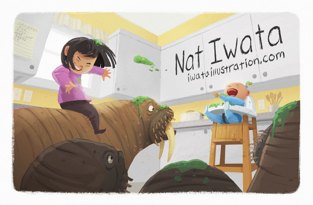
Nat Iwata
www.iwataillustration.com -
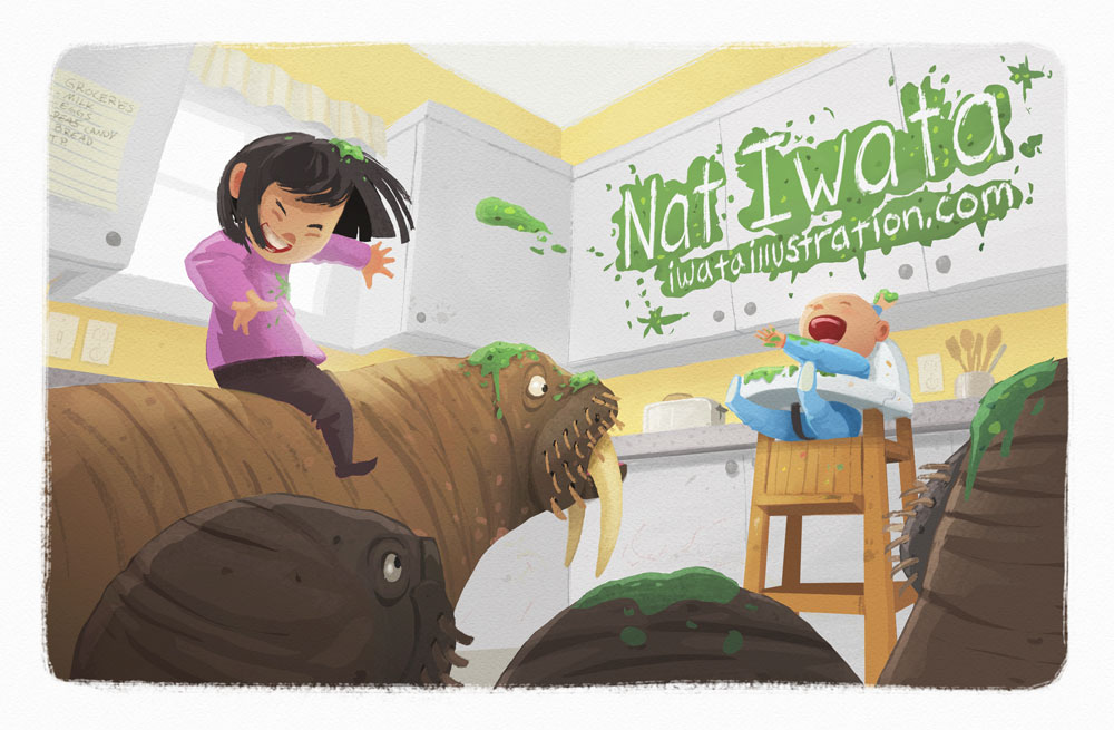
Fun image! I'm definitely a 3rd image (text in the splatter)
It works well with the image (rather than fighting the lines as a horizontal text does a little) but it also shows your ability to do text-image integration which I think is important, not to mention the creativity of such here.
-
#3 for sure
-
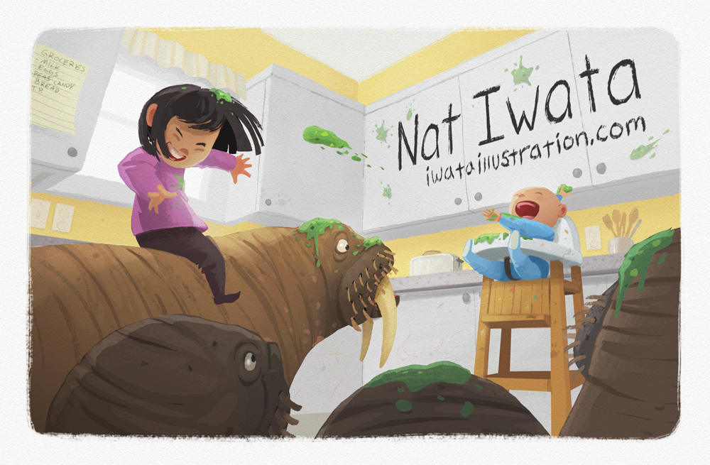
I like #2 best.
-
I love the third postcard! It catches my eye and it blends in with the environment, but it also is strong contrast against the white cabinets. Sounds awesome. I wish you luck!
-
I love #3, it feels more like a part of the composition, and I really think something like that will give you the edge, because it's clever.
-
The image is wonderful! But I have mixed feeling with placing the text on the image. Indeed, I was at a seminar in NY where the AD who was speaking (from Simon and Schuster) explicitly said not to do that - unless you seek work as a graphic designer. That said, I think no 2 works well, though the text may be a bit distracting. In No 3, the text draws too much attention and becomes the focal point of the image - which I think weakens the image presence too much. Just my two cents...
-
Hmm, I feel reluctant to swim against the tide here, but like @smceccarelli I'm not so keen on #3 - it's clever and well-executed but I think it distracts from the story of the image - the food-throwing baby and the green missile that's about to land on the girl. Personally I do like #2...but if it were me I'd go with #1, but also try to reduce the impact of the text (eg make it smaller) - as I'd want the AD to read the image first, then when they love it (because it is definitely a fantastic image!) only then should they turn to your name & website. They need to care about the art first, text second. Just my opinion though - I'm sure you will catch their eye anyway with the great art!
-
#2 - it pops more and it doesn't seem to be as much as the illustration as #3 makes it feel.
-
I like no 3 best i think it is a funny colourful and clever way to integrate the text.Wonderful image also!!
-
Thanks everyone for the feedback! You are all expressing just what I was struggling with, doing something kind of fun and creative or going more straightforward. I definitely what you're saying @smceccarelli and @Dulcie, and I think it does detract focus from the piece. I wasn't sure since it's a post card, the focus is the illustration but also making my name the focus of sorts.
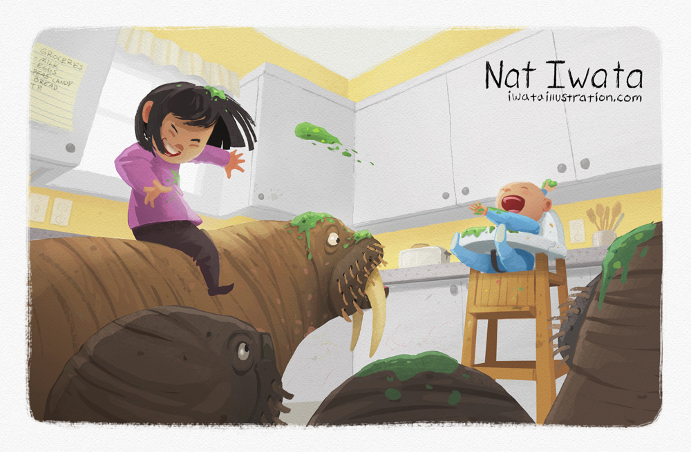
Here are a couple more options of the slanted text with some more details around it or even more spare and having a smaller less distracting text.
Nat Iwata
www.iwataillustration.com -
@natiwata Either way, you're golden! I tend to like integrated text, so I'd like the first of the two, but the 2nd is quite nice too (I like the horizontal like this much better than the first horizontal). To me, the first one looks more like a book cover or even an inside page (and is more playful), the second one looks more like a marketing postcard (which technically it is).
-
I like the first of the two. It's integrated into the illustration without being distracting.
-
I think the mess on the cupboard is more believable than the spotless version.
 But the last text treatment makes sense for the intent of your postcard.
 -
Hi Nat! Love the postcard!
")
However, I have to agree with @smceccarelli . I would opt for no text on the front or at least no text ON the image... I fell like even the small text in the corner distract from the image.. Maybe if you tried putting your name in white in the bottom left corner ? Or pale beige ? So that it's there, but not overwelming... because the image is so beautiful I think the text is just distracting.
In Illustrating children's book part 2 there was an interesting section about postcards by @Will-Terry and @Jake-Parker (video 2, last 20 minutes or so if you want to view it haha!) And Will says he only put his name on the front (no website or nothing else) and on the example he shows his name is not in the actual illustration but below it. He says that if the art director/editor loves the art, they will turn the postcard around to look at your contact info
That's my 2 cents! I really love the illustration
-
Hi Nat,
Love the image, really fun and full of energy!
Whilst I do like the text on the cupboards – the 1st of the two new ones in particular – I think I'd have to agree with @NoWayMe and others that it detracts from the illustration. Having the text horizontally across the cupboards also feels a little clumsy (?) as it cuts across the breaks in the cupboards.
Personally I'd be tempted just to keep your name neatly along the bottom out of the illustration, aligned left or right to the artwork. Whilst this isn't the most "exciting" option it won't distract the viewer from your fantastic artwork, maybe keeping some of the splatter on the cupboards. Just some thoughts...
The character's expressions are really brilliant!! Every time I look at the piece it makes me smile
Edit: Forgot to say - It crossed my mind that a letterbox slice from the image with your name on the cupboards might work nice as a website header image - just a thought...
-
@natiwata I agree with some of the other replies as far as not distracting from the illustration with the text> especially @NoWayMe w/ "Will says he only put his name on the front (no website or nothing else) and on the example he shows his name is not in the actual illustration but below it. He says that if the art director/editor loves the art, they will turn the postcard around to look at your contact info :)"
Love this postcard it looks fantastic! -
@natiwata
Love #2. Great job. -
I've done text on the back and image only on front, but I'm fond of #4 here. It's clever and the splatter/ black text fits the scene. This image is awesome, lots of clear action and an adorable cast of characters. I think you'll fetch lots of attention with them.
I'm working on mine this week for ABLA, too. I need to add several new portfolio pieces.

-
@natiwata I thought i'd throw my 2 cents in even though i have no experience with this
They are all very nice for sure! For me all of the versions with text within the confines of the cupboards are best - the ones where the text overlaps the cupboard/wall and the last one where it comes close to the edge do not read as well somehow - my 6 year old likes the second version and my 11 year old is enthusiastically supporting the third version with the smeared peas - i lean toward the third one too but possibly with the slightest desaturation of the peas on the cupboard (but not the peas in the air or hair)... or a tiny bit more saturation elsewhere?..on the top of the walrus? (some oranges i think) and mid-tones of the girl? - one little thing ....the rounded triangle under the main walrus's tusk pops forward at the moment because of the tangent there and the floor plane seems too high also... i feel like it is a cool forced perspective but that it reads better when i block that small patch of floor ...i think the reason for this lies in the highchair's front right leg (our left) tilting back slightly from whee it feels it should be... there might be a tangent at the bottom of the other leg too where it meets the valley formed by the two walruses ...my eye keeps ending up there - i am wondering if you could de-emphasise that spot somehow? I hope this was not annoying Nat! I tried to be thorough with my impressions even knowing that they may be off - any version will be great i'm sure - it is a really nice image!Edit - i think i have the chair idea wrong.... maybe it just feels like it does not share the same overhead vanishing point as the room ....but the chair may not be parallel to the cabinets? ....should the leg on our right be kicked out way to the right? - there is something there i cannot put my finger on