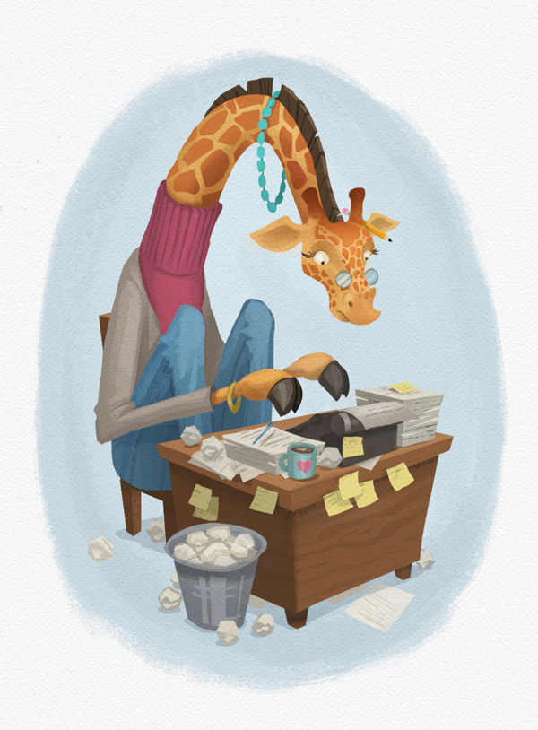
SCBWI logo illustration
-
An illustration I'm working on for my local SCBWI. Will go on a portion of the newsletter. The illustration director asked me to do it and gave a description of what she wanted. Several of you chimed in with feedback on the sketch a few weeks ago. Thanks!
Feedback welcome!

-
Adorable!
-
@natiwata looks great!
-
@natiwata Just taking a second look I really like the texture and sharp lines
-
@natiwata I want to find something wrong with it but I can't LOL. I think it turned out great.
-
LOVE it! This looks amazing! It has a very gouache-y look, though I'm assuming you're working digitally. I do feel like the typewriter is making a bit of a tangent with the desk edge, but it doesn't jump out at me so you may choose to ignore me here

-
looks great!
-
This is really nifty! The details I love, such as the necklace position, the pencil, glasses, heart mug, turtleneck...it just feels like it all fits together. Yeah!
-
Honestly I have no problem with this. Looks awesome!
-
Thanks everyone! I'm pleased with how it turned out and my SCBWI area illustration coordinator loved it, so that's good. Just gotta add the text, which I'm not great at hand-lettering but will try.