Bloku! My childrens book
-
I am writing and illustrating a kids book of my own.
It is scary to try and put something out there from start-to-finish that is completely yours... but it is time for me to tell this story.
The main idea (in one sentence as @Lee-White would have us do) is "Everyone has a purpose". Bloku is the main character and is going to learn a lot about what his purpose is.
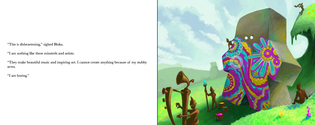
Here is a page from the book. Currently I think I want the left hand side of each spread to be the story on a white background while the right side will be full bleed illustrations to accompany.
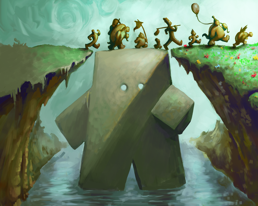
Here is one of my first illustrations for the book. I have quite a few in process and about 25% completely done.

Are there any thoughts/critiques/impressions that might help me with the process? -
I really love the image and the concept - very original and unique (I have been told, unique yet marketable is what people are looking for these days...). I like the style too. I am wondering ,if you plan this to be a single page illustration and not a spread, what would be the size of the book? Are you going for a landscape format?
The only point I would think about is the color choices. At the moment this looks very subdued, with a prevalence of browns and earth colors. If you sample a random selection of children books, you will see the color palettes are generally brighter. I am not sure there are trends around this, I just noticed that my kids shun books that have more adult color palettes and that (together with the general prevalence of brighter colors in picture books) makes me think that there might be something like age-appropriate color-space...if it makes any sense. It is just a gut feeling, no proof of that. -
@smceccarelli Thanks for the ideas.
Yeah, the color scheme could use some punch. I have experimented with that a little. Here is a spread I am working on.

It certainly has more color (ignore the weird marks like the blue line and the grabber circle in the middle of the image - they are from InDesign) and I think it is more representative of where I am headed.
The book will be 10x8 and landscape. -
@Bob-Crum Hi, Bob! It is really interesting to follow your journey.
 Thanks for sharing this.
I am wondering for which audience you are writing. Will it be for early readers? I find this decision very tough yet super important. It would be great if you would share your thought process about it. -
Awesome thanks for sharing keep us posted!
-
@Jana Thank you!
I would not consider this an early reader... more of a guided reader book (something that kids and experienced readers read together). There are some didactic aims that I have for it so I am sprinkling some bigger vocabulary into the manuscript and then having a glossary in the back. This coupled with a strong moral of finding purpose and value might make for a good kids book.
Great questions. -
I love this.
I love everything about this.
I would buy this book in a heartbeat based off of what you've shown here.
-
@Bob-Crum Love it! The concept, characters, style, it looks great thus far!
In response to what @smceccarelli is saying about the subdued colours... I would think in general that yes, brighter colours are the way to go for children's books - but has anyone noticed just how BROWN Jon Klassen's illustrations are?! Or dark overall - and he wins awards/sells millions of his books! I'm sure he's the exception rather than the rule, but just sayin'...
-
@mattramsey HA! That's awesome. Thank you so much.
-
@DanetteDraws Thank you for just sayin!
I am starting to go through my spreads and laying in some color - I doubt I will land amongst such lofty company as Jon Klassen! -
I really like these illustrations.