Hobby project: Grimms fairy tales
-
Hey guys,
I had the idea to tell a story bringing together different characters of Grimms fairy tales. The main character is the donkey from the Bremen Town Musicians. With the text I am more or less satisfy, just needs some polishing. But I am struggling with the illustrations. I was half way through when I fell into the yucky state (I learned this word here in the forum ;-)) I am not sure anymore if I have chosen the right style. I am positive that you guys can help me overcoming this.
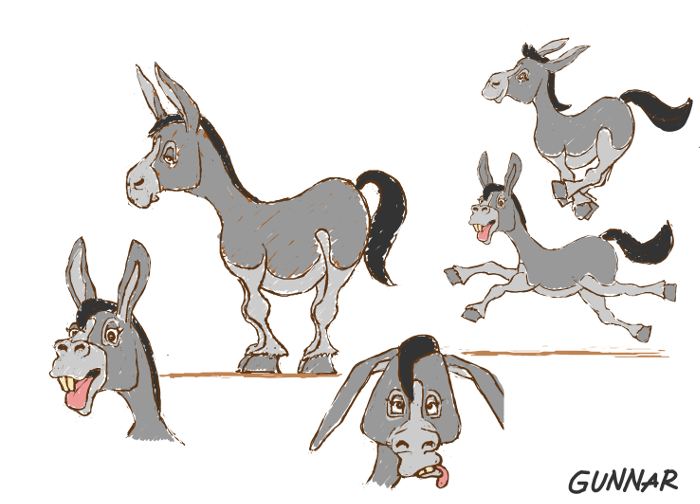
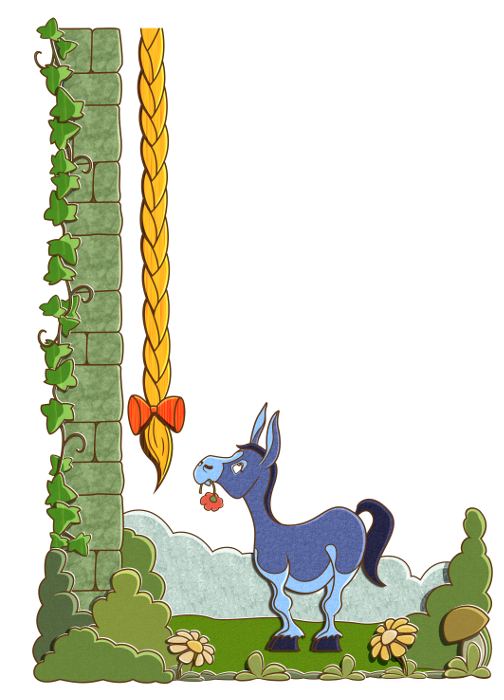
I will show you the first sketches of Gunnar the monkey and an example of one page. My concerns are:
Is the style to static? Is the style right for the Age of Kids who should knoe already the original tales. -
-
I am looking forward to any feedback. Thanks, guys!

-
@Jana These are great. I like the idea of pulling the whole grimm world together into a single story, cool concept. What apps and process are you following?
-
@RobinSlee Thanks, Robin. Glad you like it.

I am using Gimp. For the line work I am using the path tool. Then I am coloring it and add the white margins and shadows to give it a paper cut look. Finally I add the textures.
Recently, I got photoshop. But believe it or not, I have been so into Gimp for several years, that it is hard for me to switch. At least for my approach Gimp works out really fine.
Bests! -
Today I have a question about the type of text alignment which is prefered for an illustrated story book for early readers to have an idea how a finished page might look like. When I checked some examples I found justified but also left-justified texts.
The illustrations are planned to have no specific background, as in the example above, and blend more or less into the page. Therefore I think the more lose impression of a left-justified text would fit better.
What do you think? Thanks in advance for sharing your experiences.
-
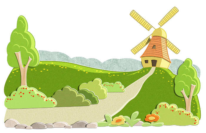
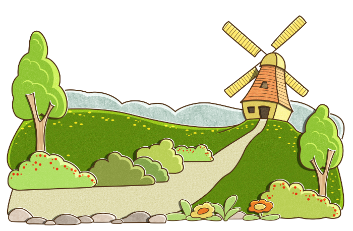
I want to show you another illustration for the Grimms story. I planned it as a half page illustration with text appearing above. There is still donkey Gunnar missing, who will be placed in the left bottom corner starting to walk up to the mill. So there will be another blue spot in the image. I am shooting for a kind of stage set design, where the elements are kind of stacked one behind the other. What do you think about the amount of details? Is it enough to draw kids attention?
-
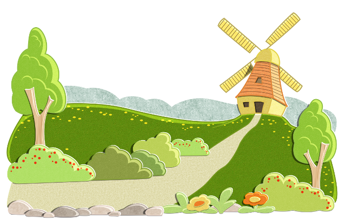
Something was distracting me when I looked at my last illustration. And I guess it was the dark lines. So I changed it and colored the line work in a similar color as the objects. I like it much better now. It is closer to what I had in my imagination.
It needs some more polishing. I am still not 100% happy with the flowers in the foreground...
-
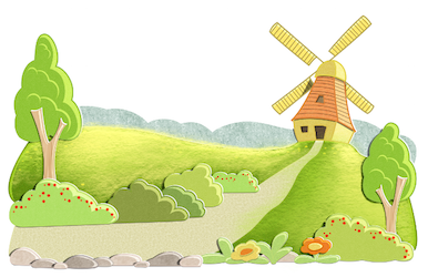
@Jana Hello Jana - i like this piece a lot - it looks like a very inviting image - one thing that keeps me wondering about it though is the rim lighting - most things are lit in a golden hour type low raking light coming from the right and slightly above the horizon - the two hillsides are lit with a different light and from differing directions from one another (it seems) i think possibly the two hillsides would be lit much like the side of the windmill with a brilliant yellowish light - i am not the most competent painter and did not try to match your cool stylization but i did a quick paint over to see what it might look like ...it does not look quite right in my paint over but there is something to it i think(i should have darkened the shadow sides of the trees a tiny bit towards the blues i think) - anyways.. feel free to ignore - i look forward to your next pieces

-
@Kevin-Longueil Hi Kevin! First of all Happy New Year to you and your family!
Thanks a lot for your feedback and ideas. I agree now that the lights on the meadow need some changes. I totally like your rendering, but I share your concern that it does not really fit the style. So I tried to convert it in the style of the image. I guess it can be done better, but this is what I came up with. Next I will work on the green tones of the bushes and flowers anyway, maybe I came to some more ideas with the hills. I also tried gradients but they also were kind of clashing with the rest of the coloring.