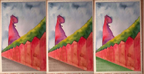
Working on a new water color painting (need help)
-
sorry for the link instead of posting the photo directly here (no clue why I can't post photos anymore)
Here is the picture I am working on https://www.facebook.com/EJCastleman/posts/863912530410222:0
I know that I am suppose to have this all mapped out beforehand, but I had to change things on the fly, and now I don't know what color to use for the ground. My color theory is garbage.
-
@Eric-Castleman Hey Eric - i think your painting is looking good! I painted the triangle of the ground a mid gray red and ran it through the sliders in procreate to see what colors would work for my eye - gray - brownish gray - or green - were the ones that seemed to work for the image - anyways - hopefully someone with some color skills will chime in - but i think those are where i would go - maybe mess with procreate too and see what you think


-
The dinosaur has so much character! He really stands out against that lovely sky. The red fence, however, competes too much with him. Try putting a few washes of a different color over the top of the fence...maybe blue (like in your sky). Your goal is to cool the color of the fence so the red dinosaur really pops. Do the washes over the ground and a little on the hedge to make them one foreground rather than 3 separate components. If I were doing it on a computer, I would try a purple multiply layer over the whole foreground. I wouldn't change the dinosaur. It is beautiful and the texture created by the watercolor is wonderful!
-
Agree with @Joy-Heyer . It´s a lovely illustration, but the red of the fence is so dominating that it takes away from your composition and focal point.
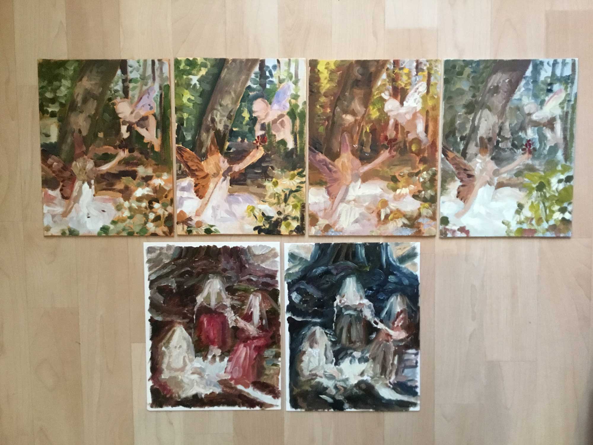
If I may dare a piece of advice, I would really stress the importance of preliminary color-studies. I used to do them also when I was working traditionally, so it is not a privilege of the digital world. I used to make a reduce-size photocopy of my lineart - several copies, as small as 2 inches, sometimes slightly bigger, depending what you are comfortable with. I worked a lot in oil, so I used paper for oil and acrylic painting, obviously you would use watercolor paper. Then you can paint very rough mini-paintings, just to get a general sense of the balance of colors and values. These really cost very little time (in oil about 30 minutes each, in watercolor probably less) and saves a lot of headache and time-consuming adjustements down the road. It is a practice that all major illustrator and artist across the centuries has been using. I positively hunt for books on process and I have books with Leonardo´s, Rembrandt´s and Rubens´ color studies, aside with Frazetta´s and Rockwell´s collections of color studies. It´s good examples to follow ;-)) -
Another thought...the foreground (hedge, fence, and ground) is exactly 1 half of your image cut diagonally. Try cropping so that the foreground is 1/3 of your image. That may remove most of the ground. It will also make the the dinosaur a more prominent figure in your image.
-
@Kevin-Longueil i love how that looks. How did you pull that texture off in procreate? Also, how are you saving your images on your ipad/iphone and making sure they are compadible with this forum? That is the problem I have been having.
@Joy-Heyer thanks for your insights! I am going to do repaint of the whole thing because of what you said. It makes total sense, and was wondering what was wrong with it. I think I will draw a few sketches with the fence and hedge lower down, and maybe enhance the size of the dinosaur. Maybe a brighter blue fence, idk. I will do some studies first, then post those here.
@smceccarelli as always, you give me great advice. I have tried looking up value studies for traditional artists, and can't really understand how that fully works. Likewise with color studies, I am confused as to how to understand which colors go well with each other. All these years I have been just drawing and painting copies of other peoples art, and until now, I thought I was so good at color, but now just realizing I was just like a cover band. May I ask if you know of any great resources for preliminary color studies? Color seems to be one of the hardest things for me to figure out.
Sorry it took me so long to respond. I have been so busy with my son and some graphic design work. As you can also tell, watercolor is such a new thing for me that I spell "water color" wrong in the title and my first post. Thanks everyone for the help.
-
@Eric-Castleman Hey Eric - what i have come up with is sending my drawings to my macbook from my iPad - hit the little wrench icon at the top left in Procreate - tap Share - tap Share Artwork - i usually send a PNG...at this point i either drop it into dropbox if it is a final or send it to an email i have set up from the iPad - ....i then open the email on my laptop - reduce the pixel length to 900 or 1100 pixels in the long direction - and then i can upload to the Forum - ....sounds like a lot of work but it takes about a 2 minutes to do -... the brush i used is Nikko's Pencil - it is all i have used for brush and eraser for a long time .... i love it - the ground plane in your painting it is just six swipes with that pencil at a low opacity - i didn't try to render really - your watercolor will look way better ! - i look forward to seeing the finish on this!
-
@Eric-Castleman I opened some dusty drawers and here are some of my old oil color studies together with the finished paintings.


This is very old stuff - I sort of still like it somehow but it is clearly legacy. Anyhow, you see how rough the color studies are - these are pretty big, around 5 inches or so. You can pretty much do trial and error on this scale - no big loss of time or materials and you can make interesting discoveries - with no fear of failing.
There is a lot of books about color, some of the best ones are those from James Gurney. There is also a very old, very controversial little book that I swallowed whole and really opened my eyes: Creative Color by Faber Birren. But he is a maniac and his writing and design is pitiful - there are a couple of real gems in there that changed my life, but it takes some masochistic tendencies to read the whole book...Really, practice and looking at art is probably the best school. Limited palettes are also a great training. I still remember when we were forced for 15 weeks to paint only with green and red (in different variations, but no other hue was allowed)The color tests from Frazetta are available in a lean book called "Rough Work". He did them in watercolor (though he painted in oil) and they look like this one:

James Gurney shows a lot of color thumbs in oil in his book "Imaginative Realism". And of course there is the whole chapter of color scripts (the whole color scripts of Pixar are available in book form - many of those were done in traditional media, mostly pastel), for which a lot of resources are available in print and online.
In essence, there is no shortage of examples of color studies in traditional media, and it is really the best way to learn about color. If you do a little research, I am sure you will find something that appeals to you. -
@smceccarelli-what wonderful color studies and finished paintings! Do you miss working in oil?
@Eric-Castleman-the SVS course Painting Color and Light is very helpful. The Marco Bucci videos talk a lot about color, particularly Digital Painting 2 video's #2: Color Rough and #6: Bonus Lecture Light and Color. And, if you don't have a subscription, here is a good one he did for his youtube channel: https://www.youtube.com/watch?v=nINus0lYQjo. I agree that it helps to have a limited color palette. It is nearly impossible to make color too complicated when you only have 2-3 colors to choose from. Lee White's illustrations are a good example of limited watercolor palettes--there are quite of few color palettes he uses that would be a good fit for this illustration. Hope that helps! Good luck!
-
@Joy-Heyer Some part of me yes....I loved oil wholeheartedly, for me it is the king and emperor of all (traditional) mediums. Maybe watercolor is the queen and pastel is the bishop

But whenever I am stuck with working traditionally (like for portrait stuff, or now with Inktober) I get so upset at all the effort that goes into setting things up, preparing substrates and mediums, finding the space, etc...I always end up saying to myself "never again!". Maybe it will grow back on me with time, but for the moment I remain an happy convert to digital
-
Did another painting. Still need to draw the other arm in.
Went with a different color scheme. Does this work better?
-
@Eric-Castleman Much better! And I love the buildings in the background. Nice addition.
-
I agree it's a lot better - really nice work! Love the textures and the colours
