Composition feedback
-
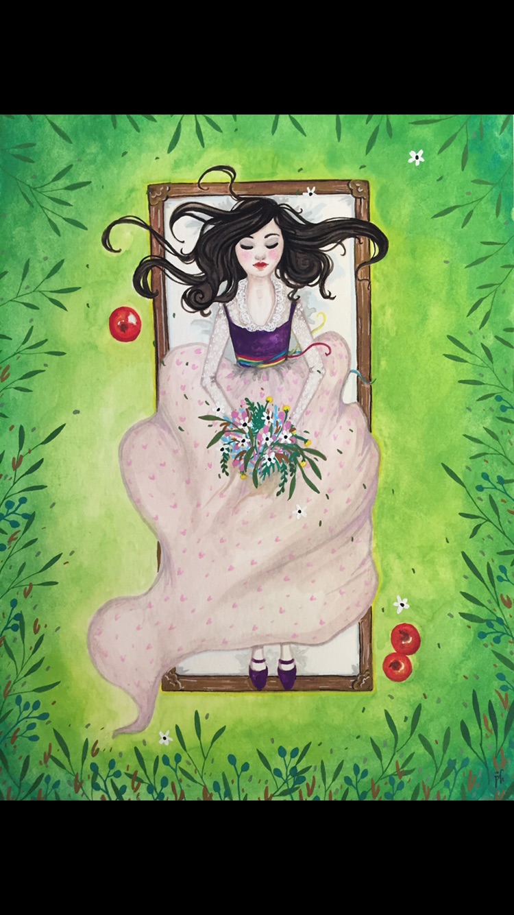
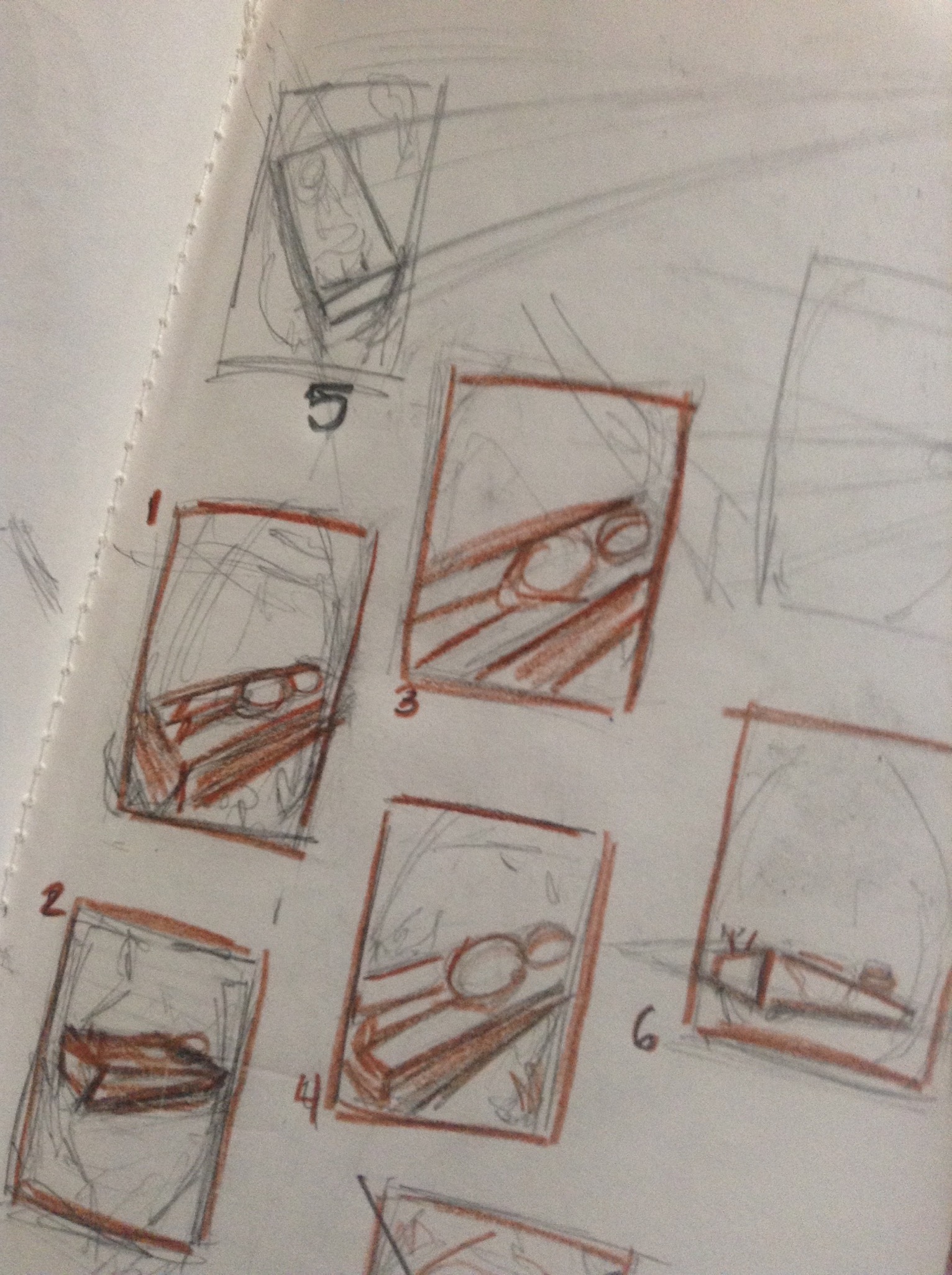
I posted this is my sketchbook, but I think it got lost so I'll post it here too. I'm attempting to take this waaaay too bright and poorly composed Snow White I did and add give it an SVS makeover. I'm attempting to put the box in a perspective that will make for a more interesting piece. I've drawn some thumbnails that I'd love some feedback on and I'll definitely take suggestions for other layouts. Thanks everyone! Sorry they're so messy.
-
@Pamela-Fraley The thumbnails would be a bit too rough and vague for me to be able to choose one. At a first glance, I would exclude number 6 because from that angle you would see almost nothing of Snow white - only the hair, the feet and a slither of the face. It could be a very emotional composition, but you would need to add something to hold attention. 3, 4 and 1 are the same composition with a different level of crop. So theoretically you could work on 1 and then crop it closer if you thing it works better cropped.
I would probably evolve number 5 - it is still a top view angle but more dimensional, so you could have the same kind of emotional content of the original illustration but with a more dynamic composition.
Just my thoughts")
-
@smceccarelli Thank you. Yea its all pretty rough. I guess the big thing I'm wanting help with is box placement but I don't really think about the cropping thing because I do everything traditionally instead of on the computer. That makes sense though. I'll work on these some more.