Inking with watercolor
-
I have used inking in certain ways throughout the years, and since coming here I have become aware of many different inking techniques. I love Lee White's way of inking his watercolor paintings, and am going to be picking up some tools this week to further that sort of skill into my artwork, however, what my main goal right now is, is how I might be able to use ink in more of a complementary way than I do now. I saw someone post their 3rd Thursday entry, which was a bird on a cage with a key (can't find it on the forum anymore) and I really loved the line work. It was only inked in certain places as more of an accent.
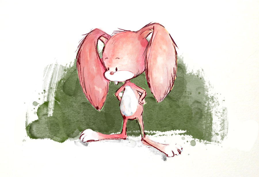
Anyways, here is a recent little character I threw together, and tried doing a more complementary style, but I still feel it needs more work. Anyone know what I am trying to get at, or have any pointers?
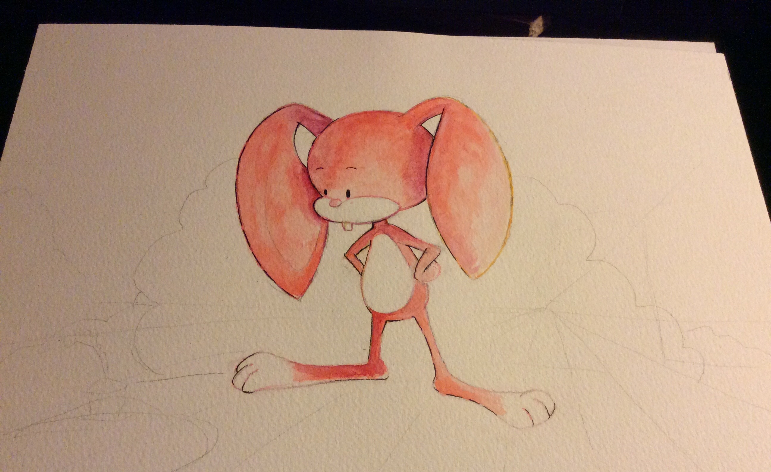
-
@Eric-Castleman Hi! That was my piece you referenced with the bird on a cage, glad you liked it

I really relate to where you are coming from...I was going to reply to your other thread about different styles, and feeling torn between a looser inky linework style, and a more tightly rendered style....but other people made such good replies there, I felt I couldn't add anything. But I feel the struggle too.
About using ink in a more complementary way, the artist I've been very inspired by, is Catherine Rayner (I know I've posted about her before)...she uses acrylic inks and linework in a very loose way where the linework is often more of an accent than an outline - http://www.catherinerayner.co.uk
(If anyone else has suggestions of other artists who use linework in a similar way, I'd love to research them too)
Are you planning to do Inktober this year? That might really help...just doing lots of little sketches, to play with the ink and see what happens. So many ways to apply it too - not just pen but dip pen, brushes, even sticks or cocktail sticks....maybe get a whole array of items and try to use all of them during Inktober. I'm planning to do it too, and hoping it will help cement the looser style in my brain

-
@Dulcie glad you replied. I really like you work, and am going to keep an eye out for you piece this coming Thursday live critique.
I really love the artist you linked to, and immedietly felt my goal in illustration was similar to her style as well. Though, I'm wonder what your process may be when trying to borrow from another artists style - do you copy one of her pieces, or do you draw something of your own and try to make it look similar? I am thinking about filling a whole art book with mimic art work of others, and assuming that it will be put into my brain naturally, but maybe there is another way of getting their influence into my work.
-
@EricCastleman Thanks! Yeah I would say to learn another artist’s skills, I would do both of those things, but I would really recommend doing a master copy most of all (which is trying to copy a piece exactly, no tracing, and trying to be as close as possible with the result).
It was recommended by both Will and Lee here at SVS as something essential when learning, and I’ve found that somehow when copying, it’s like you are walking in their shoes a bit, and your brain starts to learn the methods in a deeper way than just trying to do your own stuff in a similar style. Then once you do copies of several artists you like, you’ll have bunch of skills that will transfer into your own work and it will start to be your own unique way of using those skills.
So yeah, having a mimic art book would be a great idea
 Do keep us posted!
 -
@Dulcie here is the finished picture. What would you have done with the ink? You don't have to actually draw over it, because I don't want to take your time, but maybe you have a critique.
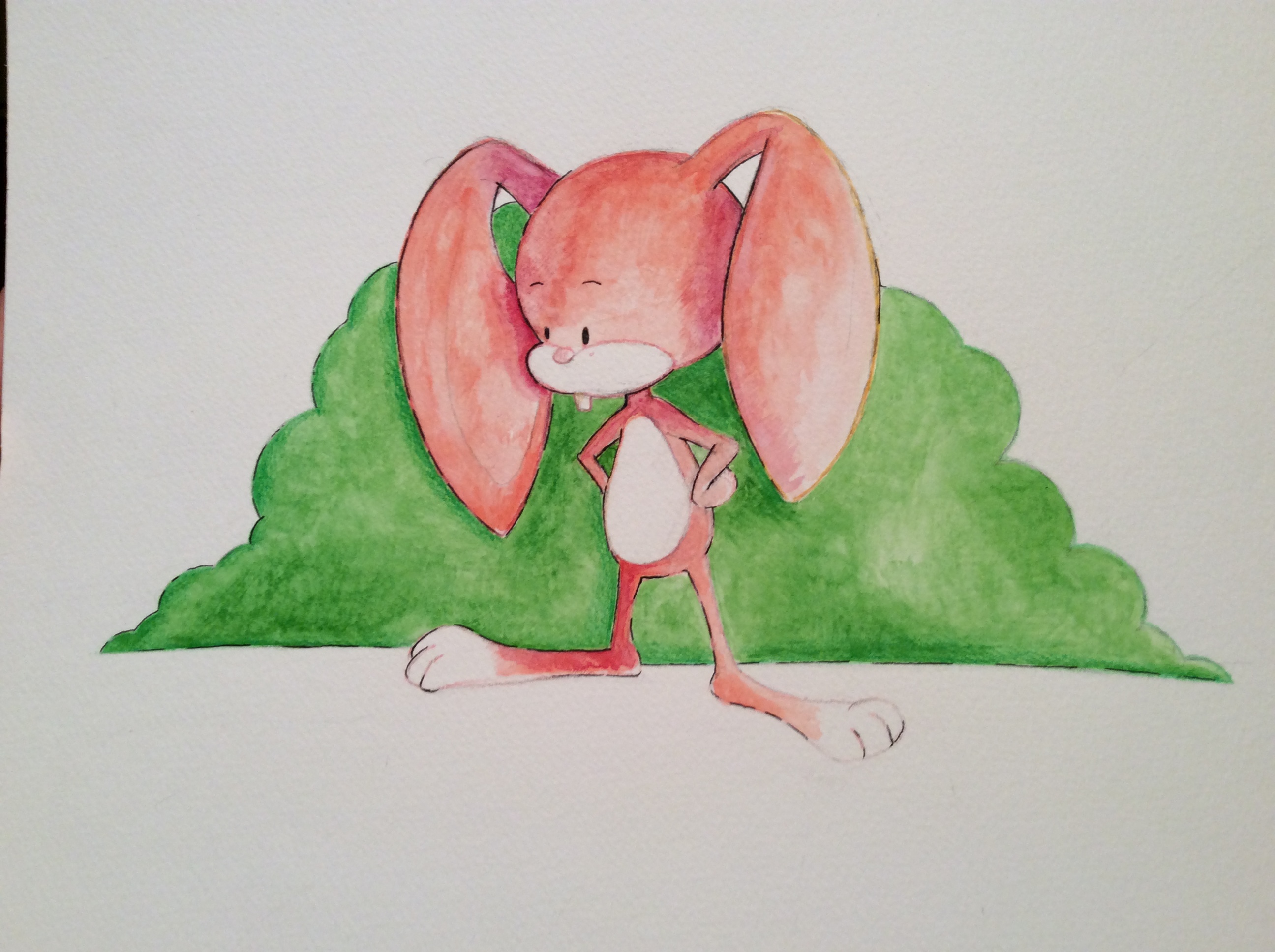
-
@Eric-Castleman Happy to be asked

Some thoughts on using ink - not saying you or anyone should necessarily do the same, because I'm also very much in learning mode too! ..but if it helps:
-
I usually use a dip pen or brush pen when doing inking, because you get different line weights depending on how hard you press. I think doing something like that would really benefit here...the variation in line weight helps make it more interesting.
-
I like the fact that you broke up the line, it's not all continuous and used only in certain places.
-
I'll sometimes use different colours - either switching to coloured pencils, or using coloured ink for dipping, if I think black is going to be too heavy. This is really a matter of personal preference and I haven't settled on one myself, I think it depends on the piece.
-
I try to think about using the line to describe other things than the outline - eg whether it could describe the texture of the object, or the shading, or the plane of perspective even....so it's not just a barrier between one colour and the next. Then only picking out certain places to describe those things with the ink. I think you could use ink here to describe the fur on the rabbit more, that's probably the biggest change I would make.
Hope you don't mind but I did a draw-over as it was easier to show, please excuse that it is a very quick sketchy digital version...I lightened up your original only so I could show the line better on top - I like your bold colours and the pinky-peach colouring
 And of course you could do the same/similar with black ink if that's your preference.
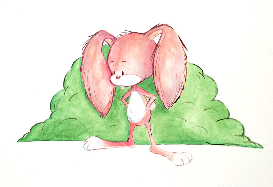
Hope that helps a bit, please do keep us posted with your progress!
-
-
@Dulcie great tips. I also really love what you did with my picture. Goes to show how some good line work can really bring a piece to life.
I think one of the things that has been limiting me is not having a fountain pen. I use hard tip ink pens, which don't give me any freedom to create thicker lines with pressure. I should also check out a brush pen.
Here is the beginning of my artist study btw. I started with some Quentin Blake
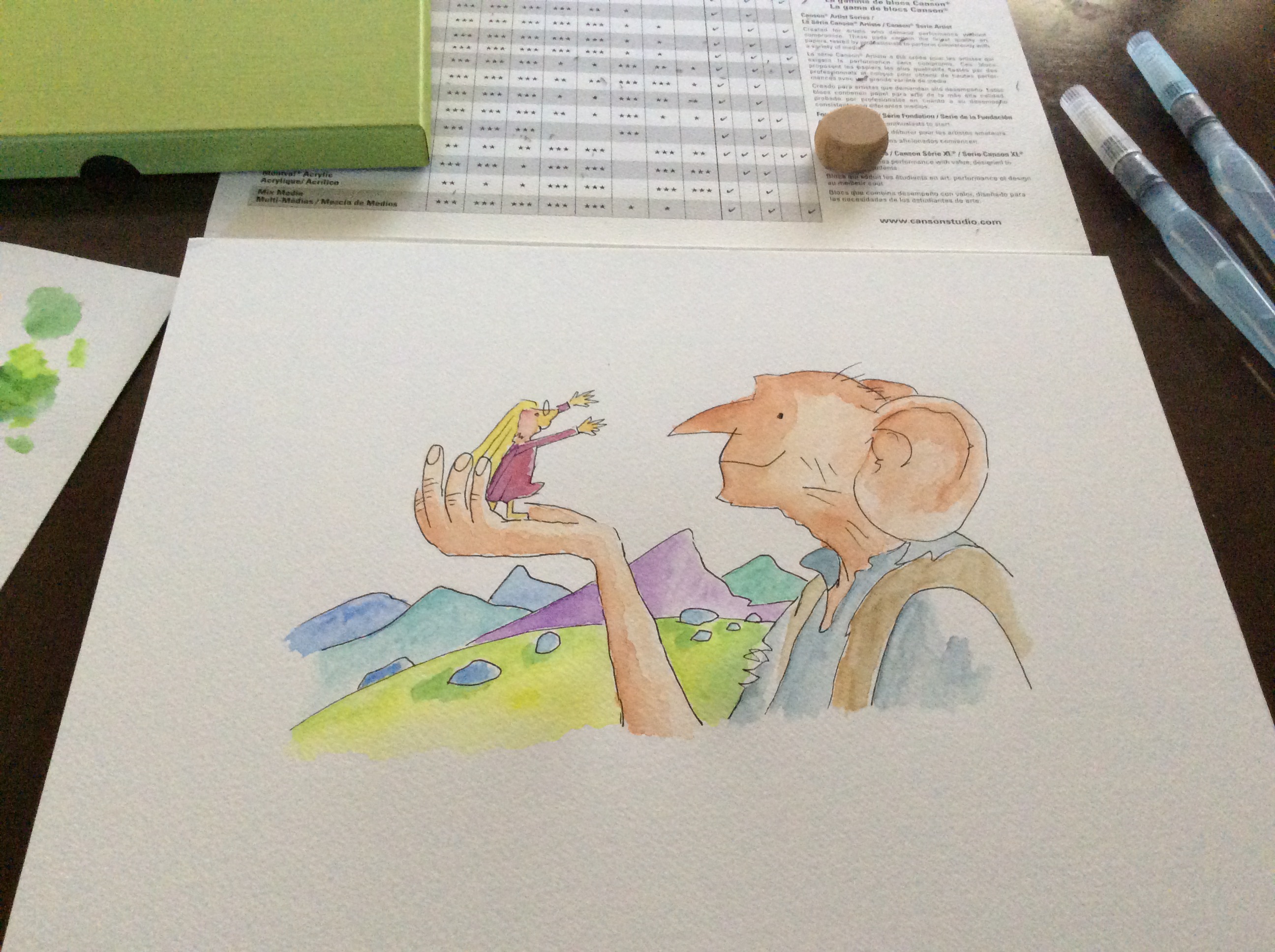
-
Fun stuff! I love that you are playing with the ink and watercolor! : )
I would suggest thinking about what you want to be crisp and what you want to be loose/soft. Also, think about what you want to be saturated vs. unsaturated. Value and saturation are VERY important to a piece and I think that is where you need the most work. Your images are looking a bit washed out, but also too saturated overall at the same time.
Here's a quick pass at loosening up the backgound (no outlines back there!) and also darkening/desaturating it back there too. then, really loosen up with that outline around the rabbit and just go for it. It's about confidence there, so just try and and risk destroying it. That is the key. You need to be willing to totally wreck it to start getting good fluid strokes (just my opinion).
Anyhoo, good luck! keep em' coming!
-
@Lee-White wow, I am so stoked and honored to have you critique my work. This really got the wheels turning in my head, because I was convinced that drawing a character model that was somewhat true to form when it comes to body proportions was impossible to then work into a more free inking style ala Quentin Blake and yourself, hence, why my inking merely stayed on track with the character design as well as my painting. What you did above really answered a huge dilemma I was having these past two weeks, which was how to incorporate all of the rules I was learning in the courses, yet still have the freedom that allows me to break rules wherever I want.
As for my painting: I totally understand what you are saying about painting in a fluid way. Prior to learning watercolor, I was using those really good markers (idk the name atm) and I felt like I was super fluid with those, but when I went to watercolor, I noticed that though I start out with the goal of painting very freely I end up tightening up out of fear of drenching the paper, as well as covering up a white area that I cannot recover. So I keep telling mhself that it is something that will come with time, and is why I am painting every day. This weekend I am going to shadow your luminous knight video, and paint along with it. I think that will really help me get a feel for what you are saying. I will post the results in this thread.
Thanks again for the help!!! I am a big fan, so it means a lot.