Oz, the great and terrible
-
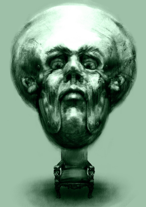
I hope you are not too tired of Oz - i think i'm going to make doing at least four more characters my goal for this month and have 3rd Thursday be my deadline too - this is my first go at Oz himself - i tried to make hime fearsome yet afraid looking - each half of his face is doing something slightly different - not sure i pulled it of - added a bit of color to this and think i should possibly do the same to the others - any feedback or criticism is always appreciated .... the chair is too crisp isn't it..?.. i always notice things when i upload to the forum
")
-
It's always after you post it that you notice things, isn't it? I agree, the chair takes away too much focus with the crisp edges. I would maybe angle the eyebrows a bit to give him the afraid look - which the eyes have for me. The mouth and angle of the nose are great, this definitely reads as Oz for me.
-
The strokes make him look really intense, like he's flying at me. Spooky! I like the chair idea but the values are really close so it kind of looks like he has a chair body. If there was more of a glow or reflection in the chair that might help. Also, make the image smaller so I don't have to scroll to see the entire thing. It's hard to get an overall impression.
-
@Rebecca-Hirsch @Lydia-M Thank you both for your feedback - i tried a cast shadow and darkening the background too - i think it helps a bit overall with the too sharp chair body look - But i think i still need to work on some things ...possibly redo the chair entirely.. not sure - i don't think i want him to look any more afraid than he does so i'm thinking of not changing the brow - was trying to skate between fearful and fearsome....... unless you are saying the shape of the brows are not quite right anatomically? - here is the latest - i increased the papier mache texture to make it obvious - maybe too much but i think i'll live with it for a bit - thank you again for taking the time to share your thoughts - very helpful to me
-
-
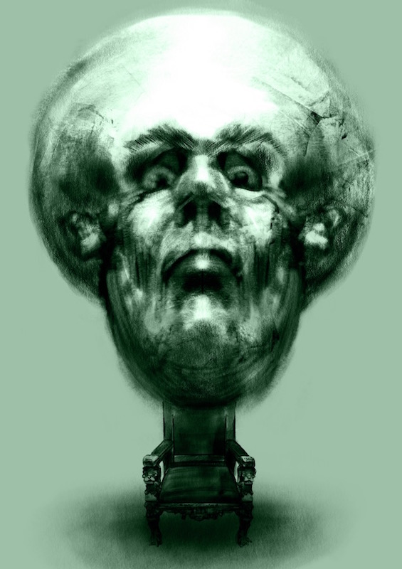
Nice work. This latest update really pops.
-
I like the toned background very much. I have to disagree with myself - when I cover up his brows he just looks afraid, so I think I was wrong on that point, the brows do add the fearsome. I like the 1st one with the toned background very much - the latest one you posted has a changed expression for me - I'm now reading him as condescending. I like the softened lines on the chin/ face edges in that first one with the tone. Nice work.
-
@evilrobot @Rebecca Hirsch Thank you both for the feedback - you are right about the expression Rebecca - i changed it to condescending by un-flairing his nostrils and lowering his eyelids - i'm not sure which i like better yet - seems to have lost something though but there are things i like about the newer version - i'll keep chipping away... thanks again
-
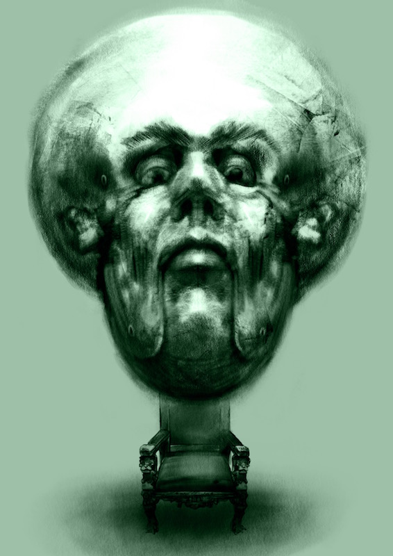
....minutia... just tweaked the eyes a bit..... think i should give it a rest and come back to it with fresh eyes