Feedback on the book spread
-
Hello!
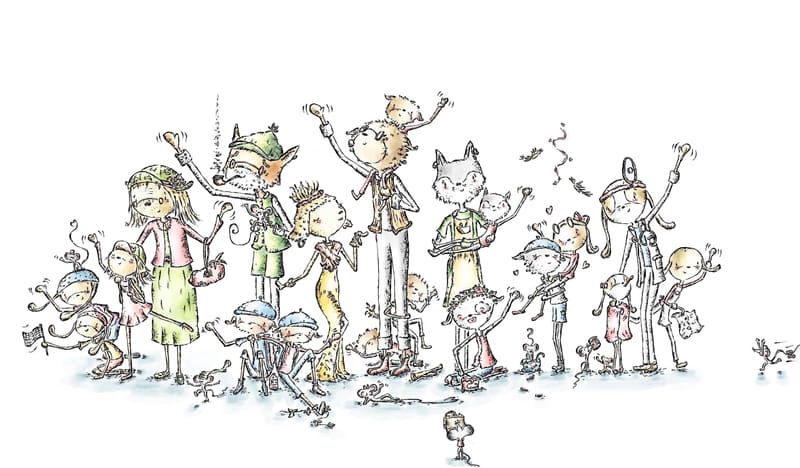
I am currently illustrating a book called Doggerels, which contains various rhymes. I wanted to ask for your opinion on the last spread I illustrated for the book. The author wanted all the characters from the book waving goodbye on the spread. I'm not sure if the picture looks good with a white background or if it seems too empty. A one-sentence text will go above it. What do you think—does it look better this way, or should I add some color or something else to the background? Thank you in advance!
(Please download the image for the better quality)

-
@Enni-Heikura You already have so much going on in the illustration that to add anything else would make it too busy, and might distract from the characters. It looks pretty good as it is.
-
I like the white, with your delicate style of line work, I think the smaller characters and details would get swallowed up.Nice!
-
@tombarrettillo Thank you for your feedback! I agree that the white background is simple and doesn't distract from the image.:)
-
@Larue Thank you for your feedback! It’s good to get confirmation from others as well.

-
I think it's great as is, the white backgrounds adds a great emphasis!
Side note: I love the tiny characters, it was so much fun looking around the image!
-
@Enni-Heikura I like it very much, I think the white background works ok!
-
@Oana Thank you so much, and great to hear that it works!

-
@Enni-Heikura I like it just like this. Very cute!! It’s the kind of spread I would lean into as a kid to see all the little details.
-
@Pamela-Fraley Thank you so much! I hope that children will enjoy looking at the details and connecting the characters to the earlier images in the book.

-
@menalkhan Oh no, I hadn't noticed your message! But thank you so much, it's nice that the small characters are enjoyable to look at.
