I would love some help with this drawing!
-
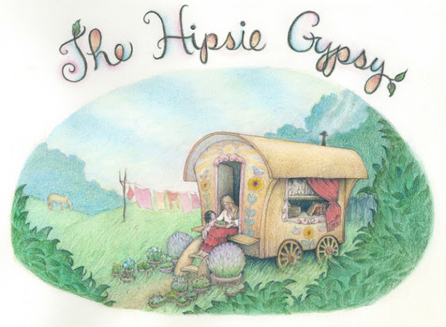
I am making an illustration for my sister's online store in watercolor and colored pencil and I am thanking kind people in advance for helping me get it to the next level. I started it with high hopes, but somewhere along the way it kind of fell apart, and I stopped liking what I was seeing. I could use some other eyes! (I don't have the resources to do anything digital to it, so I will be completely redoing it on new paper.)
My sister wanted a gypsy cart with some things around and on it to represent the sort of things she is selling in her store--herbal concoctions, books, plants. I will be putting hand lettering in an arc on top of the image with the name of her shop. Some bits are unfinished because I knew I needed to begin again before I got to those spots. I hope that doesn't make critiquing tricky. There are a bunch of compositional things I plan to change. I'll just list those:
-
The streaky clouds need to go in the opposite direction, so they are kind of pointing to the cart, as indicated by the black pencil lines. The sky blue will also be much lighter and softer, with more cloud in proportion to the blue.
-
The cart will not have a curve to its roof. (I straightened it somewhat, but still every time I look at it I see early Disney, Silly Symphonies or something)
-
The big flowers painted on the cart will be replaced with something smaller and there will be no areas of red on the cart. The cart will be shades of gold ocher, soft yellow, cream, light golden brown and such with touches of soft green, and a few folksy bluebirds. Red will be reserved for accents on the clothes and a fringed shawl hanging on the window.
-
All the scribbly black marks, such as the those of other potted plants beside the finished lavendar plants, show things I realized I needed for the composition after I got too far in to make any changes. I did thumbnails and composition sketches, but I often don't see all of what I need to do till I've gotten pretty far along.
-
I want the green grass to be a cooler tone, how long grass looks in a field--kind of silvery green.
-
I'm not sure about the clusters of leaves I've scribbled in the foreground. I feel that something is needed to continue to frame the view. There are trees in the distance on the right and the woods kind of wrap around until you just see the leafy edge in the foreground. That's all I can think of doing. Does it make sense compositionally and in other ways? I felt like I had to define the leaves at that point, not just the outline of the foliage mass.
I am wondering if I need to radically change- totally redraw the picture, or if implenting my current ideas will be fine. I guess that's my main question.
-
-
@anthemsweet Hey Anthemsweet - it is so hard to give advice when someone is not working digitally - it feel a bit cruel - but here are my first reactions to the piece - for me my eye is drawn to the saturated green grass next to the wagon - it is the most saturated color in the opposition - i think saving more saturated areas for the focal point may be a good rule - also highest contrast for focal point would be good - i think if you darkened the darks around the two figures where appropriate starting with occlusion shadows it would help make the figures pop - i think keeping your lightest lights in or around the figures would be goo too - right now the arch of the door is brighter than the white shirt of the Mother - i think if you reversed this it would be good - one other thing worth mentioning would be atmospheric perspective - it looks like the green does not get less saturated as it recedes into the trees but just get a slightly light application - i think using a less saturated green as you go back in space and one that moves slightly away from the yellows would be good - James Gurney is always a good place to start with these things - but there are many recourses that explain atmospheric perspective much better the i did - anyway - i hope some of that makes sense and is helpful - i like your image! Good luck http://gurneyjourney.blogspot.com/2013/07/atmospheric-distance-and-value.html
-
I am a traditional artist so I understand the process can be very time consuming and it's hard to get from thumbnail to the final composition and really be able to see the results! It looks like a great composition to me and the notes you made up top sound like you have figured out most of what you need to do! I would say a bit more contrast to bring out the details might help. (for example, the dark blue under the cart against the gold is working really well. Otherwise I look forward to seeing it after your revisions. I don't know that I am the best one to critiquehere, but I think it will be beautiful when you're done with it.
Marsha Ottum Owen
-
@Kevin-Longueil Thank you for that link. I've been looking through James Gurney's blog and loving it! I am wondering if what you see as the saturated green grass is the sloppy unrendered mass of leaves in the foreground where I slopped some of the saturated grass over the grass? I'll change that for sure! (I for sure want to desaturate all the greens in the pic, by the way). Also, I'm thinking about those foreground framing leaves, though. I don't them to pull away from the focal point. Maybe make them kind of shadowed?
I'm really glad you pointed that out about the mohther's shirt being darker. I didn't exactly intend it that way, but it got that way by overrendering. I'll be keeping that it in mind.
Thanks!
-
@Marsha-Kay-Ottum-Owen Thank's for your encouraging input!
-
Hi,
Lovely image and I am sure your sister will love it.
I would agree that the grass is to bright. If all possible I would bring out the figures they seem to get a little lost.
Though I love the gypsy wagon, very well drawn.An Illustrator loving this Artist community.
www.bobszesnat.com | https://www.facebook.com/bobszesnatart/ -
@Bob-Szesnat Yeah, I'm trying to think how to bring the figures out more with, brighter brights and whiter whites, reserving red for their clothes, making much smaller and less showy flowers on the cart. I'm a little worried that no matter what I do they are just going to be too small to have a good impact. My sister did not ask for figures, so they don't have to be there, but to me it feels lonely without them. THanks for your input!
-
@anthemsweet are you looking to make a scene with the cart in it or does the cart, and the items in it, need to be more of the focus?
If you want more visibility on the cart, people and items, try moving your 'camera' in closer to make it show mostly the cart and people. -
@RChabot Yeah. I'm thinking I need to completely redraw it. Sigh.
-
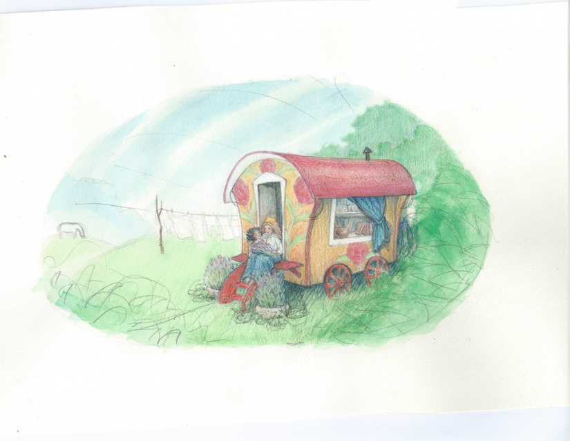
Here's my new drawing. I'm not sure how well it works as an image for a shop banner--somehow i feel it's too cool toned for that, or maybe not graphic enough. I'm not very graphically oriented, anyway. I'll be completely redoing the lettering.