Ready to put in my portfolio?
-
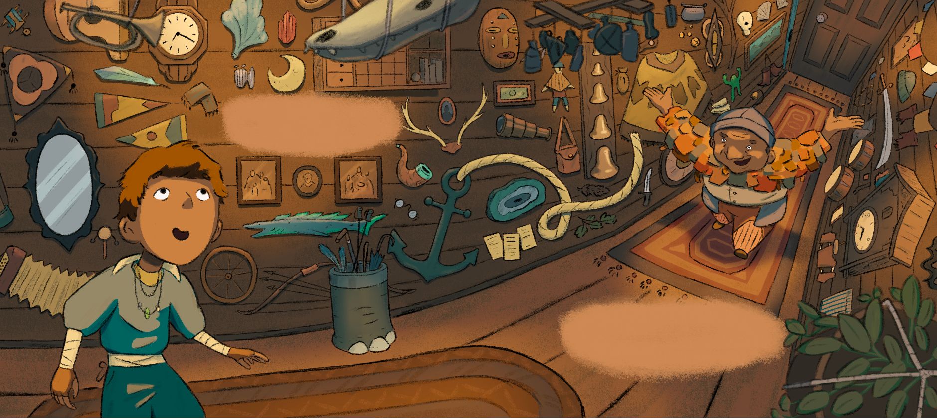
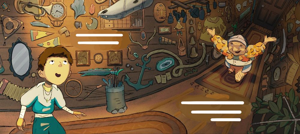
This is the first spread I’ve ever done as well as the first room for text piece I’ve made. At this point my brain is numb to assessing what changes this piece could need at this. I’m comfortable with calling it done but also comfortable with making changes based on any feedback you all might have. One thing I can think of that I still go back on forth on is the lighting. Does the lighting make sense to you, is it too spotty looking? I tried lighting the walls and floor with harder edges as one point but it felt too odd but I still think there could be a somewhere between a soft and hard fade that could work.
Thank you all to helped me when I was starting out on this piece and getting it to this point!
-
@Griffin-McPherson I really like this piece Griffen. I like the perspective, and I like the energy in it. I think the lighting is good, and the color palette works.
What I can notice that feels off is the perspective on the right side of the image, the cuckoo clock isn’t at the same angle as the poncho on the wall, so the two don’t feel like they belong in the same hallway. I would expect to see some sort of diagonal tilt to the poncho. Maybe some thickness to show that your looking at it from above, since you can see the roof of the clock. The other items would need slight adjustment too.
The other thing that feels off is that the text placements feel like afterthought. I would instead reduce the texture in the floor in that area, so text sits over top, or extend the rug, so that text sits over a plain section of rug, I would do the same with the wall. I would have the items on the wall give more breathing room to the text space, so that it looks like things were naturally hung in that intended manner and just so happened to be enough room for text.
-
@AngelinaKizz you’re right about the room for text spots. I was t sure if those felt right and seeing as I’ve never done those before it will take some practice to get it just right. Personally I am a believer that that text/speech bubbles belong in picture books, I rarely see it but I love when I do. However in this case it would be more visually appealing if those areas are more integrated I think. I hadn’t thought about extending the rug out, I wonder if that would work better than shortening the rug because with shortening it I worry that the patch of open floor would look a bit too boring.
The perspective is intentionally very wonky. Since the right page is all warped and bent with the hallway curving towards the viewers, the right most side of the page is going to be most distorted because it’s at the edge of the "camera". It’s like a fish eye lens but reverse I think?
-
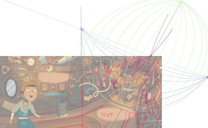
@Griffin-McPherson I love a good fisheye lense, but I think you need to lean heavier into it to be a clear read. I did a little draw over, quickly, so not great, but I think the minor tweaks help with clarity. Maybe the plant could come away from the way a bit to give more dimension to the space. Totally up to you though. Also, you have a bit of detail right in the gutter, that you might want to give more space so it doesn’t get lost in the binding,
-
@Griffin-McPherson This looks really nice, I like your warm and cozy palette!
I do agree though that the drawn on beige spot behind the text spaces look odd. It's a little bit of a crutch to have to do that - it means you haven't planned the contrast of the piece well enough for the text to stand out without it.There is a problem of contrast throughout, with all the values being a very even dark grey and the characters not standing enough against the busy background. When you have a busy piece, it's doubly important to plan your values well so that the most important parts stand out immediately. If we put the illustration in greyscale, we can see that it lacks contrast. The things that stand out the most are the mirror and the anchor rope - both things that are unimportant and should NOT attract the eye as much.
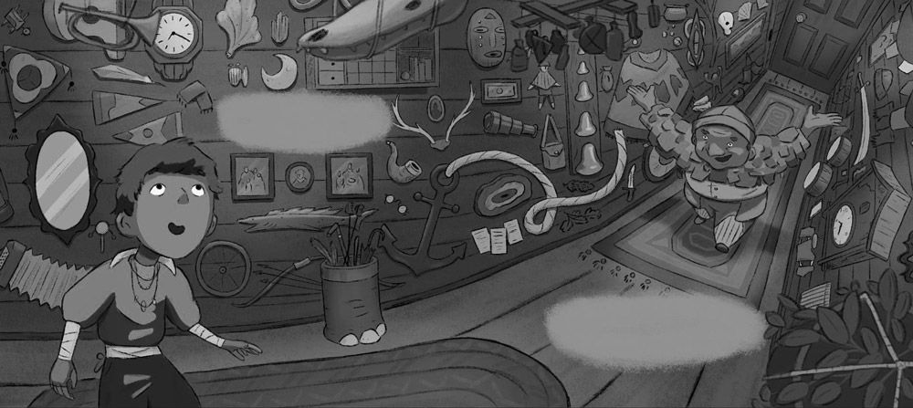
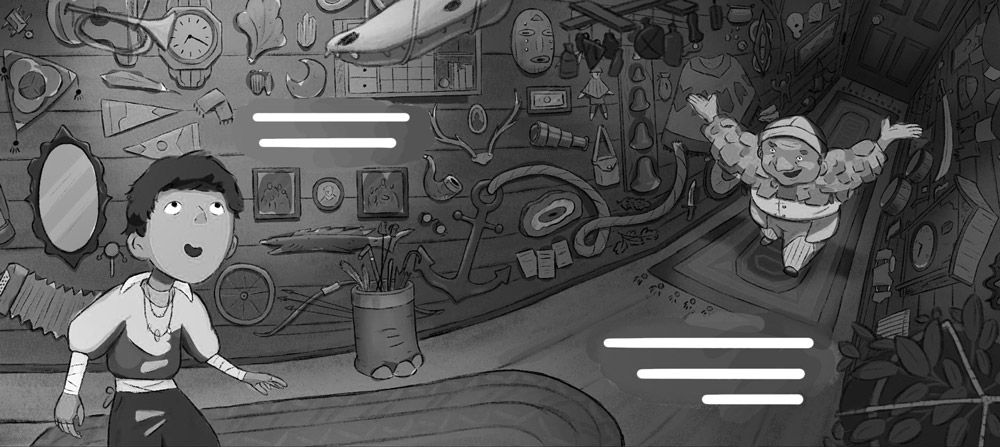
I would suggest to darken a lot of the background elements so they stand out less. Then, creating different levels of lighting in the piece would create more interest and allow you to make the characters contrast. In the image below I demonstrated how you could light the left side, and darken the right side. The old man alone hasn't been darkened, making him stand out. The character's hair has been darkened so he doesn't blend into the background anymore. You can see that even without the lighter patches behind the text, if you reduce the intensity of your wood texture and put the text very light, it will stand out no problem.
Or, in color, something like this. I hope it helps! This piece has a ton of potential, but the execution is still a bit off right now.
vanessastoilova.com
instagram.com/vanessa.stoilova/Check out my Youtube channel for tips on how to start your career in illustration! www.youtube.com/c/ArtBusinesswithNess
-
@Griffin-McPherson I love how this turned out! The perspective actually doesn't bother me at all. I do like what @NessIllustration did with the values though. My other thought is that you may want to make the spaces for text look a little less obvious. Maybe using the same color as the wood in the background, but just leaving is without any texture/lines on it? If it needs to be lighter you could potentially do that with a color dodge layer.
-
@Griffin-McPherson I think the lighting is perfect and I love the wonky perspective. I've been playing around with perspective lately as well. My one concern is the first space for text. I think it's an awkward position. how about placing it on the floor? Around the same level as the other space?
Portfolio: nyrrylcadiz.com
Instagram: https://www.instagram.com/nyrryl_cadiz/
YouTube: https://www.youtube.com/channel/UCbJCF1Im8ZO7hpGWTKOJMuA -
@NessIllustration the text spot’s definitely have to change, no question about that. I like the idea of making the hallways a bit darker as it goes back but I don’t want it to look as if the lights in the back are off.
I’ve been wondering about that rope since the beginning, it could definitely be toned down. An issue with the mirror that my friends pointed out is that it’s about the same size as the kids head which makes it stand out on top of how bright it is so I’ll be adjusting that as well. I can see how the characters could stand out more but I don’t want to lose the objects in the hallway too much because I want the hallway to feel like a bit of a character itself and my hope is that viewers get a little lost in it.Thanks so much for your help and feedback!
-
@Griffin-McPherson I wouldn't worry too much, we can still see the objects very well even if you tone them way down
") With the outlines, they're very easy to see and don't need this much contrast.
With the outlines, they're very easy to see and don't need this much contrast. -
@AngelinaKizz I’m afraid if I get too strict with the perspective rules that it will mess me up because in the past when I’ve bent perspective around I’ve learned that if I start to follow the rules too closely then more of it looks wrong because it isn’t all perfectly lined up.
I think another reason this would be challenging is because I would be applying 5 point perspective to a space that physically bending around with the floor of the hallway bending back in space and the walls are acutely bending away from each other in a v shape which I did in order to show the objects on the walls more clearly rather than looking down at the tops of objects. I think I will still play around with bending the clock, the bells, and the poncho around though because they’re larger objects.
I really appreciate the draw over! It’s always so helpful to see different approaches -
@Nyrryl-Cadiz hmm, I worry that having both of the text spots right next to each other might look a little weird because I think they’re usually more staggered. However, I can’t find any examples of illustrations with room for text! I’ve looked through a bunch fi the picture books I have and I’ve searched google but I just can’t find examples to see how others do it

-
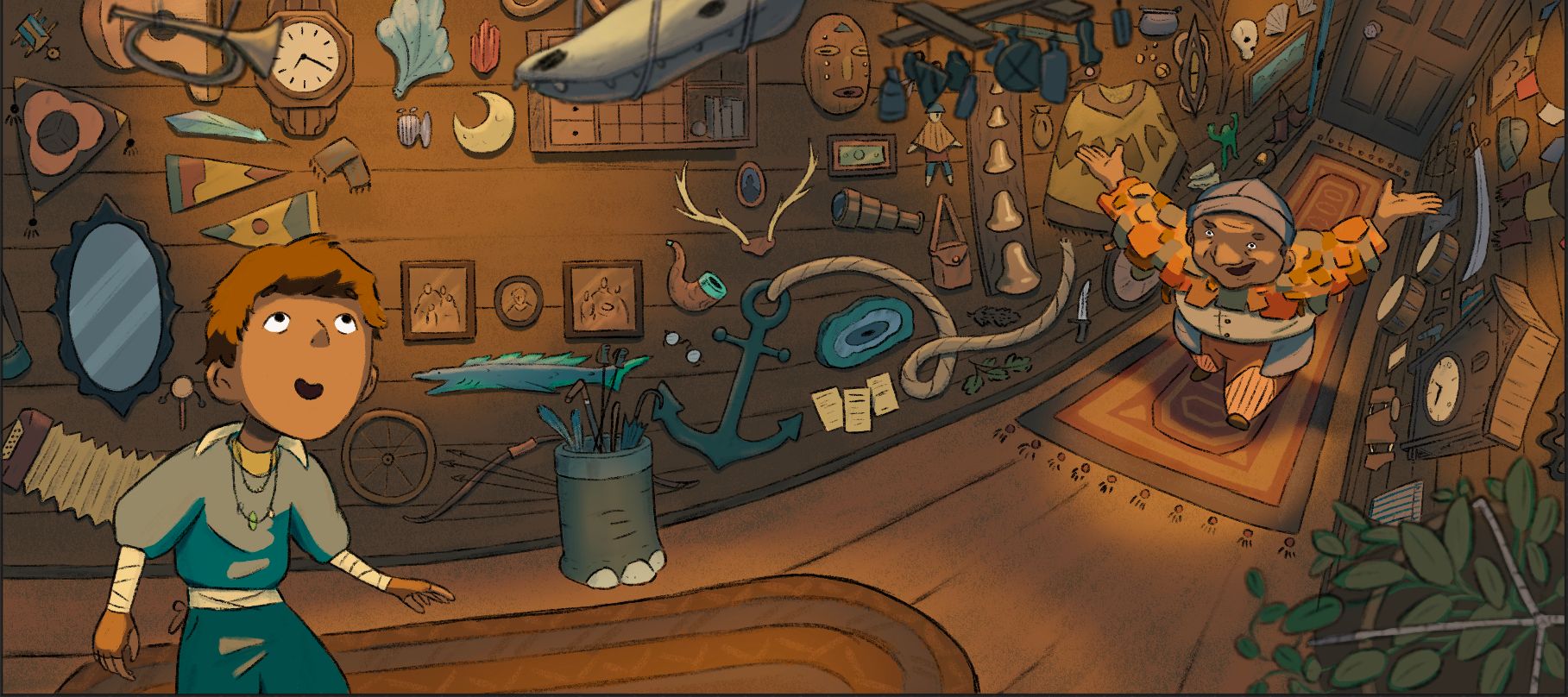
Revisions! Used a bit of everyone’s suggestions so thank you to all of you! The only thing I’m still wondering about it the room fort text. Though I do think they look better I still think they feel a bit odd, maybe compute the texture of the wood in those areas but still keeping any line art out of those spots would work? Let me know!

-
@Griffin-McPherson i don't think they look odd, the text is misssing and thats why i guess. If it still fells odd with text, maybe we can brainstorm again?
i really like the illustration! I admire how you are able to just make the changes. i mostly feel if its done its done and i will think about what i got as critique for the next piece. I should work on that though.
Website: www.von-Nimmermehr.com
Instagram: https://www.instagram.com/von_nimmermehr_illustration/ -
@Griffin-McPherson looks great! I think once you put some text in, it'll feel right. If not, then you could add some of the line work underneath at a reduced opacity. Great piece!
-
@von_Nimmermehr it’s hard to go back and do revisions once you get in the mindset of being done with it. I don’t usually go back and do revisions like this but it’s rewarding to be able to improve it from the point of what I thought was completion. I haven’t actually had to deal with someone telling me I need to make revisions since art school I’m trying to get more comfortable with revisions again.
-
I know I’m getting into nitpicking territory but can the room for text spots still work with the lines of the woods boards running through them or should I have them faded out?

-
@Griffin-McPherson have you tried placing text over top and seeing how it looks?
-
@AngelinaKizz I have, it kind of works both ways but of course the faded lines adds a bit more clarity
-
@Griffin-McPherson i would go with the faded lines then
-
@Griffin-McPherson I like the very faded lines!