What should a character design/pose sheet look like?
-
Howdy, friends!
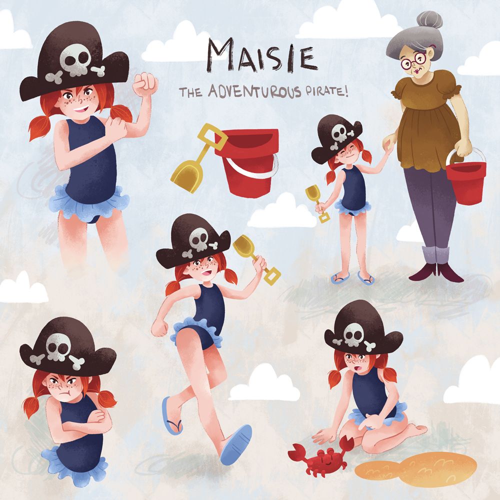
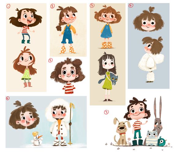
I’ve asked a similar question before but I still feel like I need answers. I’ve searched all over, trying to figure out what exactly a character sheet should consist of and I have found almost nothing on the whole dang internet or maybe I should say I found a whole lot of different answers. To be clear I don’t mean a character turn around I mean a character sheet that shows poses and expressions.
Some people say not to show close up expression drawings because you can just show those same expressions in a full pose. Some have only 2 or 3 poses and then a ton of expressions. Some don’t show any dynamic poses, only more casual poses.
The reason I’m bothered by this is because there are so many unspoken rules in the art industry and I don’t want to make character sheets that are doing something "wrong". However, as far as I can tell there is nobody in the business who can tell you exactly what a character sheet should look like and ultimately it comes down to personal preference. I’ve been leaning towards a resting pose, dynamic pose, and a wild card pose which is just whatever pose I feel like is a good display of that characters personality. And then maybe 3 or 4 expressions.
Does this sound about right to you all? How do you like to make character sheets?
-
@Griffin-McPherson I would stick with the svs character sheet breakdowns. The 5 positions. 1 full face close up, 3/4 turns , 2 action poses doing what they do best, back side.
-
@AngelinaKizz yeah that seems like a pretty safe template to use. I forget if they mention this but should all of it be in color or is it fine to just color the 3/4 and the expression for example. Maybe the other poses just have a flat color and basic shadows?
-
@Griffin-McPherson I think I would go with whatever you feel is most aesthetically pleasing. Generally there is a greyscale piece in a portfolio, so you could use your characters position as the greyscale work.
-
@Griffin-McPherson When I was in animation school we did a turnaround + a couple action poses. But even on the turnaround, we were encouraged to vary the pose and expression on each, because the exact same position in all angles is really boring and doesn't show our range as much.
But that was for animation where character sheets are the final output of character designers and a crucial reference for the animators. In picture books, the character sheet isn't really used as a final work (unless you do it for yourself) and your portfolio should really focus on finished pages and covers.
My former agent said one character sheet is ok to have, and insisted it has a simple background, be visually interesting, and feature "charm" and feeling, even character interactions. Basically, it was still more important to show these skills, than the format, number of poses, or any of that technical stuff.
I'll bet you can't find a standard because there isn't one. We have to remember what is the main goal of the character sheet (or any art we create) and what skills we're trying to showcase. If we accomplish that, the formatting matters little.

-
@NessIllustration it’s interesting that your agent said you should only have maybe 1 character sheet in your portfolio. I just finished up some illustration coaching and they are a former agent and said that character sheets are a must have in portfolios and they have never heard of anyone saying character sheets don’t belong in portfolios. I can’t recall where exactly but I’ve heard people say that if it isn’t an image that would be published then it doesn’t belong in your portfolio. My coach even mentioned that some publishers would turn down illustrators because of their lack of character studies. I am once again perplexed by what art directors and publishers want

-
@Griffin-McPherson Well they didn't say I should only have 1, but that it shouldn't be a main focus. The skills that are shown on character sheets (consistency, anatomy, expressions, poses) can be shown on finished book pages instead, and those also showcase your skills of composition, flow, perspective, etc.
Maybe what your coach meant is that your portfolio should focus on characters, which is absolutely true. Illustrations of backgrounds with no characters are not where it's at. But doe character studies = character sheets? You can show character skills on spread illustrations. In fact, it showcases the most accurately what the publisher is likely to get if they do hire you.
Not sure what they meant by you can't show images that could be published... Maybe they meant before that illustration is published it's still confidential? Because if they meant your can't put book page examples in your portfolio, that makes NO sense. That's like a jewelry maker showing examples of their knitting on their website instead of their actual finished jewelry. Doesn't the client want to see what they'll get?
-
@NessIllustration no no, I think what is meant by only having illustrations that would be published is that they should be spreads, spot illustrations, any type of illustration you actually see published in a book. Opposed to something like character sheets which, or concept sketches which you will not see in anything other than something like an art of book.
I believe character sheets are the same as character studies or pose sheets. That’s another thing I’ve never found clarification on. I think they’re all just different words for the same thing except for a character turnaround which is more specific.
From my understanding the reason character sheets are desired by art directors is sort of the opposite what you were saying. A full page illustration isn’t going to display that you can show character consistency because they’re not going to appear multiple times on the same page. Similarly you can only show one expression and one action so a character sheet allows you to check a lot of the boxes. This was my understating from my coach. They also mentioned that character sheets are especially crucial if you do not have published work (like myself).
-
@Griffin-McPherson Oh sorry, I understood the opposite!
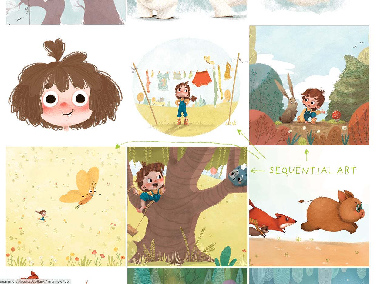
Then I agree: art directors can see your skills best when you show them a final product. That's what they'll be asking you to do after all! I really believe they don't give a rat's ass about how many poses you include in your character sheets..The most desired way to showcase character consistency is a sequence, meaning showing 2-4 different illustrations from the same project. This is the closest you can get to showing them what they will get from you if they hire you. You're also showing your ability to stick with a project for more than 1 week, which is a big deal for art directors. They are terrified of hiring an artist with shiny object syndrome that cannot complete a full book. If you don't have published projects, this can be a personal project.
-
@Griffin-McPherson Hi Griffin! I've worked as a concept artist in the gaming and small film industry, so I can tell you the reason you are getting various answers are because it depends on what the character sheet is being used for. This differs per industry as well as for what part of development you are doing. For example, if the sheet is being used to define who the character is (early visual development), then what is going to be explored is different than if the character has been decided on and you are handing the designs over to the 3d department to model.
If you are handing a design over to the 3D department for example you will need it to have more of a "static" pose so that they know what it will look at from all angles as well as an extreme stretched expression, neutral and squished.
For book illustration, where the character sheet is just being used by you and not for another artist to build off of, what you put on there is more about what will help you to create a book. I know one book illustrator who basically did all the poses and faces she knew she would have in her book as part of her character sheet. That way when she illustrated the book she already knew what she needed.
There is no specific standard because what is needed in a sheet varies on what is needed for production. So don't worry about doing it "wrong"
-
@NessIllustration that’s what I always thought until I was told otherwise and then I started questioning the shoulds and should nots of portfolios. I also agree that portfolio’s should have sequential pieces to show story telling capabilities but I was told not to do this because each illustration should be unique and show something totally different like different environments, situations, characters, which I do think is also important but not having sequential art really confused me.
-
@carlianne so then by that logic should there not be character sheets in a children’s book portfolio at all? I recall in one of the character design courses Jake talks about sending in different designs to the publisher but that was more about figuring out what the character would look like rather than creating a character sheet with poses and expressions.
-
@Griffin-McPherson Someone's giving you bad advice - or rather it's parts of good tips, but twisted. Yes variety in the portfolio is important and you should show all kinds of different environments, characters, angles, weathers, etc. But first of all, a sequence is just 3 pieces out of 12-20 in a portfolio.
Second of all... who says there's no variety within a single project?
 Pick up any book and flip through the pages. They all should look very different! A book with all pages looking alike would be so boring.
A portfolio sequence could go like this:
- Character in their house early morning with parents, zoomed out.
- Character walking on street with friends, closer shot
- Zoom on character's face shouting at friend, focus on interaction and abstract background showing conflict
It's all the same story and the art director will be able to see a character repeated in all 3 as well as the style + project coherence in all 3, but there will be variations in the locations, "camera" shot, emotion, secondary characters and interactions. All of this is more compelling than a character sheet.
-
@Griffin-McPherson This seems to be referring to the process when Jake was working on the project with the publisher, this is something completely different than the portfolio.
-
@Griffin-McPherson I use character sheets just as a fun exercise, but do not include them in my picture book portfolio, because for picture books, you want to show how you create picture books, not character sheets, I think? But maybe I am wrong.

And I did use for my portfolio some illustrations I've originally done as a character sheet, but I put them there separately.
When I think about it, I even didn't send a character sheets to my editor when working on a picture book. I did sent "development" sheet, when we were brainstorming about how the character should look like and what style would be the best for this specific book. (I would not place that on my portfolio)

After that, I've done just one illustration with the approved character and used that as a reference for me when working on the book... (also not for my portfolio though)

And as @NessIllustration said, I would rather focus on having some nice sequential art on your portfolio!

It doesn't have to be a ton, but it should show that you can stay consistent with your characters (this you could do on the character sheet) and how you are able to place them on a page, background and everything (character sheet is useless for this).
But - social media looove characters sheets! So if you like to create them, do it! And post it