Niko's Sketchbook
-
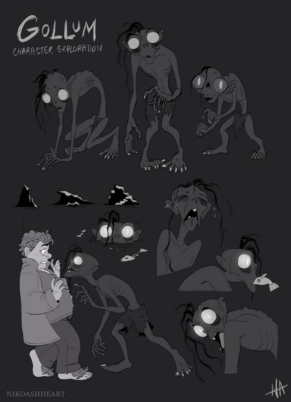
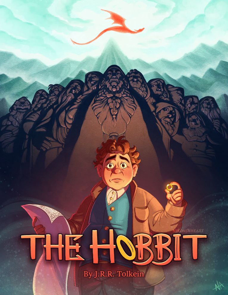
This feels like a strange thing to start my sketchbook with, but hey, it's what I'm working on so here it goes! I'm doing a few pieces of chapter art of my interpretation of The Hobbit to go with a book cover design I did just recently. Bilbo and the dwarves came naturally, but when it came down to draw Gollum I struggled a bit with a design that felt right so I wound up doing some character exploration with him. I really love the little guy on the right, but he doesn't really suit the style I'm going for.
-
@nikoashheart these look great! Favorite is the far left top, and all the ones below are great poses. Nice work!
-
@nikoashheart cool!!!
-
@nikoashheart Wow! I think they're all great

-
@tom-barrett Thank you! I like that one too! That's more in line with what I was originally drawing as chapter headers, but I found him hard to work with alongside Bilbo. If I straightened him out, he'd feel as tall as an elf! But I do like how limby he is. I might have to save his silhouette for another project!
-
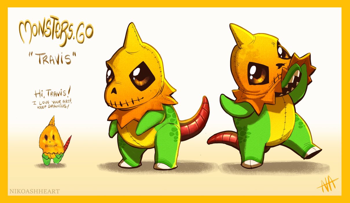
Decided to give the Monsters.Go prompt on Instagram a try! Love the idea behind these. Monsters designed by kids that we get to do fanart of? What's there not to love!
 This design was done by Travis.
 -
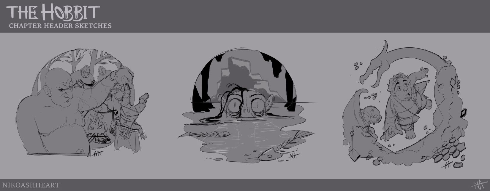
Here's some sketches for those Hobbit chapter headers I mentioned! Featuring the trolls, Gollum, & Smaug. These will be finessed & completed soon, & I might do more! Let me know what you all think, I could definitely use some feedback~
-
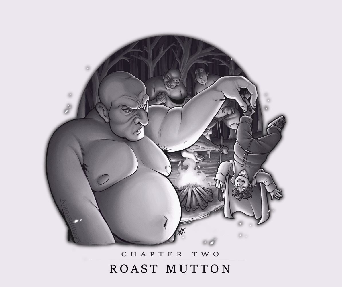
@nikoashheart wow it really looks good! I like the troll one, it takes me to that scene of the book. The dangling Bilbo and the other two guys in the background. I like that composition. The smaug one confused me a little since Bilbo obviously is looking up, but I can't quite place where smaug is coming from, plus he seems a bit thin/small for the big dragon. Great Gollum although I can see your point of straigthening him out. Could you scale him down, or does it become too small? The poses are awesome, dynamic and expressive. The crying Gollum reminds me a bit of the show Arcane. But it really expresses his poor Gollum sadness.
-
@Chantal-Goetheer Thank you~! I can totally understand how the Smaug one is confusing right now, but hopefully some shading will make it clearer! The dragon shape is meant to be Smaug's shadow looming over Bilbo. As far as Gollum goes, yeah I tried scaling him down, but when I do I wind up having to scale up his head and he looks sooooooooooo creepy. Almost fetus-like, to be honest! I'm glad ya like the stuff, though! I'm really excited to get to finishing them!
-
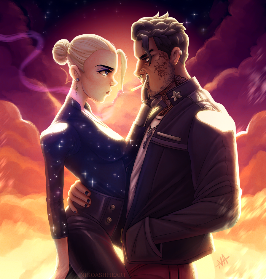
Been sick the last few days, so I haven't done a lot of work, but I did finish up some personal work I started ages ago. I really love how the piece turned out, but it's definitely more adult and I'm not sure if it's appropriate to put in a kidlit portfolio? What do you all think?
-
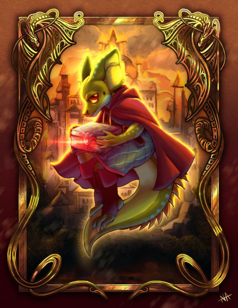
Also finished this piece, which is a birthday present for my dear friend featuring his Kobold character from our D&D games!
-
@nikoashheart these are looking great! This looks like a really fun project to work on. It’s also great to have portfolio-wise
-
Finally have an update on The Hobbit series! I've finished Chapter 2: Roast Mutton. Let me know what you think! I'll be finishing the other two in the next few days.
-
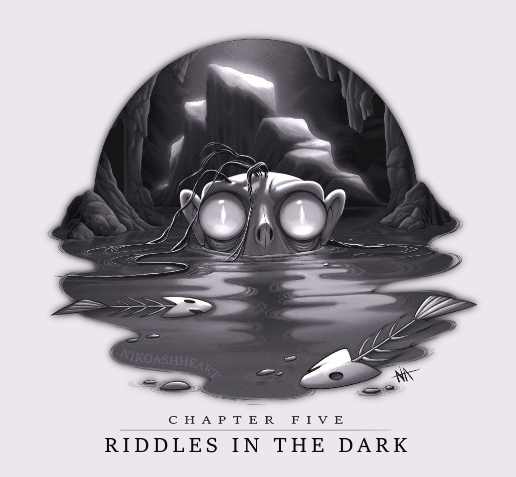
Another update to the Hobbit series! I of course had to do a Gollum piece, especially after doing that concept work for him earlier, and I really enjoyed working on this one. It didn't turn out quite exactly like I intended, but honestly I think it's better! My original was more "mysterious" but it was way too dark, I think. The scene itself is apparently so dark that Bilbo has a really hard time seeing, and I wanted to reflect that in the art, but in the end I felt it better to reinterpret it for the sake of the illustration. Let me know what you think!
Smaug is up next!
-
@nikoashheart wow! I love the gollum piece! Very cool. I’m really liking how you’re pushing the values with your gray scale images.
-
@Pamela-Fraley Thank you!! I struggled a bit with the values, so I'm glad they're working.
-
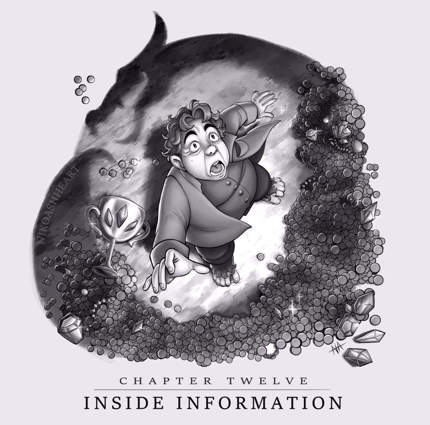
And here's the last of The Hobbit pieces, featuring the infamous Smaug! I really struggled with this one. I originally intended to do something a lot more gestural with the coins, but they just became lost in the silhouette. This took a lot longer, but I think works better. I'd love to do more of these one day, but I've got other projects to get to, so the three + the cover will have to do for now!
-
It occurs to me I actually never posted the cover I don't think? So up that goes as well!
-
@nikoashheart I really like this cover. Making the figures in the mountain is such a great idea. I also like the shadow Smaug idea too in the illustration above. Very clever.
-
@nikoashheart I love the stylized shape of Smaug, very nice!