Colour pencils advice
-
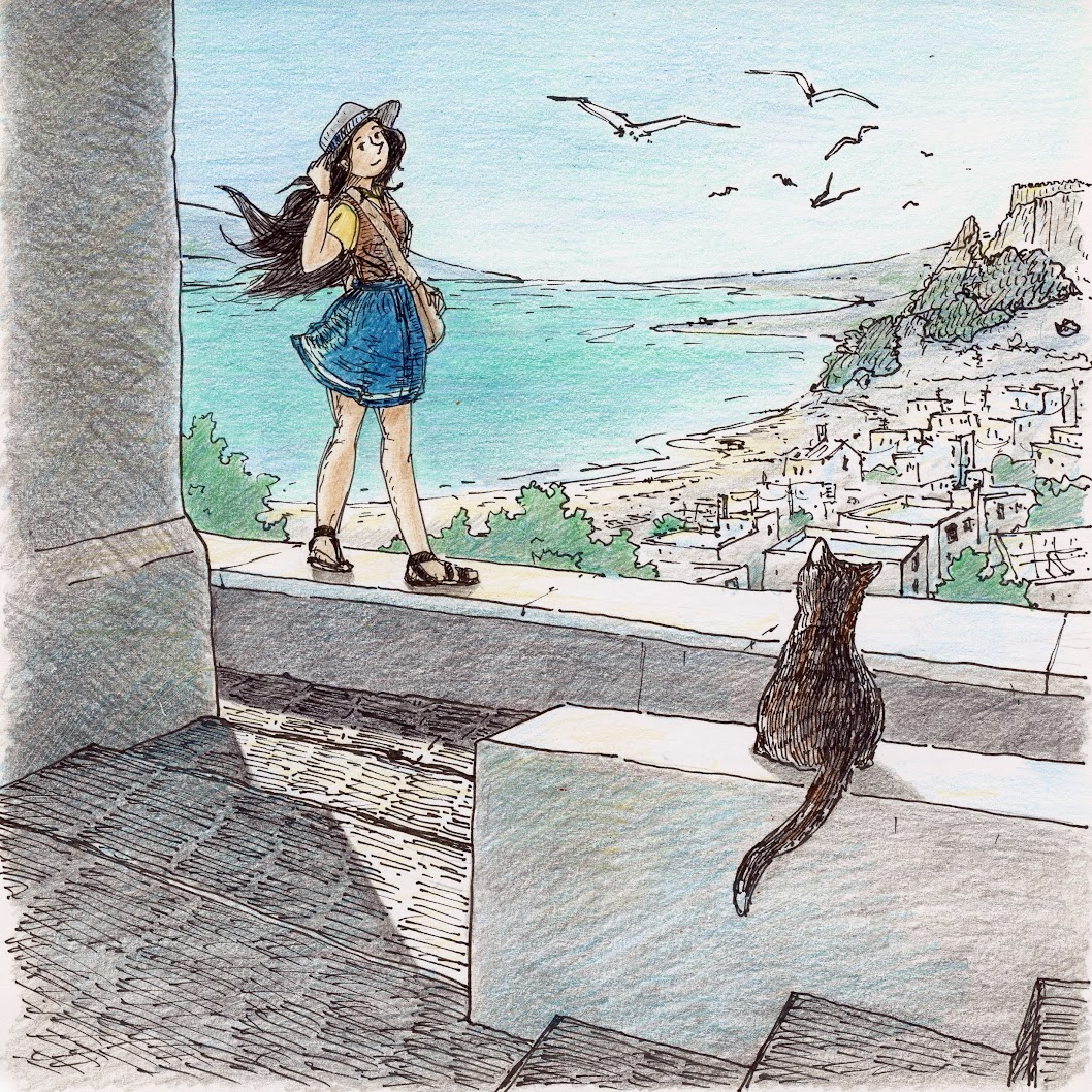
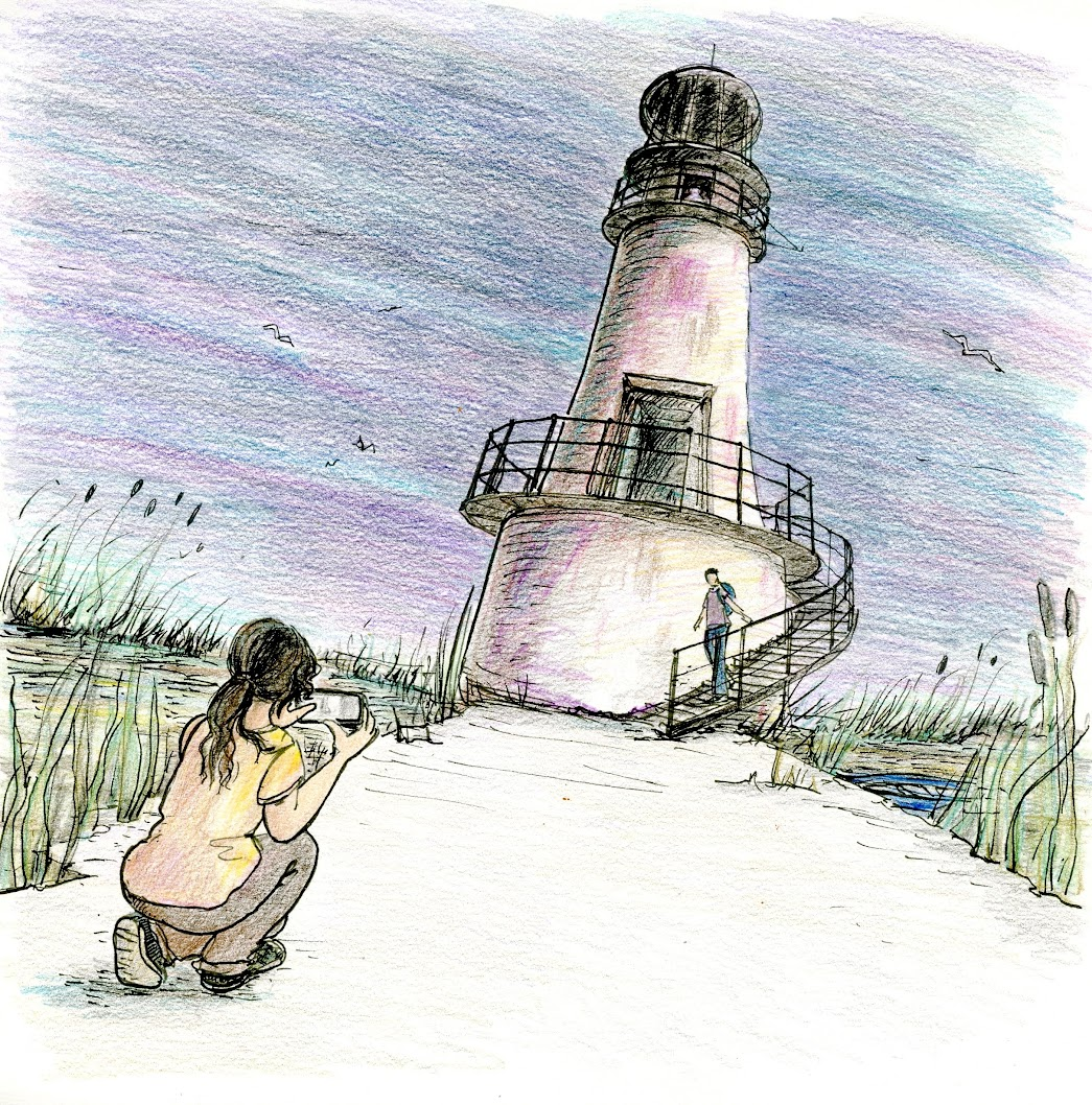
Hi! I have started a series of illustrations, as a relaxed exercise to push myself towards doing a story in comic book format, and these might be possible covers or it, or just panels... I am in fact trying to find a style, and one method I would like to explore is colour pencils, because..... it is something I am more used to, and can get to easily (as opposed to watercolors or other media requiring a more organised working space and time). Do you know of any references / illustrators using colour pencils and would you have some feedback for me? Thank you


-
@Oana Hi, Oana! Definitely give coloured pencils a good try if you want a medium that is more portable. I do like what you've achieved with them so far so I encourage you to experiment even further. Botanical artist Ann Swan works in coloured pencil https://annswan.co.uk/product-category/originals/ and also offers some online tutorials. I don't know her but admire her work and have gotten a few tips from reading her website and newsletters.
Also, be sure to try different brands of coloured pencils to see which works best for you. Some are more waxy, some dry and chalky, some are water soluable! You'll be surprised what a difference it makes when you find the right one for the way you like to work. A few days ago I chanced upon an artist who uses a solvent to blend the colored pencils after application - gives an interesting almost watercolor look. I can't think of the artist's name right now but when I do I'll post it here for you.It looks like you're well on your way to finding a technique that works for you. You're layering your colors which goes a long way in achieving depth in addition to getting some glowing color. The way you've used varying the direction of the pencil marks to achieve the look of cut stone is excellent. I would suggest trying to build your layers up slowly and evenly at first to create. Perhaps slow down and use less pressure in your first few layers. While the multiple direction works very well on the stone, You might be more pleased with the water is you tried to lay in the color very slowly and stay as horizontal and parallel as possible. Keep building up the color with more layers and with all the marks in the same direction.
Hope that helps a little! Keep going . I think you'll be able to achieve great results with the pencils as these already look very very good!!!!! Super job with color choices!
-
@lidia-ull Thank you for the advice and the botanical drawings are a great reference, I will look closer at her website!
I also like to use ink, so I'll experiment some more with combining layers of inked texture and pencil texture. I have in mind of getting a large Polychromos box but meanwhile I love a brand called Giotto, school grade it seems but I think the quality at the price is awsome, I have a 50 pencil case and a skin tone set. -
@Oana I work primarily with colored pencils. Prior to jumping into the illustration world I had been doing photorealistic colored pencil portraits. I haven’t used them nearly as much as I’d like to in the last 2.5 years as I had an accident that has left my dominant hand permanently disabled.
I’ve used almost all of the “big” brands. I would suggest buying a few open stock and trying out each pencil before committing to a set. You don’t necessarily need to buy expensive pencils if you are really happy using the set you’re using. Going into a higher quality pencil gives you a greater intensity in pigments, better mixability, the opportunity for more layers (as they aren’t as waxy) and many have a high lightfast rating,
Polychromos, while super lovely (I do a good chunk of my work in polys) can be difficult to get used to. They’re a very hard oil based pencil. They’re fabulous for holding a fine point, staying sharp, but they don’t lay down as smoothly as something on the creamier side.
If you’re only using the colored pencils for illustrations that you later plan to scan rather than sell as mounted on the wall pieces of artwork, I honestly wouldn’t worry too much about going too high end.
You could venture into something like colorsoft by derwent. Intense Colors, super creamy, layerable, but not nearly as expensive as the pencils with lightfast ratings. There’s also derwent procolor, which are supposed to be similar to prismas, but I haven’t had a chance to try them. If you’d like to venture into a higher end pencil, but not as concerned about lightfast, Caran Dache Pablo’s are absolutely beautiful to work with. Very creamy, very smooth, absolutely lovely.
The key to colored pencil, is working in light layers, and layering to get the tones you want. That being said you don’t have to go into the biggest set of pencils the brand sells. You could get away with buying a smaller set, and adding a few open stock pencils for what you’d be missing. I bought the 120 set of polys and there’s a ton that I’ve never even touched. I constantly have to replenish a certain color palette, but the rest never touch.
I’d be happy to answer any questions you have about colored pencils.
-
@Oana These are lovely! I have always loved the look of pen illustrations. The remind me of reading my first chapter books as a kid. Like Narnia - where every now and then there was a little pen sketch of the lamp post or Mr. Tumnis.

As for colored pencils, I dont know as much as a lot of people on here, but I Love the FaberCastell polychromos. One of the nicest things about them is that they glue the pencil all the way through the middle!! They are the only colored pencils I have used that don’t get broken on the inside. I hate it when you sharpen a pencil and it just falls out immediately… you have to keep sharpening till you get to a not broken spot. So annoying. Haha! -
@Oana beautiful color palette. Love your inking ... even though this is thread is about colored pencils. Just had to throw that out there.

Adding to this conversation by listing some illustrators who work in colored pencils, either entirely or with other media:
-
Molly Idle. All her work is done traditionally with Prismacolors.
-
Marla Frazee. If I remember correctly, she draws with black Prismacolors and then colors with watercolor.
-
Kaya Doi. She's the author-illustrator of the Chirri & Chirra books and works entirely in colored pencil.
-
Juana Martinez-Neal. She works in mixed media; colored pencil along with watercolor, textures, and pencil.
-
Cat Min. She works in mixed media too; colored pencil textures feature prominently in her work. A note on the back page of her book Shy Willow explains her process.
With just these 5 examples, you can see that there are a ton of different ways illustrators use colored pencils in their work ... and so many different styles and applications!
Personally, I found that what worked for me is buying different brands open stock and trying them out, experimenting with how they could be used, and what fit best for me in my process.
Hope this info helps you in finding your own preferred media and process!
-
-
@AngelinaKizz Thank you for all the details! Oh.. I looked at your pencil portraits and they are remarkable, you do know about pencils! Hope you manage to overcome the loss of that hand usage, that's a terrible thing to happen. I have read stories of artists, musiciand also, compensating phisical problems in some form or other and getting their art through....
The big Polichromos box was what I was thinking of, but I can get what you are saying... they do sell them by piece, only I'll have to decide what colors I need without having a clear idea what pallete I need
 The best would probably be to work on building a palette and some experience with what I have, and then picking individual colors from the store will be easier. I have seen Caran Dache at a local store, I will take a closer look!
 -
@Melissa_Bailey What a great list of resources Melissa, thank you!
 Very inspiring to see all the different styles!
 -
@Pamela-Fraley Thank you Pamela! I also loved ink illustrations in my books as a child. We had a Jules Verne series and I loved each illustrated page

-
@Oana I think the 24 set would be more than adequate to start with, and add in some of the softer colors that works be harder to mix. Even the jump from 24-36 comes with more yellow and greens, which aren't generally in my palette. It's not until you get at least a 60 set, that you start getting greys, and not until 120 that you get flesh tones and more earth tones. You could easily add those to the 24 set and have a really beautifully balanced set. Once you get playing with a basic set, you'll likely feel the "I wish I had that shade" and you'll intuitively create the palette you require.
-
Don’t forget D’Aulaire! They did books on Greek and Norse Mythology