Personal projects feedback please:|
-
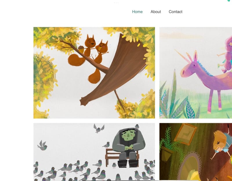
@Asyas_illos hi! I love the simple design and how the illustrations are displayed, they are big enough to see them properly and small enough to create a nicely looking gallery

I would add some sequential art, since this is something most art directors are looking for.
And I don’t know why, but when I click on the about page, it will not allow me to click back on the home page or contact page.
Good luck, creating an online portfolio usually is a pain in the bee. I’m still working on mine, so…
-
@mag it certainly is! I have really been struggling with it! Thanks for the feedback
 ️
️ -
@Miriam thanks for the feedback on editing, I will look into it. I was hoping those darn things would be not be visible on the side I can’t for the life of me figure out how to delete the darn things so I tried just moving them as far off the page as I could lol
 well looks like I’ve got some more work to do…
 -
@mag and yes the tabs are glitchy I don’t know why. If use the back button then choose again it will work but I don’t know what the deal is with that?!
-
@Miriam if you have time can you please see if those images are still visible on the side of the page?
-
@Asyas_illos I don’t see them anymore. Though I never noticed them the first time.
-
@Asyas_illos Everything still looks the same.

Good luck figuring it out! -
@Miriam not for me, maybe you need to refresh your browser history?

-
@AngelinaKizz @Miriam are you using a desktop computer or a mobile device?
-
@Asyas_illos in using the browser on my iPad.
-
@AngelinaKizz ok I think it’s a desktop issue then cuz it doesn’t show for me either. So I found the way to delete it but unfortunately I need a key board lol. Looks like I’ll have to get the ole’ laptop out (long sigh)

-
@Asyas_illos Hi! Just wanted to say that I took the time to read through this entire thread yesterday and today and I am so impressed with how your work is shaping up. I noticed your work already on Critique Arena, but this just confirms my opinion. And you're so fast! I have done my candy house design for Hansel and Gretel three times.
About your website: I am on Safari and still see the half flower motif. But Safari doesn't always play well with others. Good luck with your site. Looks great so far, and I was going to recommend Squarespace, but I'm sorry it doesn't work with your iPad. Do you have access to a Creative Cloud portfolio site? That could work and be cleaner than the Wix one. Or maybe there's a way to get rid of the Six banner. Just a thought.
Cheers!
-
@LauraA thank you, and I love how your your Hansel and Gretel came out you have a very classic style, that I admire! Thanks for the heads up I guess I have to to dust off the laptop and try to fix it that way. Thanks for the feedback!
-
Hello again! Thanks to those helping me to figure out my website, if anyone using a desktop computer could please check my homepage again to see if there are still remnants of any images left on the sides I’d be extremely grateful!!
-
@Asyas_illos I'm using a desktop. Website looks good! Portfolio front and center. I missed most of the previous parts of this thread, but I don't see any issues on the sides. There's a white boarder around the images and whitespace on the sides.
-
@Stephanie-H ok sounds good! Thanks Stephanie!
-
@Asyas_illos I just took another look, and the images are not showing up on the sides anymore, so it looks good.

But the links on the "About Me" page are still not working.
(I am using Chrome on my laptop.)
-
@Miriam awesome thanks! Although I’m not sure what to do about the links

 ️
️ -
@Asyas_illos Can you try deleting them & putting them back in?
-
@Miriam not sure I want to try and mess with it more because it’s so finicky it was a template. I just replaced everything with my own stuff. It’s annoying but if you go back and refresh it works. It was such a pain use this, I have plans to upgrade after I use it for a bit.