Durrell's Sketchbook
-
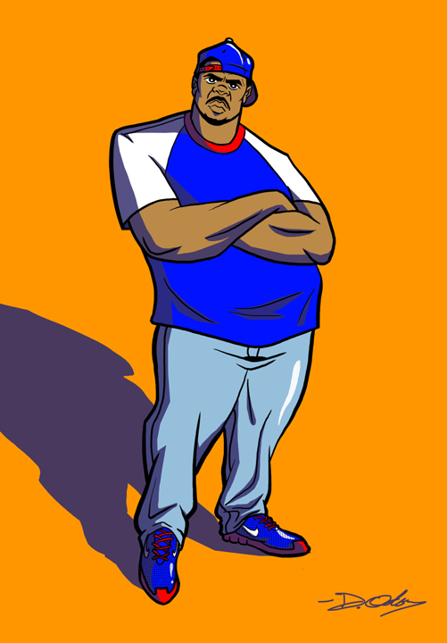
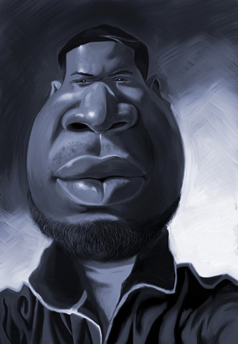
First time as a svslearn.com subscriber, and I want to take advantage of whatever they have to offer, so here are my recent experiments. My only goal is to improve on my fundamental visual art skills. So please check these out and let me know what you all think.
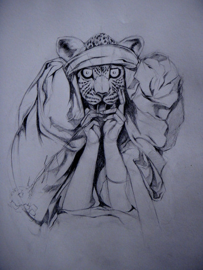
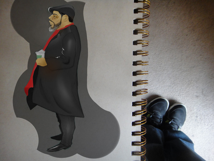
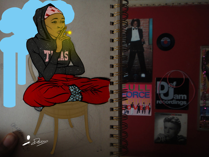 
 -
I really like some of these especially the B/W piece. Strong work from my view point.
-
Great work!
-
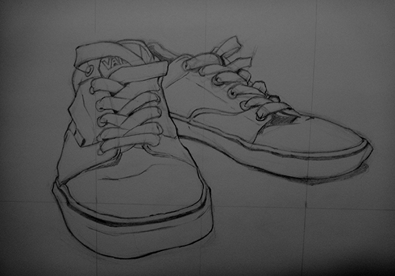
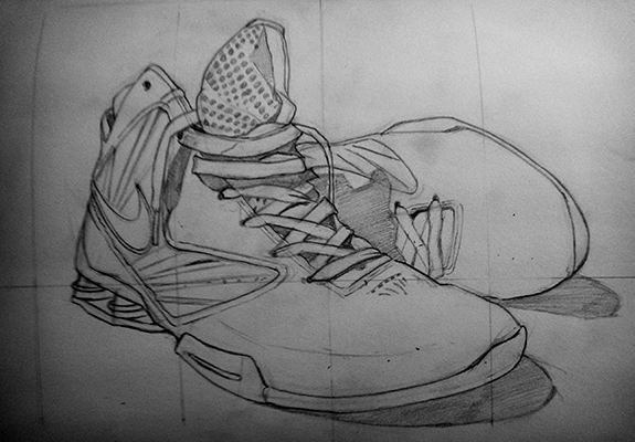
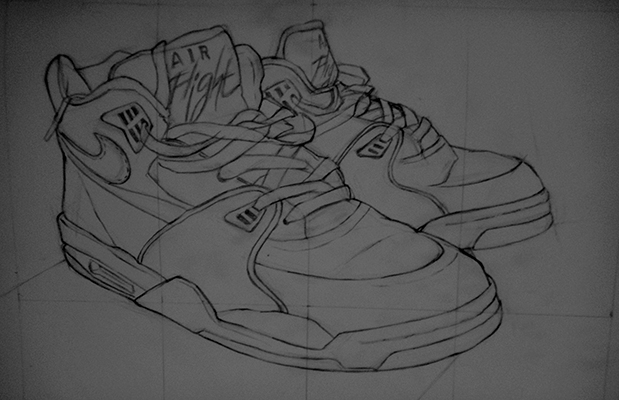
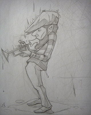
Thanks Rob and Steve. Here are some still life practices and a cartoon sketch.
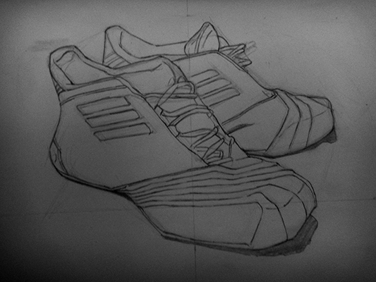
-
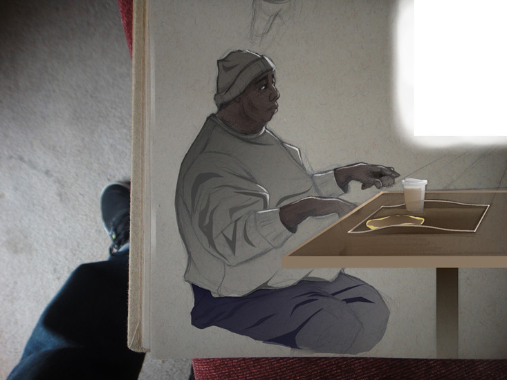
I love the one of the guy sitting at the table. It looks like you're still working on it, but the mood of that one gets me. Awesome.
-
Great character designs! I love the guy on the bottom playing trumpet. You also have a good use of color in the first piece. Keep up the great work.
-
very nice designs! Thanks for sharing them!
I noticed you putting the photoshop paints added to look like they are in your sketchbook. If you want to further enhance that effect, flatten your layers down to just the sketchbook backgound pic as a layer and your photoshop painting as a layer, then play with the blend modes in the layers palettes. Try Overlay first as that one sometimes just looks great as is. I use multiply, but that can sometimes lose the color. Anyway, give it a go and see if you can blend it seamlessly and make it look like it's actually painted in the sketchbook.
Again, great looking designs. Keep em' coming!
-
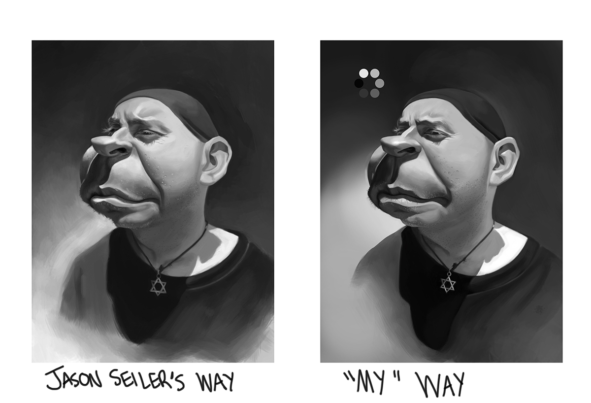
Have not posted in a while but here is an assignment I did for Jason Seiler's class Art of Caricature.
-
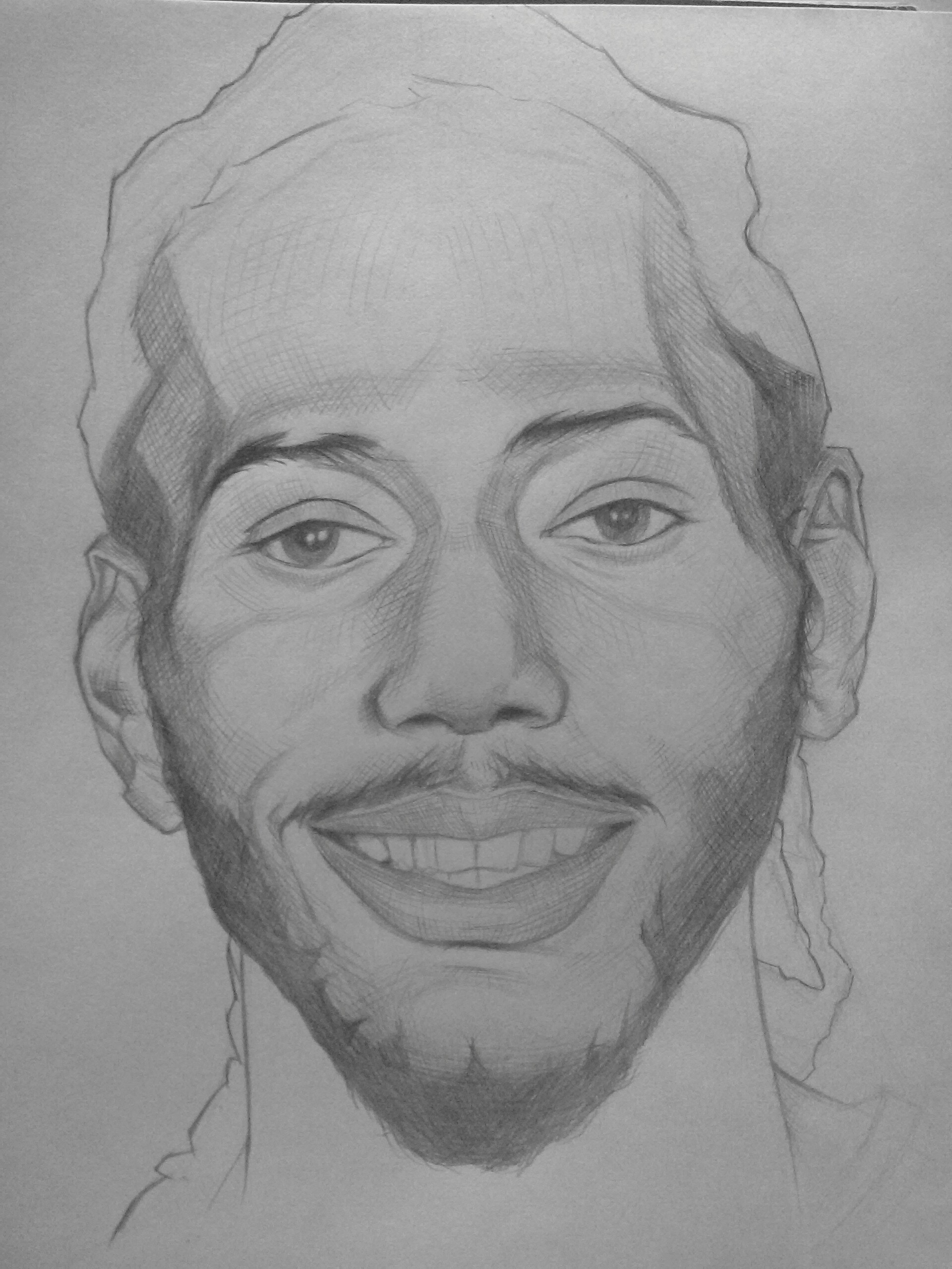
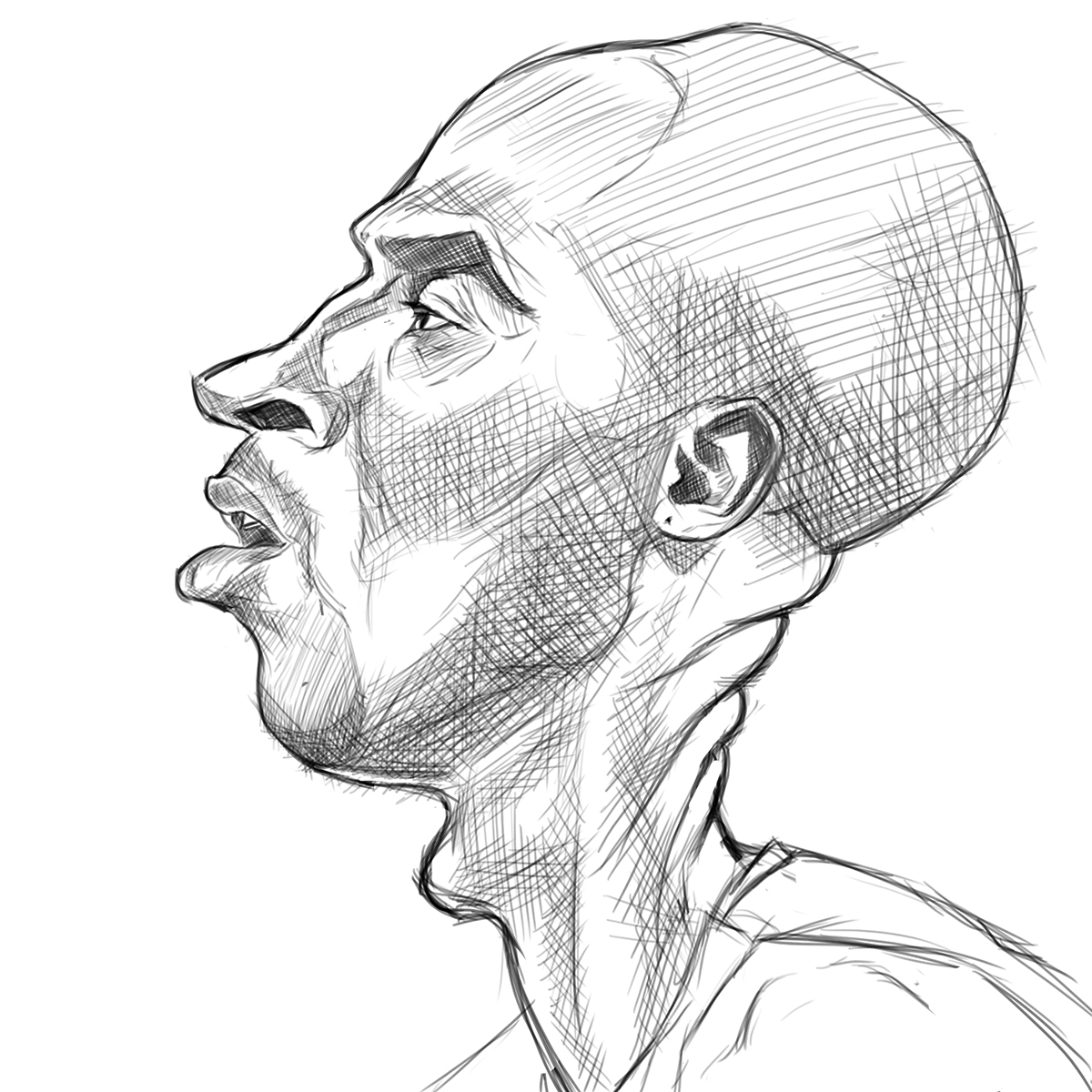
New sketch. Kobe Bryant Caricature.
-
The top guys body looks a little off kilter to me. I love the black and white ones A LOT! All of them look really good though.
-
Awesome stuff!
-
@Marsha-Kay-Ottum-Owen said:
The top guys body looks a little off kilter to me. I love the black and white ones A LOT! All of them look really good though.
Yeah. I kind of freestyle the whole thing without looking at no real reference besides his sneakers, but thanks.
-
-
@Lee-White said:
very nice designs! Thanks for sharing them!
I noticed you putting the photoshop paints added to look like they are in your sketchbook. If you want to further enhance that effect, flatten your layers down to just the sketchbook backgound pic as a layer and your photoshop painting as a layer, then play with the blend modes in the layers palettes. Try Overlay first as that one sometimes just looks great as is. I use multiply, but that can sometimes lose the color. Anyway, give it a go and see if you can blend it seamlessly and make it look like it's actually painted in the sketchbook.
Again, great looking designs. Keep em' coming!
Thank you, Lee. I will definitely try that next time, Also I purchased your Visual Storytelling video, which is definitely a skill I need to build is on, which is excellent by the way.
-
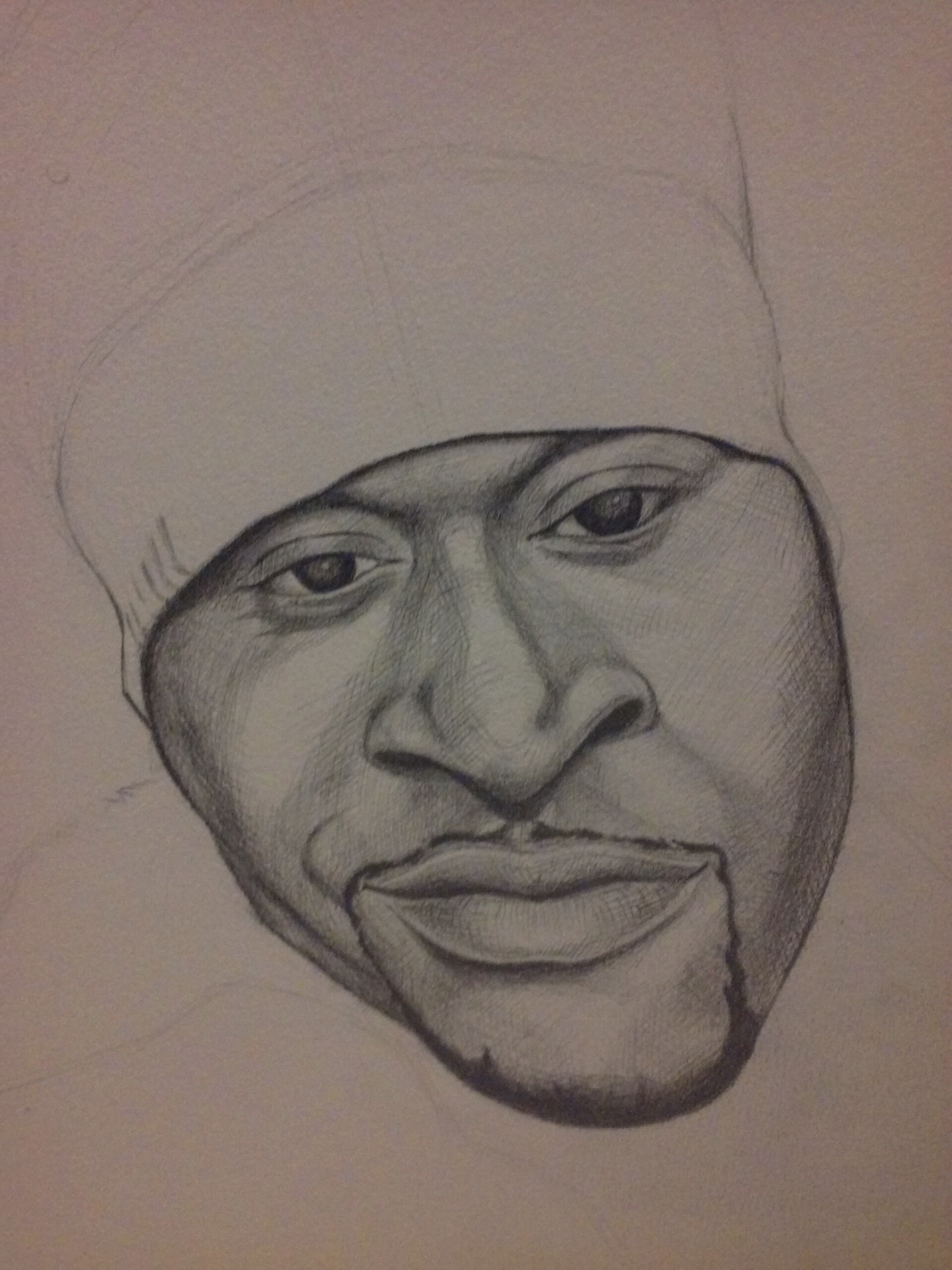
Here's a WIP portrait I'm learning from the Dave Malan video.
-
I like the feeling of your work a lot! Very genuine. You seem like you have a good understanding of the basics to me

-
You have such a distinct style, love these sketches, please keep 'em coming! I am super impressed.
-
Thanks @bharris . I always try to keep the basics in mind while I'm drawing but also try to take the liberty in terms of style and the type of look I want.
Thank you, @Kasey-Snow. Hopefully I can keep this goin as long as I can. One day at a time.
-
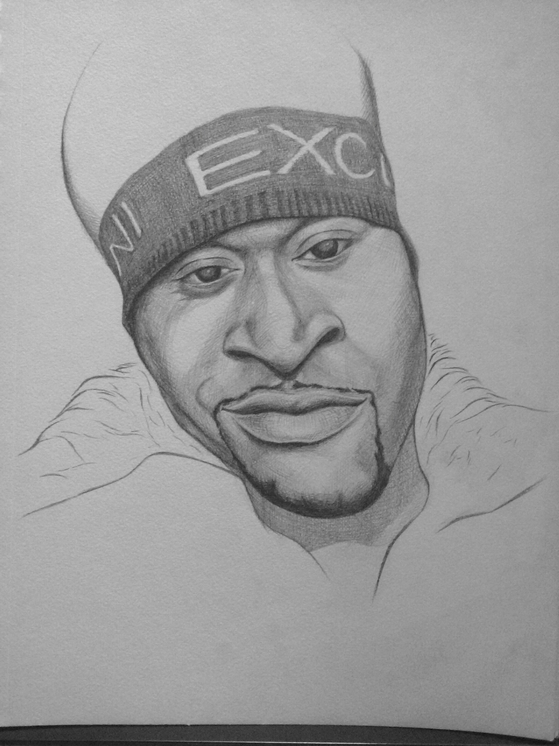
Here's is how far I took the portrait.
-
Here's another portrait of Kawhi Leonard. Unfinished though.
