Riley, Riley, Riley…
-
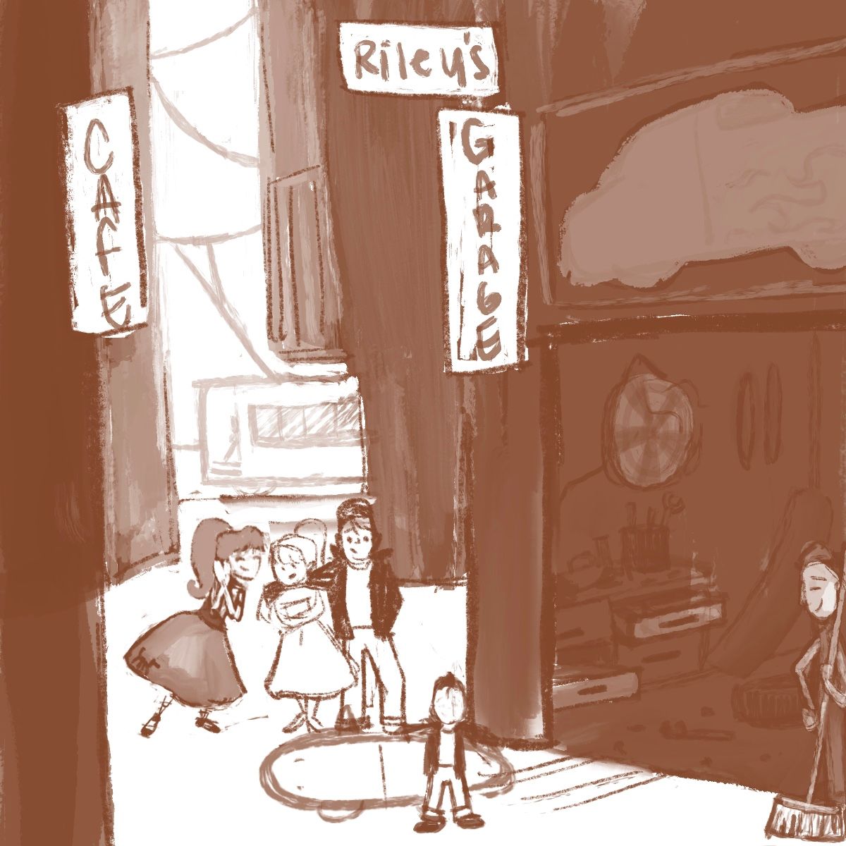
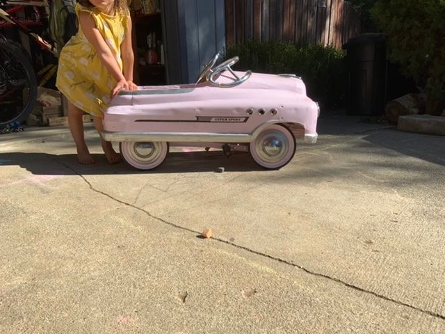
I won’t lie I detested this topic. A messy garage is not at the top of my list of things to draw. But after all my shenanigans regarding last months I can’t give up so easily just because I don’t like the topic, so, here is my first rough. For some reason I kept imagining like this 50s greaser type garage, but I knew it wouldn’t fly as “children’s illustration” so thought I’d have it be a kid who’s built this pedal car, I wanted to try my hand at another era so wish me luck, and if you have any feedback please feel free to speak up. Characters are not set in stone and I have yet to design the peddle car. I have a vintage one in my own messy garage that I plan to dig out later today to refer to.
-
-
@asyas_illos I like the idea so far. That’s a good challenge to do another time period. I hope you pull out another two top 16 entries!
-
@chrisaakins thanks, haha I have feeling that won’t be happening again! Also I don’t think I will have nearly as many entries this month, not vibing with it as much, we’ll see…
-
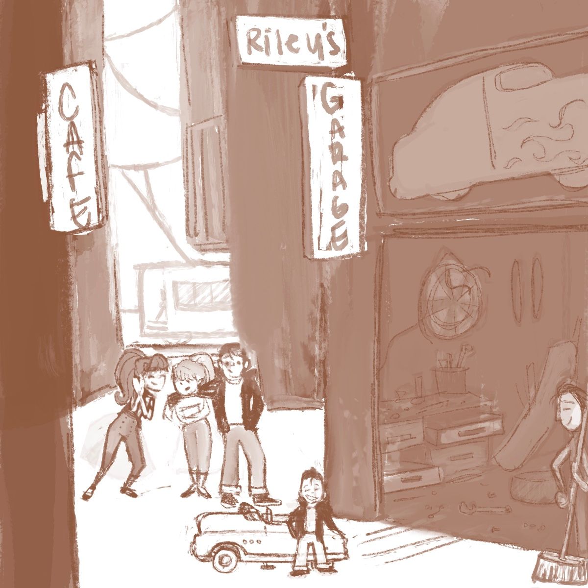
Tightened it up a bit but I know the trashed garage part is lacking
-
I’m curious if you guys think I have too many characters in this piece? I’m thinking I could lose the teen male and just have the girls kind of adoring this little boy who is thinking he’s sooo cool, while his father (Riley senior) watches from the sidelines? Does that look readable? Thanks
-
@asyas_illos like the concept, but yes, I do think it's missing a bit with the story. With your values and composition, the focal point for me is the 3 characters, not the kid and pedal car.
Is the pedal car supposed to be the focal point? Is Riley the little kid next to the pedal car? If so, why are they so small?
Why are they just standing there? Could they be doing something interesting? Could they be in motion?
Think about the story and your composition. There is a lot of dark, empty space with nothing much going on. What if you cropped the composition and zoomed in on Riley & his pedal car? Do we need to see the entire garage, or only part of it? Maybe even a corner would give us enough information... Do we need to see the entire bodies of the rest of the characters? If they're adults/teen, it might be fun to show them from the waist down. It might heighten the feeling that Riley is trying so hard to be a grown up greaser, and literally not measuring up!
Those are my thoughts for the moment. This is definitely a challenging prompt! Looking forward to seeing where you go with it.
-
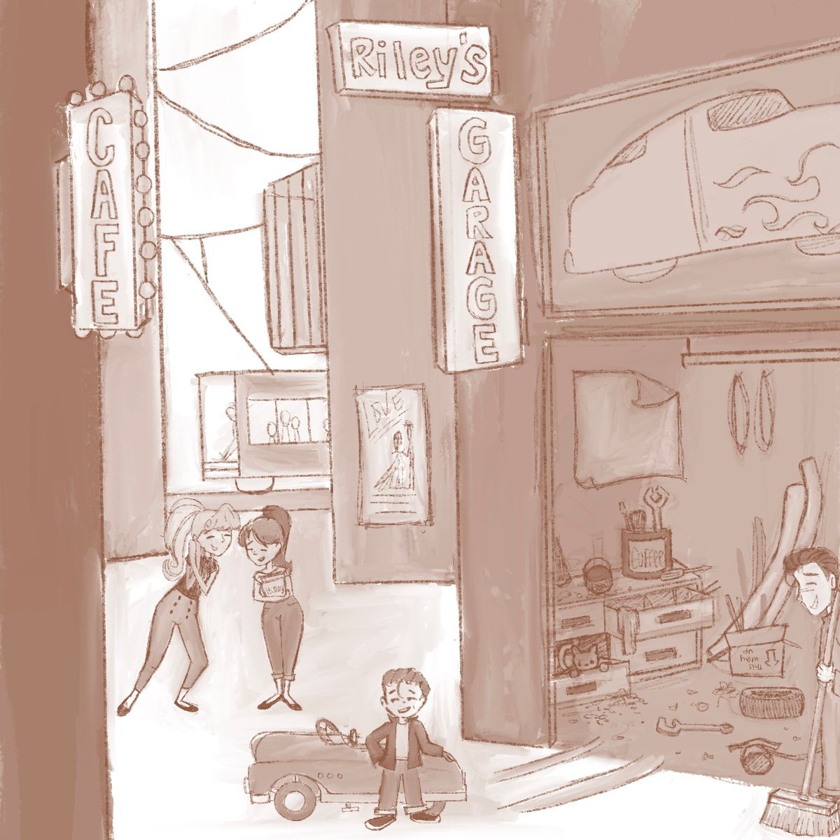
@melissa_bailey thank you for the feedback! I wanted to show his pride and I’m not sure it would be clear if I had him in motion. I think once I color he will stand out as the focal point. But I will play around with cropping and see what happens. Here is an updated image as of now
-
@asyas_illos I usually work very close it seems, so I wanted to back it up and bring a lot of environment into this one
-
This is a great idea! Love that it's set in the 50s. Watch out for tangents with the teenagers heads and the road. I agree, such a challenging prompt this month!
 Looks good so far though. Looking forward to seeing the final piece(s)
-
@ruth thank you and I’ll watch for tangents especially after learning that it can be a deal breaker!
-
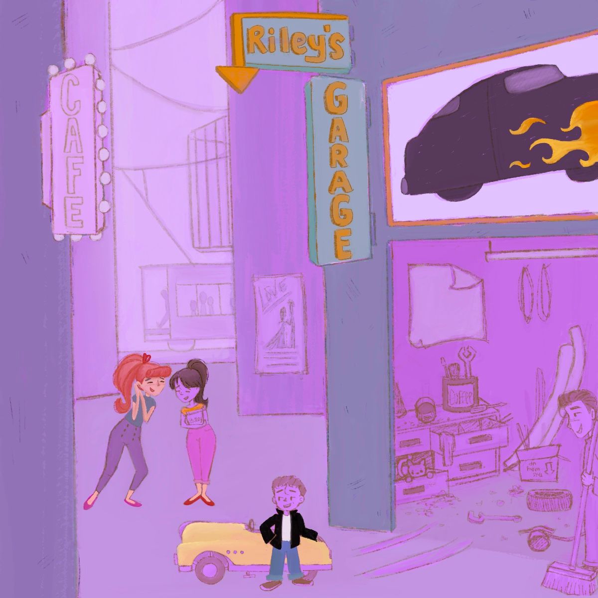
I’ve dropped a little color, though I’m still figuring out what others colors I want especially inside the garage. I’m pretty much going monochromatic with the background and think I may do something similar in the garage.
-
@asyas_illos I like your idea, think the pink color overlay is great, and I love that pedal car! Sorry I'm late to the game on this one, but it seems to me that the car, and Riley, are a bit too small and straight on in comparison to the whole to be the focal point of the story. I know you want to get those fun neon signs in there, but maybe you could add a little perspective on the car, which you would see from above like the tool drawers? That and a judicious crop, would probably do the trick without you having to rework it too much.
Also, Riley could use a little swaggering contrapposto to go with his flirty eyebrows. (Somehow I'm thinking of the character Alberto in Luca, so maybe you could google some screenshots for reference.) And maybe he's still got a little grease on him?
Easier said than done, I know!

-
@lauraa thank you for your feedback! I will have to consider these, I think the chest in the garage actually could use a little less perspective now that I look at it, maybe I’ll tweak both. I know, I have been trying to figure out how to crop it without losing to much of 50s feel, so that Riley gets more attention. Ugh! Yes easier said than done!
-
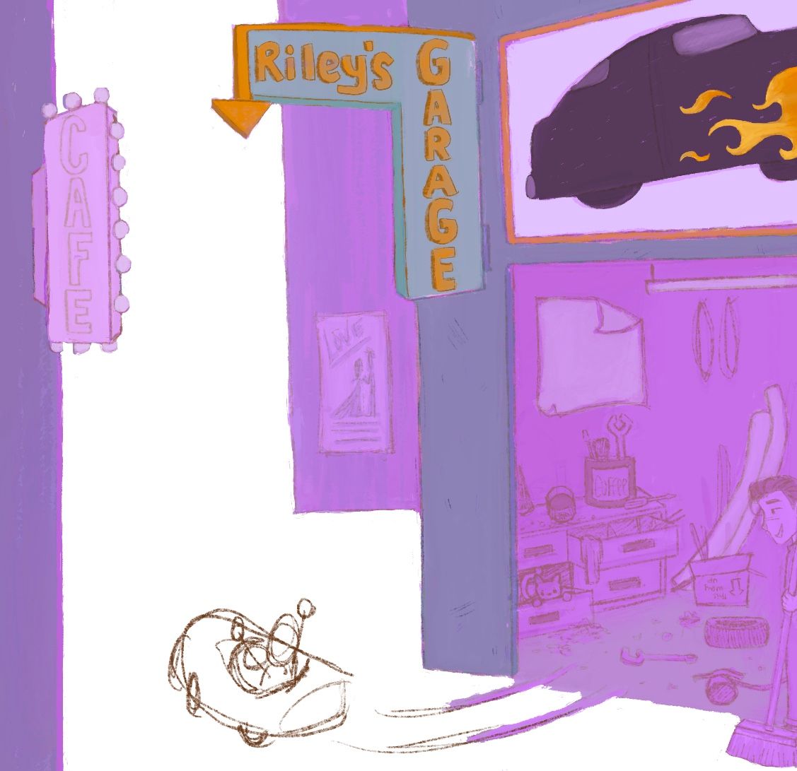
Oh my god you guys I’m losing it with this one! I screwed with the og one so much I ended up erasing much of it. So I don’t know what the hell im doing now… I have other ideas I’ve been kicking around so I might focus on those and come back to this when I’m less pissed off

-
@asyas_illos
Working on something else for a little bit will help you come back refreshed. Take a short break, draw something you love, and then come back. -
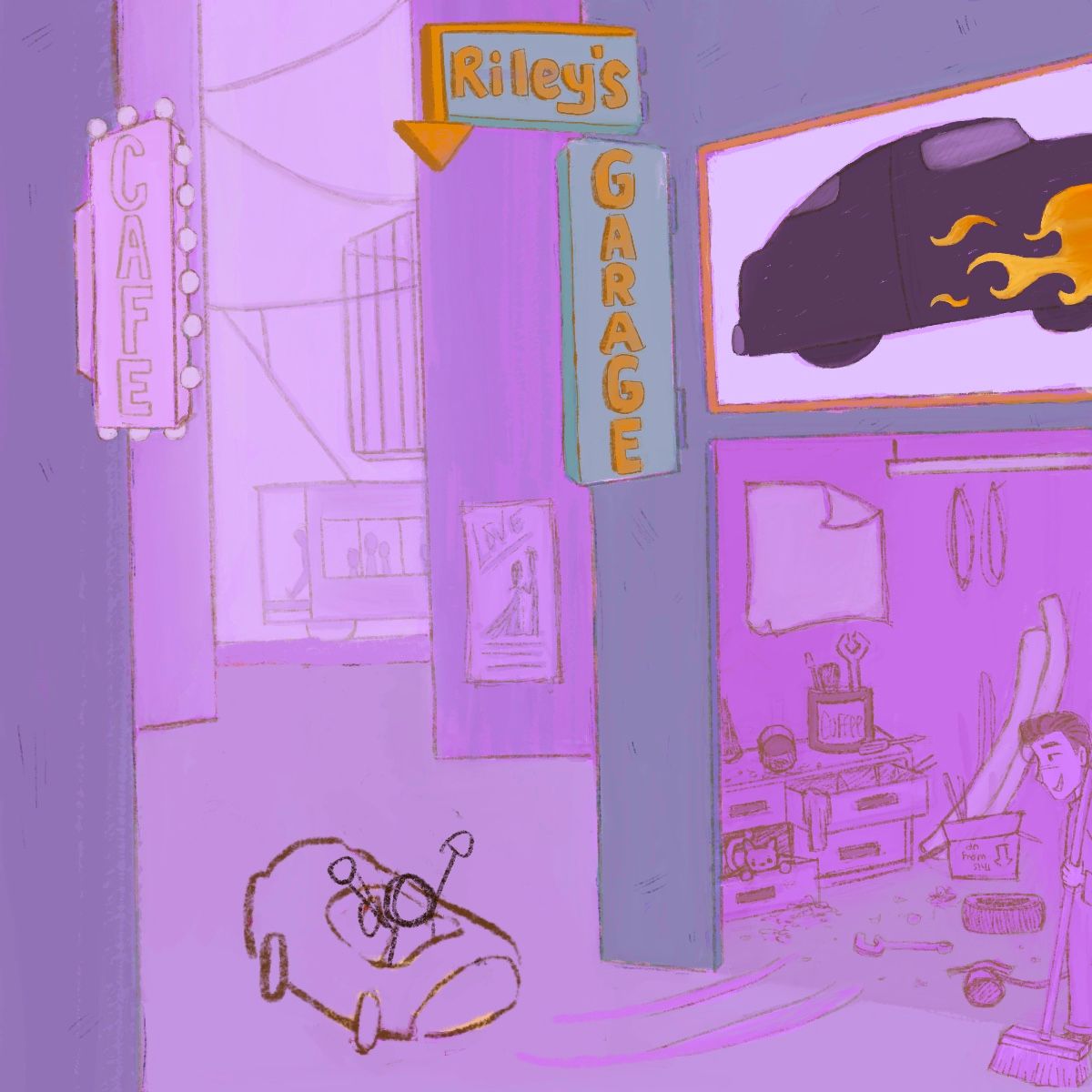
Ok I cooled off and salvaged the og, just thinking maybe I lose the girls and have Riley riding out.
-
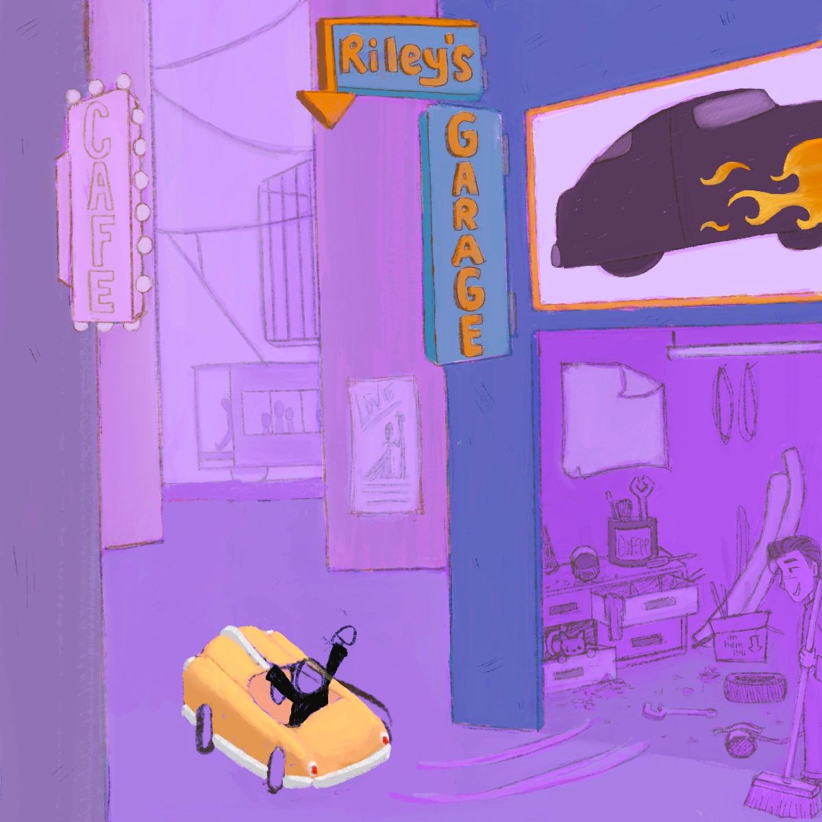
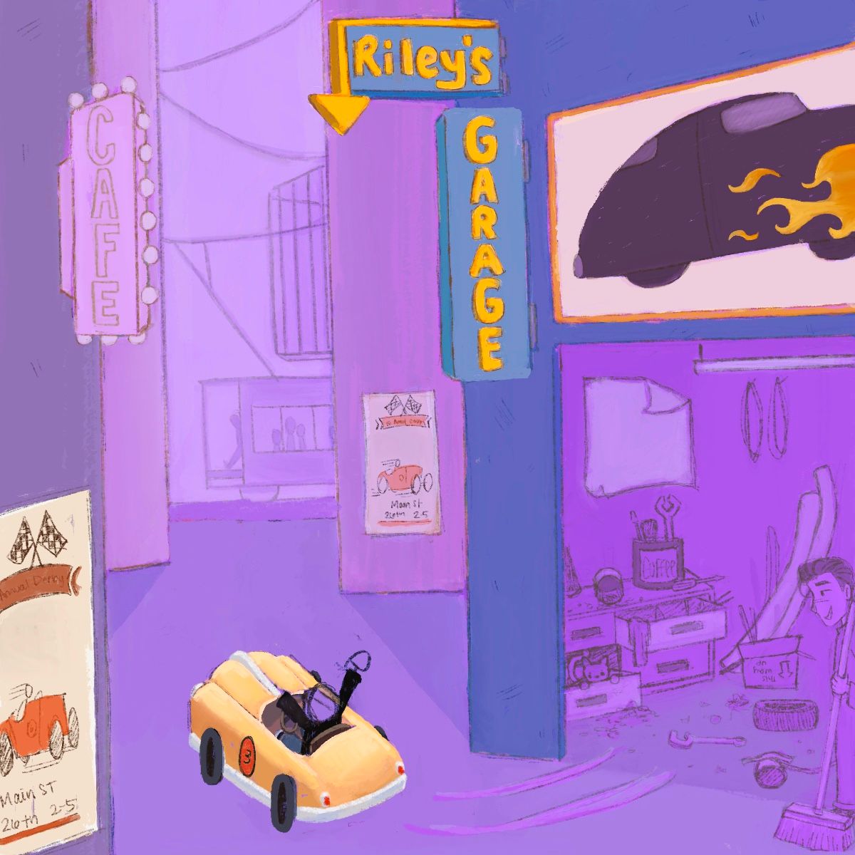
Well my problem now is that it no longer looks like a pedal car from this angle, just looks like a tiny car. I’m thinking adding a flyer announcing a derby? I don’t know why I’m struggling so much with this, but I have to finish at least one entry especially since I’m having such a hard time with it!
-
Made some progress and feeling a little better about it
-
@asyas_illos one thing that I find a bit confusing, is the Riley’s Garage. To me, that would imply that the man in the bottom right is Riley. I love where you’re going with it, and I know you’re struggling with the prompt, but you’ve got great skills, and I know you can pull this one off. Is there anyway I see Riley’s face? I preferred when he was just rolling out of the garage, because you could see his expression.