Colour Studies — Feedback Please!
-
Hi Folks,
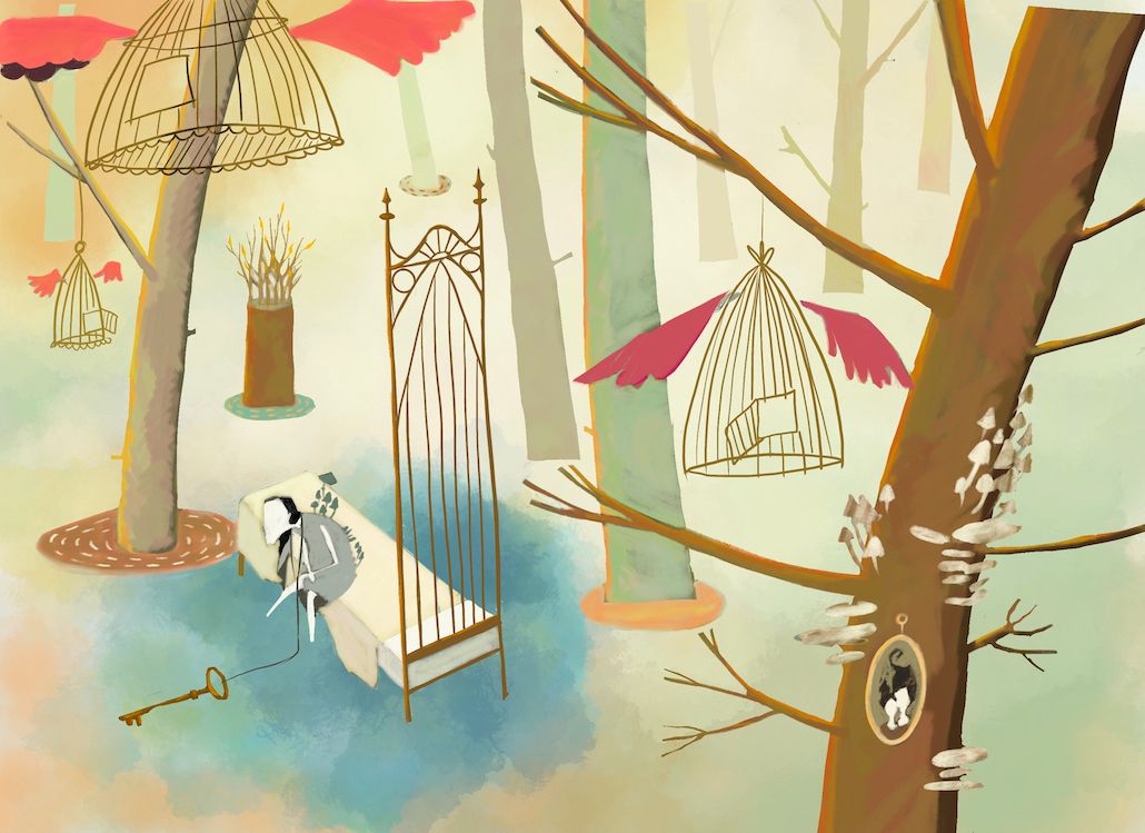
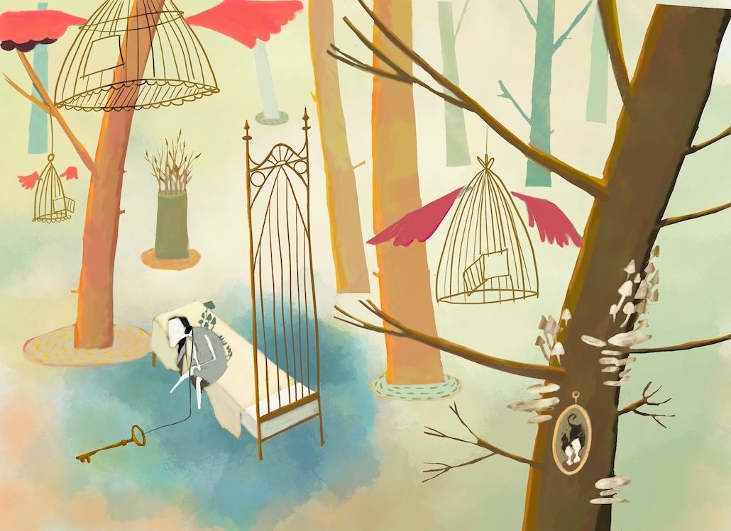
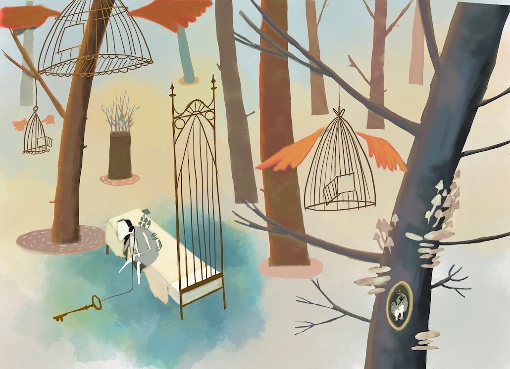
I've been working on colour studies all day today (best day ever) for this piece and have arrived at 3 I really like but can't see it anymore. The first two are quite similar (sorry), so I suppose it's really between one of those first two (1A and 1B) or the last (2).
The keywords/themes are:
-
an ending which is also a beginning
-
hope
-
golden hour
-
peace and resolution
-
the righting of a wrong
I'd really appreciate any feedback! Thank you
")
1a
1b
2
the site: katherinetyson.com
instagram: instagram.com/katherinetysonart -
-
I like that the trees are a bit darker and more saturated in the second one but they take a bit of the attention away from the character I think so my pick is the first one because it still looks great and guides the eye to the character a bit better
-
I agree that the darker trees work best, chacter on the bed is first and foremost. Interesting illo, I like it.
-
I really like the third one it’s got great contrast. # 2 I guess it’s called

-
I like the warmth of the first two palettes 1a and 1b. Nice work rendering such abstract concepts. I like the rhythm that you created with line and shape. The reason I like the warmth is that it counteracts the sort of starkness of the landscape and objects, and the poor character who is embodying hopelessness and inertia.
studiojcd.com
she/her/hers
Insta/Twitter: @chengdesautels -
@Katherine Two appeals to me, but I think it's about those saturated wings and they're making me look up too much. I think the first one gets the keywords just right and looks very balanced.
I like this image! It's got a lot going on symbolically, but it's still clear and simple.
-
I love the concept. I like the darker of the 3 - for me, that version splits the illustration into foreground (the tree) and background (the person/forest) - this makes it easier to focus on either. Whereas the lighter colours almost blend the back/foreground, so it loses the depth and focus.
-
@katherine I think I enjoy the second one a little more. I think it communicated the golden hour theme best with the lighter, warmer trees in the middle ground best. I also like the cooler, blue trees towards the back as cooler colors tend to recede in our minds. The third is just a bit too cold and doesn't say "hope" to me much.
Love this piece, btw. Such an interesting composition. Made me keep looking all all the details in hopes of understanding the story more. Lovely!
@madebyduh
www.madebyduh.com -
@griffin Thank you, I agree — I think the darker trees are competing too much with the main focal point too.
-
@larue Thanks Larue!
-
@asyas_illos Thank you! I'm a bit torn about the contrast — I think I need to make sure it's not detracting from the main focal point.
-
@jenn Thank you so much Jenn, such a thoughtful reply. I agree about the warmer palette and I think I'll go with this one for the reasons you mentioned. My only concern is that the warmth detracts from the blue and green emanating from the character, which is supposed to symbolise a new beginning and redemption.
-
@lauraa Yeah those wings are way too hot, eh? I think I might try making them a dirty white, like the mushrooms. They're really not supposed to be a focal point at all. They should be a third read, at most.
-
@mymightypencil Thank you — I'm leaning towards the lighter version — I wonder if you feel that 1B also lacks depth? I thought perhaps the warmer trees might look like they're coming forward more because warm colours advance. If you still think this one lack depth perhaps I could make the closer trees a bit darker and maybe over-lap some of the trees more?
-
@duh Thank you so much! I think this is the one I'm going to move forward with. I agree, the third one doesn't say hope to me either. I think I'll play around with de-saturating everything except the blue and green around the character as this is supposed to be the focal point.
-
This is such a lovely piece. So interesting, I can't stop looking at all the details. I'm definitely drawn to the first one. I think the trees in the second one are too warm and seem to draw my eye away from the character, and I agree the 3rd one is too stark and doesn't say 'hope' at all. Please share the final piece when it's done, would love to see it

-
I think the more green and warm colors looks like a more fun color harmony that fits the more abstract quality of your illustration, rather than the more blue and cool toned colors in #3. The colors feel more deliberate.
I think #2 is my favorite of the three. The tree in the middle of the page fits with the other trees better for that look of depth without distracting from the character off to the side of it. I also really love the brush textures in this, especially the mixed watercolor wash look.