New Sketches and Lighting - Critiques Welcome
-
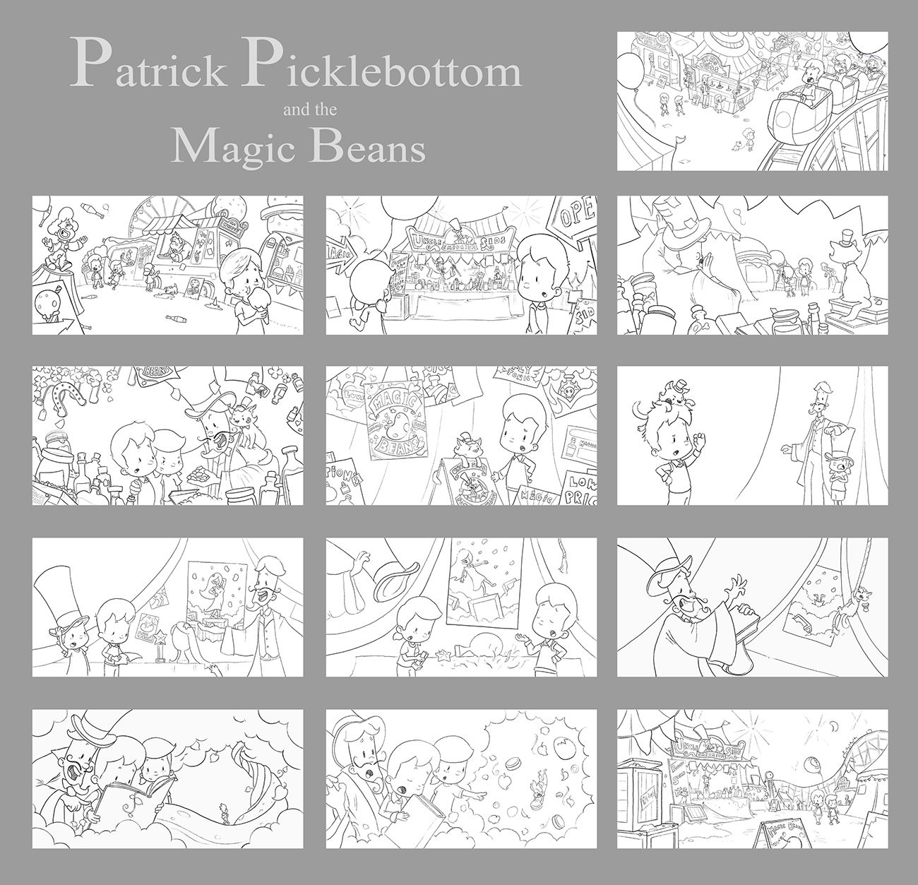
Working on a new book and trying to get everything planned out well before I begin coloring. A basic overview of the book is about 2 kids who go to the fair and a man tries to sell them some useless beans by making up some stories, but in the end the kids are too smart and pass up on the offer.
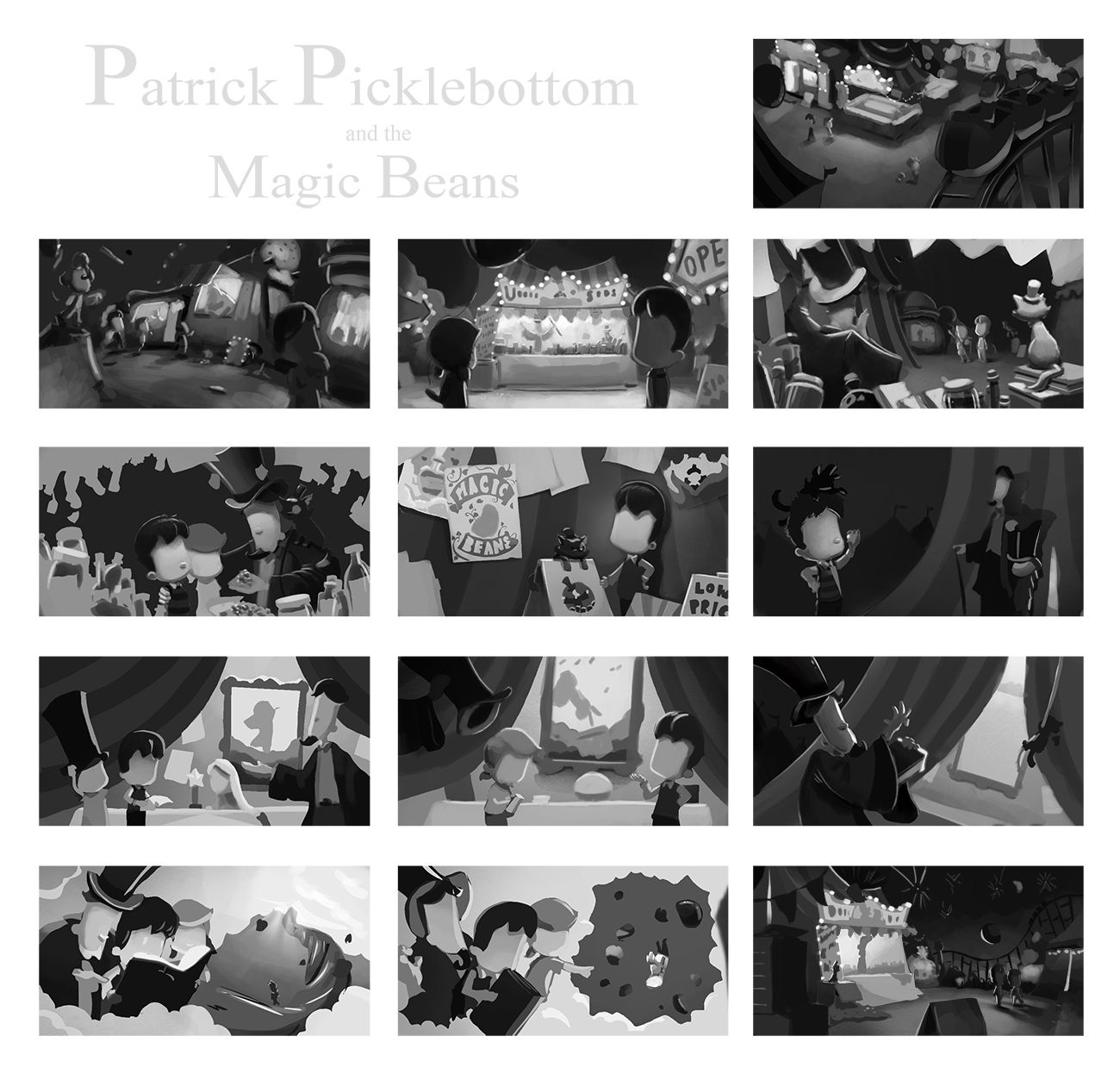
I'd quite like to hear any feedback about the sketches or the light and shadow thumbnails. Each page has to be a spread so I didn't have an option for any spot etc illustrations, but tried to vary up the perspectives and make it as interesting as possible.
-
I love seeing your book process. Thank you for sharing!
I just noticed how only the first and last page have wide shots. Perhaps you could include a bird’s eye view or worm’s eye view of tent’s interior. Or have the cam peeking behind an item instead of just straight on the characters for the middle pages?
-
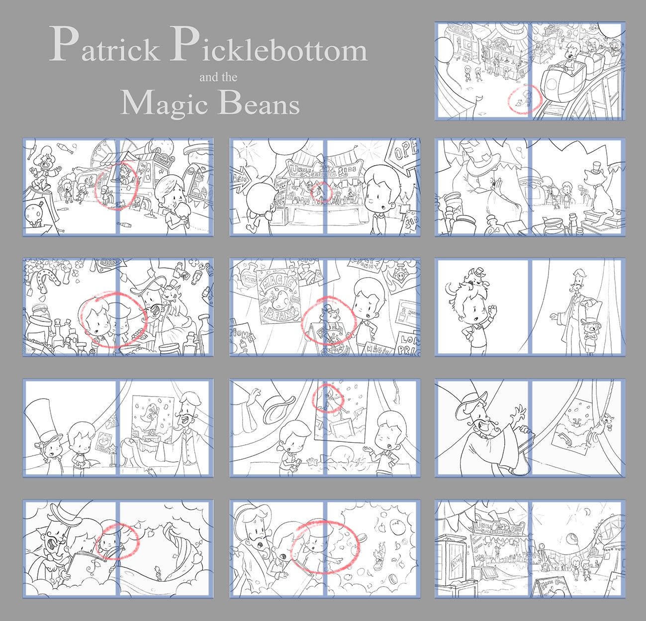
Hi Gary, first off, congrats on the new book project. You've done a lot of good work so far. Some quick suggestions to help others that might want to chime in--add page numbers to your spreads, and add a thin faint gutter line.
For the line drawings, I love how you start off with a perspective from high above. There's a feeling of momentum, that we're about to go on a wild rollercoaster ride, with lots of slow-fast-scary-hohum moments. The following spreads show variety in perspectives, but then in the middle spreads, there seems to be less variety. Of course, it doesn't help that you can't do spots, vignettes and one-pagers. Maybe with the spreads that are next to each other and have a similar or same perspective, you can try placing the camera behind a character showing their POV? Or if this a slow sequence, just shift the camera slightly to add some variety? Then going back to my note about a rollercoaster ride, I was hoping that there would be some stage where fast action or excitement was evident. Without the text, and just looking at the images, everything seems to be proceeding at a generally steady pace. If there is an exciting climactic moment, maybe you can choose a more extreme perspective for that spread?
As for the value study, I like the extreme contrasts; feels dramatic. Some might think it feels a bit too dark, but I think color will probably fix this. And I do notice how the 3rd to last spread is brighter than the others. Logically, this must be the climax of the story. But then the next spread is so similar in value and perspective. Again, try to vary the perspectives for adjacent spreads. Sorry for the long comment. Hopefully something here is helpful. It all looks amazing, regardless, but your work usually is.
-
Hi @gary-wilkinson, this is looking really good so far!
I like the value study and think it will provide the dramatic scenes you’re looking for.
I drew an imaginary line for the gutter and noticed some of your scenes have primary content smack in the middle, which you might consider adjusting as shown in the attached redline.
I’m sure you’ll work these out because your books are all awesome! Can’t wait to see this one finished!
I must say full spreads on every page is a unique request from the publisher, but hey - they’re paying!
-
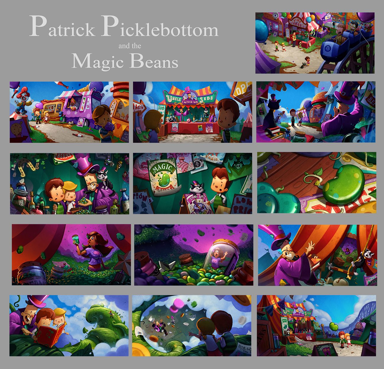
My apologies for not coming back to this thread, I managed to finish earlier last year, but had to move onto other projects. Thank you for the critiques and advice. It really did help me rethink some parts of the book. Aside from changing the time of day from night to daytime I also redrew some of the spreads and tried to add in a bit of variety to the viewpoint where I could. I believe this book will come out later this year (or next).
I thought perhaps some of you might be interested in seeing how it came out in the end. Although i'm not in love with some parts, I felt that it helped to tell the story in the best way I could. I've been trying out a new style recently as well which hopefully is appealing and can be aseen in another book I finished earlier this year.
-
Looks AMAZING @Gary-Wilkinson! Love your work. Can’t wait to see this book out in the world!